For a long time there has been discussion of replacing the matplotlib default color map and color cycle, but we still haven't done it. We need a clear set of criteria, and a small set of good alternatives, leading to a decision, a PR, and a release. Now is the time.
Here is what I think is the most recent extensive thread:
http://comments.gmane.org/gmane.comp.python.matplotlib.devel/13122
Early in that thread Nathaniel Smith proposed the following criteria:
- sequential, not diverging
- perceptually uniform
- still perceptually uniform when converted to greyscale
- variation in hue is good
- colorblind-friendly
- hue ramp should work even without the luminance variation
I added:
- aesthetically pleasing
Probably not all of these can be met perfectly at once, but they seem like good goals. The one most likely to be controversial is the first. I propose that we not bother arguing about it, but just accept Nathaniel's recommendation.
For actual proposals:
1) A greyscale has been proposed; it satisfies several of the criteria very well, but misses by omitting hue entirely. It is proposed as a way to force users to choose something other than the default; I don't think this is a good *competitive* strategy.
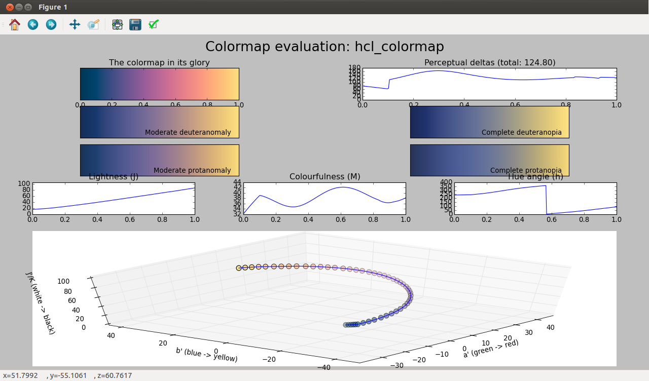
2) YlGnBu or YlGnBu_r seems to me to be a viable candidate. It has the great advantage that we already have it. It seems to rate well by most of the criteria illustrated via Nathaniel's https://github.com/njsmith/pycam02ucs viscm() tool. (Perceptual distance is a little jumpy.)
Others?
Proposals for the new color cycle for line plots?
Proposed release strategy:
We will close the 1.4.x line with 1.4.3, in the process of being released now.
The next step is the color change release, 2.0, based on 1.4.3, but with any additional bug fixes and other reasonably non-risky changes that are ready to go.
Any substantial new features will then go in a subsequent point release.
Eric

