Well, since we are thinking of it… What about prettyplotlib’s style? I am not sure I want to completely steal either project’s style as it is their own look-n-feel (and there are some aspects of their styles I don’t quite like, but I am something of a luddite…). But I would certainly be receptive to addressing whatever egregious appearance faux pas we may have. Perhaps the owners of those projects could provide use feedback on what they might consider their “short-list” for things they would fix in matplotlib?
···
On Sat, Feb 28, 2015 at 5:50 PM, Todd <toddrjen@…149…> wrote:
On Feb 19, 2015 1:39 AM, “Nathaniel Smith” <njs@…503…> wrote:
On Feb 16, 2015 3:39 PM, “Eric Firing” <efiring@…229…> wrote:
On 2015/02/16 1:29 PM, Michael Waskom wrote:
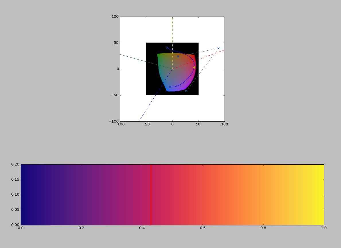
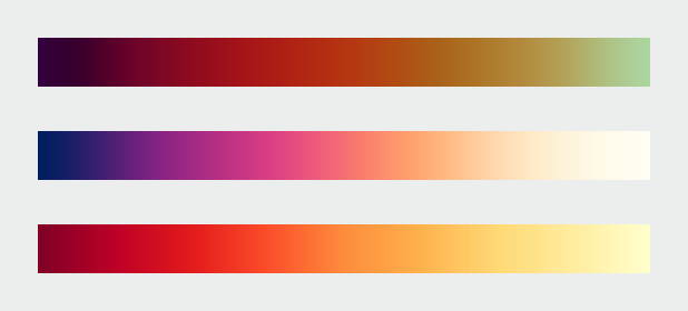
Nathaniel’s January 9 message in that thread (can’t figure out how to
link to it in the archives) had a suggestion that I thought was very
promising, to do something similar to Parula but rotate around the hue
circle the other direction so that the hues would go blue - purple - red
- yellow. I don’t think we’ve seen an example of exactly what it would
look like, but I reckon it would be similar to the middle colormap here
http://earthobservatory.nasa.gov/blogs/elegantfigures/files/2013/08/three_perceptual_palettes_618.png
(from the elegant figures block series linked above), which I’ve always
found quite attractive.Certainly it can be considered–but we have to have a real implementation.
While I hate to promise vaporware, I actually was planning to have a
go at implementing such a colormap in the next few weeks, based on
optimizing the same set of parameters that viscm visualizes… FWIW.Are we planning to make other default appearance changes at the same
time? The idea of changing the color cycle and/or dot-dash cycle has
already come up in this thread, and this earlier thread proposed
several more good ideas [1]:
http://thread.gmane.org/gmane.comp.python.matplotlib.devel/13128/focus=13166
If the goal is still to put all the appearance-related changes in a single release (to simplify changes to downstream unit tests), but nobody has stepped up to make changes except to the colors, might it be possible to just adopt the default seaborn style (except for colors, of course)? If anybody is strongly motivated to make changes they can, but if nobody does there would still be a good, modern, pleasant-looking style used by default.
Dive into the World of Parallel Programming The Go Parallel Website, sponsored
by Intel and developed in partnership with Slashdot Media, is your hub for all
things parallel software development, from weekly thought leadership blogs to
news, videos, case studies, tutorials and more. Take a look and join the
conversation now. http://goparallel.sourceforge.net/
Matplotlib-devel mailing list
https://lists.sourceforge.net/lists/listinfo/matplotlib-devel