I vote for D, although I like matlab's new default even better
I vote for A and B. Only B if i get just one vote.
C is too washed out and i like the warm colors more than the cold ones in D.
It’s funny that this comes up while I’m handling colormaps in my own work at the moment.
···
Neal Becker <ndbecker2@…287…> schrieb am Fr., 5. Juni 2015 um 12:58 Uhr:
I vote for D, although I like matlab’s new default even better
Matplotlib-users mailing list
Matplotlib-users@lists.sourceforge.net
https://lists.sourceforge.net/lists/listinfo/matplotlib-users
It is funny that you mention that you prefer the warmer colors over the cooler colors. There has been some back-n-forth about which is better. I personally have found myself adverse to using just cool or just warm colors, preferring a mix of cool and warm colors. Perhaps it is my background in meteorology and viewing temperature maps?
Another place where a mix of cool and warm colors are useful is for severity indications such as radar maps. It is no accident that radar maps are colored greens and blues for weak precipitation, then yellow for heavier, and then reds for heaviest (possibly severe) precipitation – it came from the old FAA color guides. While we all know that that colormap is fundamentally flawed, there was a rationale behind it.
Hopefully I will have some time today to play around with the D option. I want to see if I can shift the curve a bit to include more yellows and orange so that it can have a mix of cool and warm colors.
Ben Root
···
On Fri, Jun 5, 2015 at 11:21 AM, Philipp A. <flying-sheep@…273…> wrote:
I vote for A and B. Only B if i get just one vote.
C is too washed out and i like the warm colors more than the cold ones in D.
It’s funny that this comes up while I’m handling colormaps in my own work at the moment.
Neal Becker <ndbecker2@…287…> schrieb am Fr., 5. Juni 2015 um 12:58 Uhr:
I vote for D, although I like matlab’s new default even better
Matplotlib-users mailing list
Matplotlib-users@lists.sourceforge.net
https://lists.sourceforge.net/lists/listinfo/matplotlib-users
Matplotlib-users mailing list
Matplotlib-users@lists.sourceforge.net
https://lists.sourceforge.net/lists/listinfo/matplotlib-users
Hi,
This is a great initiative, I love colormaps and am always disatisfied.
However, I am concerned about these proposed defaults. As Ben says, there are two types of data sets: “intensity” or “density” data, and data sets with a natural zero (i.e. positive or negative anomaly or velocity). I’d be fine with any of the proposed colormaps for “intensity” data sets, but I would never use them for anomaly data sets; I couldn’t tell where the middle (zero) of any of those colormaps are intuitively.
Jet and parula, for all their sins, are decent compromises for the naive user (or the user in a rush) because they do a good job of representing both types of data. Even in black and white jet does something reasonable, which is go to dark at extreme values and white-ish in the middle. Jet also has a nice central green hue between blue and yellow that signals zero (or at least it does to me after years of looking at it). I don’t see that jet really loses that under colorblindness; in fact I almost prefer the “Moderate Deuter” version of jet to the actual jet.
Anyways, I guess I am advocating trying to find a colormap with a very obvious central hue to represent zero. Anomaly data sets are very common, so having a default colormap that doesn’t do something reasonable with them may be a turn off to new users.
Cheers, Jody
···
On Fri, Jun 5, 2015 at 11:21 AM, Philipp A. <flying-sheep@…3454…3…> wrote:
I vote for A and B. Only B if i get just one vote.
C is too washed out and i like the warm colors more than the cold ones in D.
It’s funny that this comes up while I’m handling colormaps in my own work at the moment.
Neal Becker <ndbecker2@…287…> schrieb am Fr., 5. Juni 2015 um 12:58 Uhr:
I vote for D, although I like matlab’s new default even better
Matplotlib-users mailing list
Matplotlib-users@lists.sourceforge.net
https://lists.sourceforge.net/lists/listinfo/matplotlib-users
Matplotlib-users mailing list
Matplotlib-users@lists.sourceforge.net
https://lists.sourceforge.net/lists/listinfo/matplotlib-users
Personally, I disagree. I think that sequential colormaps make better
defaults b/c then the software isn't making an assumptions about the
central tendency of your data.
You raise a good point though. Perhaps a compromise is to make "sequential"
and "diverging" valid arguments to any function that takes "cmap" and falls
back to the default colormap and e.g. "coolwarm", respectively.
···
On Fri, Jun 5, 2015 at 9:17 AM, Jody Klymak <jklymak@...4192...> wrote:
Anyways, I guess I am advocating trying to find a colormap with a very
obvious central hue to represent zero. Anomaly data sets are *very*
common, so having a default colormap that doesn’t do something reasonable
with them may be a turn off to new users.
Jody,
This has come up before and the consensus seemed to be that for the anomaly data sets knowing where the zero is is very important and the default color limits will probably get that wrong. So long as the user has to set the limits, they can also select one of the diverging color maps.
I also advocate for users/domains which typically plot anomaly/diverging data sets to write helper functions like
def im_diverging(ax, data, cmap=‘RbBu’, *args, **kwargs):
limits = some_limit_function(data)
return ax.imshow(data, cmap=cmap, vmin=limits[0], vmax=limits[1], *args, **kwargs)
Tom
···
On Fri, Jun 5, 2015 at 11:21 AM, Philipp A. <flying-sheep@…273…> wrote:
I vote for A and B. Only B if i get just one vote.
C is too washed out and i like the warm colors more than the cold ones in D.
It’s funny that this comes up while I’m handling colormaps in my own work at the moment.
Neal Becker <ndbecker2@…287…> schrieb am Fr., 5. Juni 2015 um 12:58 Uhr:
I vote for D, although I like matlab’s new default even better
Matplotlib-users mailing list
Matplotlib-users@lists.sourceforge.net
https://lists.sourceforge.net/lists/listinfo/matplotlib-users
Matplotlib-users mailing list
Matplotlib-users@lists.sourceforge.net
https://lists.sourceforge.net/lists/listinfo/matplotlib-users
Jody,
This has come up before and the consensus seemed to be that for the anomaly data sets knowing where the zero is is very important and the default color limits will probably get that wrong. So long as the user has to set the limits, they can also select one of the diverging color maps.
OK, fair enough - if the consensus is that people who want diverging colormaps need to know what they are doing, and the default is only for sequential data, then that argument has merit. I do not look forward to seeing the first student talks that try to contour velocity data using one of these colormaps, but maybe the results will be so ghastly the naive user will realize they need to do something more appropriate.
However, if sequential is what you have decided, then it is useful to say how the underlying data is distributed: For uniform distributions like those used in the plotted examples, I prefer C and D. However, for data like that in the movies, which look to be more Gaussian, I would actually prefer B, or a version of D that went to black and white to better represent the extreme values. Put another way, I’d use A and B, but most of the time I’d set my data limits so that they didn’t saturate as much as they do in the plotted examples. Hopefully that makes sense.
Cheers, Jody
···
On Fri, Jun 5, 2015 at 11:21 AM, Philipp A. <flying-sheep@…273…> wrote:
I vote for A and B. Only B if i get just one vote.
C is too washed out and i like the warm colors more than the cold ones in D.
It’s funny that this comes up while I’m handling colormaps in my own work at the moment.
Neal Becker <ndbecker2@…287…> schrieb am Fr., 5. Juni 2015 um 12:58 Uhr:
I vote for D, although I like matlab’s new default even better
Matplotlib-users mailing list
Matplotlib-users@lists.sourceforge.net
https://lists.sourceforge.net/lists/listinfo/matplotlib-users
Matplotlib-users mailing list
Matplotlib-users@lists.sourceforge.net
https://lists.sourceforge.net/lists/listinfo/matplotlib-users
I agree that jet does a bad job with anomaly data, but I disagree
that having a diverging colormap as default (or even a “diverging”
argument to anything that takes a cmap value) would solve that. Very
often the “zero” of an anomaly is not at the center of the extrema,
and requires creating a custom diverging colormap anyway (see
attached example).
OT, I recently found a nice alternative to jet here:
It takes care of my biggest crib with jet, which is that there is
not enough perceptual variation in the middle of the range.
Cheers,
Sourish Basu
···
On 06/05/2015 10:17 AM, Jody Klymak
wrote:
Anyways, I guess I am advocating trying to find acolormap with a very obvious central hue to represent zero.
Anomaly data sets are very common, so having a default
colormap that doesn’t do something reasonable with them may be a
turn off to new users.
https://mycarta.wordpress.com/2014/11/13/new-rainbow-colormap-sawthoot-shaped-lightness-profile/
Hi,
I agree that jet does a bad job with anomaly data, but I disagreethat having a diverging colormap as default (or even a “diverging”
argument to anything that takes a cmap value) would solve that. Very
often the “zero” of an anomaly is not at the center of the extrema,
and requires creating a custom diverging colormap anyway (see
attached example).
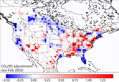
Well, I strongly disagree with that attached example! It makes it look like -0.5 is equivalent to +1.5! Unless there is a really strong reason to do that, I think that is poor practice as it makes your negative anomalies look far stronger than your positive, and that is not the case in the underlying numbers.
Cheers, Jody
···
On 06/05/2015 10:17 AM, Jody Klymak
wrote:
Anyways, I guess I am advocating trying to find acolormap with a very obvious central hue to represent zero.
Anomaly data sets are very common, so having a default
colormap that doesn’t do something reasonable with them may be a
turn off to new users.
https://mycarta.wordpress.com/2014/11/13/new-rainbow-colormap-sawthoot-shaped-lightness-profile/
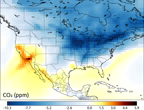
Yes, that is indeed a problem. However, if I want to plot a field
which is mostly zeros, then I prefer to use a colormap which is
white at zero. I could just extend the smaller absolute value (-0.5)
to the same absolute value as the larger one, and plot -1.5 to 1.5.
But in that case, I’d only be using a third of the possible
dynamical range of the negative (blue) part, which IMO is a waste.
If I have a field which has a zero median (which I want mapped to
white), goes from -0.5 to +1.5, and I actually want to show the
difference between (say) -0.3 and -0.4, what other option do I have?
This problem is reasonably common for me, BTW. I can have a carbon
monoxide field with an average/background of 60 ppb, but variations
from 30 to 550 ppb. So I need a color scale which (a) is white at
60, and (b) shows small variations below 60 and large variations
above 60 with equal “clarity”.
Cheers,
Sourish
···
On 06/05/2015 12:22 PM, Jody Klymak
wrote:
Hi,
On 5 Jun 2015, at 11:17 AM, Sourish Basu <sourish.basu@…287… >
wrote:
I agree that jet does a bad job with anomaly data, but Idisagree that having a diverging colormap as default (or
even a “diverging” argument to anything that takes a
cmap value) would solve that. Very often the “zero” of
an anomaly is not at the center of the extrema, and
requires creating a custom diverging colormap anyway
(see attached example).
Well, I *strongly* disagree with that attached example!It makes it look like -0.5 is equivalent to +1.5! Unless
there is a really strong reason to do that, I think that is
poor practice as it makes your negative anomalies look far
stronger than your positive, and that is not the case in the
underlying numbers.
Cheers, Jody
OT, Irecently found a nice alternative to jet here: It takes care of my biggest crib with jet, which is that
there is not enough perceptual variation in the middle
of the range.
Cheers,
Sourish Basu
<ff_adjustment_winter.png>------------------------------------------------------------------------------
          _______________________________________________

          Matplotlib-users mailing list

          Matplotlib-users@lists.sourceforge.net
–
Jody Klymak
------------------------------------------------------------------------------_______________________________________________ Matplotlib-users mailing list
–
Q: What if you strapped C4 to a boomerang? Could this be an
effective weapon, or would it be as stupid as it sounds?
A: Aerodynamics aside, I’m curious what tactical advantage
you’re expecting to gain by having the high explosive fly back at
you if it misses the target.
On 06/05/2015 10:17 AM,
Jody Klymak wrote:
Anyways, I guess I am advocating tryingto find a colormap with a very obvious central hue
to represent zero. Anomaly data sets are very
common, so having a default colormap that doesn’t do
something reasonable with them may be a turn off to
new users.
https://mycarta.wordpress.com/2014/11/13/new-rainbow-colormap-sawthoot-shaped-lightness-profile/
https://lists.sourceforge.net/lists/listinfo/matplotlib-users
Matplotlib-users@lists.sourceforge.nethttps://lists.sourceforge.net/lists/listinfo/matplotlib-users
If you need to see small changes at low values and they are equally important to large changes at high values, then taking the logarithm is often useful (or scaling your colorbar logarithmically).
Cheers, Jody
···
On 5 Jun 2015, at 11:39 AM, Sourish Basu <sourish.basu@…287…> wrote:
This problem is reasonably common for me, BTW. I can have a carbon monoxide field with an average/background of 60 ppb, but variations from 30 to 550 ppb. So I need a color scale which (a) is white at 60, and (b) shows small variations below 60 and large variations above 60 with equal "clarity”.
–
Jody Klymak
Reminder: in matplotlib, color mapping is done with the combination of a colormap and a norm. This allows one to design a norm to handle the mapping, including any nonlinearity or difference between the handling of positive and negative values. This is more general than customizing a colormap; once you have a norm to suit your purpose, you can use it with any colormap.
Maybe this is actually what you are already doing, but I wanted to point it out here in case some readers are not familiar with this colormap+norm strategy.
Eric
···
On 2015/06/05 8:17 AM, Sourish Basu wrote:
Very often the "zero" of an anomaly is not at the center of the extrema,
and requires creating a custom diverging colormap anyway (see attached
example).
Furthermore, I think there is some work being done to add functionality to the Norm to allow specifying a middle value along with a vmin and a vmax.
Ben Root
···
On Fri, Jun 5, 2015 at 3:20 PM, Eric Firing <efiring@…202…> wrote:
On 2015/06/05 8:17 AM, Sourish Basu wrote:
Very often the “zero” of an anomaly is not at the center of the extrema,
and requires creating a custom diverging colormap anyway (see attached
example).
Reminder: in matplotlib, color mapping is done with the combination of a
colormap and a norm. This allows one to design a norm to handle the
mapping, including any nonlinearity or difference between the handling
of positive and negative values. This is more general than customizing
a colormap; once you have a norm to suit your purpose, you can use it
with any colormap.
Maybe this is actually what you are already doing, but I wanted to point
it out here in case some readers are not familiar with this
colormap+norm strategy.
Eric
Matplotlib-users mailing list
Matplotlib-users@lists.sourceforge.net
https://lists.sourceforge.net/lists/listinfo/matplotlib-users
Hi Eric,
Reminder: in matplotlib, color mapping is done with the combination of a
colormap and a norm. This allows one to design a norm to handle the
mapping, including any nonlinearity or difference between the handling
of positive and negative values. This is more general than customizing
a colormap; once you have a norm to suit your purpose, you can use it
with any colormap.
Though I was hazily aware of norms, I’d not really seen that before. I particularly like the example at http://matplotlib.org/examples/pylab_examples/pcolor_log.html
This seems useful enough that a section under “User Guide:Advanced Guide” would be really helpful. An example that displays all the canned norms, and maybe how to make a custom norm. I only found the pcolor_log example by searching for colors.lognorm, which I only knew about from your comment above. There a few hits on stackexchange, but those are for specific instances and hard to find by random.
I could help do this, but it’d take a while to actually learn how to use the norms.
Thanks, Jody
···
On 5 Jun 2015, at 12:20 PM, Eric Firing <efiring@...202...> wrote:
Maybe this is actually what you are already doing, but I wanted to point
it out here in case some readers are not familiar with this
colormap+norm strategy.Eric
------------------------------------------------------------------------------
_______________________________________________
Matplotlib-users mailing list
Matplotlib-users@lists.sourceforge.net
matplotlib-users List Signup and Options
--
Jody Klymak
Jody,
Contributions to the documentation would be very welcome.
Eric
···
On 2015/06/05 11:13 AM, Jody Klymak wrote:
Though I was hazily aware of norms, I’d not really seen that before.
I particularly like the example
athttp://matplotlib.org/examples/pylab_examples/pcolor_log.htmlThis seems useful enough that a section under “User Guide:Advanced
Guide” would be really helpful. An example that displays all the
canned norms, and maybe how to make a custom norm. I only found the
pcolor_log example by searching for colors.lognorm, which I only knew
about from your comment above. There a few hits on stackexchange,
but those are for specific instances and hard to find by random.I could help do this, but it’d take a while to actually learn how to
use the norms.
Which would still have the problem that similar color
saturations/values at the two ends of the colorbar would represent
different (linear) distances away from the median/“zero” value.
But I see your point, in my specific example the confusion is made
worse because the two ends have the same sat/val, just different
hues. Lately I’ve started ‘sandwiching’ different types of colorbars
(see attached) to get around that issue.
Cheers,
Sourish
···
On 06/05/2015 12:44 PM, Jody Klymak
wrote:
On 5 Jun 2015, at 11:39 AM, Sourish Basu <sourish.basu@…287… >
wrote:
This problem isreasonably common for me, BTW. I can have a carbon
monoxide field with an average/background of 60 ppb, but
variations from 30 to 550 ppb. So I need a color scale
which (a) is white at 60, and (b) shows small variations
below 60 and large variations above 60 with equal
"clarity”.
If you need to see small changes at low values and they areequally important to large changes at high values, then taking
the logarithm is often useful (or scaling your colorbar
logarithmically).
Cheers, Jody
–
Jody Klymak
–
Q: What if you strapped C4 to a boomerang? Could this be an
effective weapon, or would it be as stupid as it sounds?
A: Aerodynamics aside, I’m curious what tactical advantage
you’re expecting to gain by having the high explosive fly back at
you if it misses the target.
Actually, I didn’t use norms because I never quite figured out how
to use them or how to make my own. If there’s a way to create a norm
with a custom mid-point, I’d love to know/use that.
-Sourish
···
On 06/05/2015 01:20 PM, Eric Firing
wrote:
Reminder: in matplotlib, color mapping is done with the combination of a colormap and a norm. This allows one to design a norm to handle the mapping, including any nonlinearity or difference between the handling of positive and negative values. This is more general than customizing a colormap; once you have a norm to suit your purpose, you can use it with any colormap.
Maybe this is actually what you are already doing, but I wanted to point it out here in case some readers are not familiar with this colormap+norm strategy.
Eric
------------------------------------------------------------------------------
_______________________________________________
Matplotlib-users mailing list
–
Q: What if you strapped C4 to a boomerang? Could this be an
effective weapon, or would it be as stupid as it sounds?
A: Aerodynamics aside, I’m curious what tactical advantage
you’re expecting to gain by having the high explosive fly back at
you if it misses the target.
Matplotlib-users@lists.sourceforge.nethttps://lists.sourceforge.net/lists/listinfo/matplotlib-users
Not to plug one of my own answers to much, but here’s a basic example. http://stackoverflow.com/questions/20144529/shifted-colorbar-matplotlib
I’ve been meeting to submit a PR with a more full featured version for a few years now, but haven’t.
···
On Jun 5, 2015 4:45 PM, “Sourish Basu” <sourish.basu@…287…> wrote:
On 06/05/2015 01:20 PM, Eric Firing > wrote:
Reminder: in matplotlib, color mapping is done with the combination of a colormap and a norm. This allows one to design a norm to handle the mapping, including any nonlinearity or difference between the handling of positive and negative values. This is more general than customizing a colormap; once you have a norm to suit your purpose, you can use it with any colormap.
Maybe this is actually what you are already doing, but I wanted to point it out here in case some readers are not familiar with this colormap+norm strategy.
Actually, I didn't use norms because I never quite figured out howto use them or how to make my own. If there’s a way to create a norm
with a custom mid-point, I’d love to know/use that.-SourishEric ------------------------------------------------------------------------------ _______________________________________________ Matplotlib-users mailing list Matplotlib-users@lists.sourceforge.net [https://lists.sourceforge.net/lists/listinfo/matplotlib-users](https://lists.sourceforge.net/lists/listinfo/matplotlib-users)–
Q: What if you strapped C4 to a boomerang? Could this be an
effective weapon, or would it be as stupid as it sounds?
A: Aerodynamics aside, I’m curious what tactical advantage
you’re expecting to gain by having the high explosive fly back at
you if it misses the target.
Matplotlib-users mailing list
Matplotlib-users@lists.sourceforge.net
https://lists.sourceforge.net/lists/listinfo/matplotlib-users
Dang it, Joe,
How do you do everything l try to do like 1000x better?
Guess I’ll be closing this:
https://github.com/matplotlib/matplotlib/pull/3858
-paul
···
On Fri, Jun 5, 2015 at 2:57 PM, Joe Kington <joferkington@…287…> wrote:
Not to plug one of my own answers to much, but here’s a basic example. http://stackoverflow.com/questions/20144529/shifted-colorbar-matplotlib
I’ve been meeting to submit a PR with a more full featured version for a few years now, but haven’t.
On Jun 5, 2015 4:45 PM, “Sourish Basu” <sourish.basu@…287…> wrote:
On 06/05/2015 01:20 PM, Eric Firingwrote:
Reminder: in matplotlib, color mapping is done with the combination of a colormap and a norm. This allows one to design a norm to handle the mapping, including any nonlinearity or difference between the handling of positive and negative values. This is more general than customizing a colormap; once you have a norm to suit your purpose, you can use it with any colormap.
Maybe this is actually what you are already doing, but I wanted to point it out here in case some readers are not familiar with this colormap+norm strategy.
Actually, I didn't use norms because I never quite figured out howto use them or how to make my own. If there’s a way to create a norm
with a custom mid-point, I’d love to know/use that.-SourishEric ------------------------------------------------------------------------------ _______________________________________________ Matplotlib-users mailing list Matplotlib-users@lists.sourceforge.net [https://lists.sourceforge.net/lists/listinfo/matplotlib-users](https://lists.sourceforge.net/lists/listinfo/matplotlib-users)–
Q: What if you strapped C4 to a boomerang? Could this be an
effective weapon, or would it be as stupid as it sounds?
A: Aerodynamics aside, I’m curious what tactical advantage
you’re expecting to gain by having the high explosive fly back at
you if it misses the target.
Matplotlib-users mailing list
Matplotlib-users@lists.sourceforge.net
https://lists.sourceforge.net/lists/listinfo/matplotlib-users
Matplotlib-users mailing list
Matplotlib-users@lists.sourceforge.net
https://lists.sourceforge.net/lists/listinfo/matplotlib-users
Hi Eric,
OK, how about an example based on the following notebook:
http://nbviewer.ipython.org/url/web.uvic.ca/~jklymak/matplotlib/MatplotlibNormExamples.ipynb
It includes Joe’s example of a non-linear midpoint.
Cheers, Jody
···
On Jun 5, 2015, at 14:26 PM, Eric Firing <efiring@...202...> wrote:
On 2015/06/05 11:13 AM, Jody Klymak wrote:
Though I was hazily aware of norms, I’d not really seen that before.
I particularly like the example
athttp://matplotlib.org/examples/pylab_examples/pcolor_log.htmlThis seems useful enough that a section under “User Guide:Advanced
Guide” would be really helpful. An example that displays all the
canned norms, and maybe how to make a custom norm. I only found the
pcolor_log example by searching for colors.lognorm, which I only knew
about from your comment above. There a few hits on stackexchange,
but those are for specific instances and hard to find by random.I could help do this, but it’d take a while to actually learn how to
use the norms.Jody,
Contributions to the documentation would be very welcome.
Eric