On Fri, Jun 22, 2012 at 2:48 PM, Alan G Isaac <alan.isaac@…287…> wrote:
On 6/21/2012 10:24 PM, Tony Yu wrote:
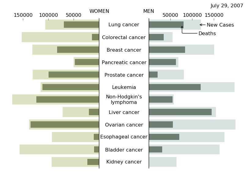
Here’s an example based off the horizontal bar charts in the gallery.
Pretty good, really!
More than just a starting point.
And here is a modified example a little closer visually
tornado chart example; inspired by
and sample code from Tony Yu
import numpy as np
import matplotlib.pyplot as plt
cancers = [
'Kidney cancer',

'Bladder cancer',

'Esophageal cancer',

'Ovarian cancer',

'Liver cancer',

"Non-Hodgkin's\nlymphoma",

'Leukemia',

'Prostate cancer',

'Pancreatic cancer',

'Breast cancer',

'Colorectal cancer',

'Lung cancer',

]
num_cancers = len(cancers)
generate some random data for the graphs (TODO; put real data here)
new_cases_men = np.random.uniform(low=20e3, high=200e3, size=num_cancers)
new_cases_women = np.random.uniform(low=20e3, high=200e3, size=num_cancers)
deaths_women = np.random.rand(num_cancers)*new_cases_women
deaths_men = np.random.rand(num_cancers)*new_cases_men
force these values where the labels happen to make sure they are
positioned nicely
new_cases_men[-1] = 120e3
new_cases_men[-2] = 55e3
deaths_men[-1] = 80e3
bars centered on the y axis
pos = np.arange(num_cancers) + .5
make the left and right axes for women and men
fig = plt.figure(facecolor=‘white’, edgecolor=‘none’)
ax_women = fig.add_axes([0.05, 0.1, 0.35, 0.8])
ax_men = fig.add_axes([0.6, 0.1, 0.35, 0.8])
ax_men.set_xticks(np.arange(50e3, 201e3, 50e3))
ax_women.set_xticks(np.arange(50e3, 201e3, 50e3))
turn off the axes spines except on the inside y-axis
for loc, spine in ax_women.spines.iteritems():
if loc!='right':

    spine.set_color('none') # don't draw spine
for loc, spine in ax_men.spines.iteritems():
if loc!='left':

    spine.set_color('none') # don't draw spine
just tick on the top
ax_women.xaxis.set_ticks_position(‘top’)
ax_men.xaxis.set_ticks_position(‘top’)
make the women’s graphs
ax_women.barh(pos, new_cases_women, align=‘center’,
facecolor=‘#DBE3C2’, edgecolor=‘None’)
ax_women.barh(pos, deaths_women, align=‘center’, facecolor=‘#7E895F’,
height=0.5, edgecolor=‘None’)
ax_women.set_yticks()
ax_women.invert_xaxis()
make the men’s graphs
ax_men.barh(pos, new_cases_men, align=‘center’, facecolor=‘#D8E2E1’,
edgecolor=‘None’)
ax_men.barh(pos, deaths_men, align=‘center’, facecolor=‘#6D7D72’,
height=0.5, edgecolor=‘None’)
ax_men.set_yticks()
we want the cancer labels to be centered in the fig coord system and
centered w/ respect to the bars so we use a custom transform
import matplotlib.transforms as transforms
transform = transforms.blended_transform_factory(
fig.transFigure, ax_men.transData)
for i, label in enumerate(cancers):
ax_men.text(0.5, i+0.5, label, ha='center', va='center',
transform=transform)
the axes titles are in axes coords, so x=0, y=1.025 is on the left
side of the axes, just above, x=1.0, y=1.025 is the right side of the
axes, just above
ax_men.set_title(‘MEN’, x=0.0, y=1.025, fontsize=12)
ax_women.set_title(‘WOMEN’, x=1.0, y=1.025, fontsize=12)
the fig suptile is in fig coords, so 0.98 is the far right; we right
align the text
fig.suptitle(‘July 29, 2007’, x=0.98, ha=‘right’)
now add the annotations
ax_men.annotate(‘New Cases’, xy=(0.95*new_cases_men[-1], num_cancers-0.5),
            xycoords='data',

            xytext=(20, 0), textcoords='offset points',

            size=12,

            va='center',

            arrowprops=dict(arrowstyle="->"),

            )
a curved arrow for the deaths annotation
ax_men.annotate(‘Deaths’, xy=(0.95*deaths_men[-1], num_cancers-0.5),
            xycoords='data',

            xytext=(40, -20), textcoords='offset points',

            size=12,

            va='center',

            arrowprops=dict(arrowstyle="->",
connectionstyle=“angle,angleA=0,angleB=90,rad=3”),
)
plt.show()