I am a student and I want to create a project in in which a different persons spending time on a particular table.
Kindly help me .
Hi @Suraj_Verma, what code have you already tried? This looks like something you can probably do using vlines:
import matplotlib.pyplot as plt
fig, ax = plt.subplots()
_ = ax.vlines(x=[1,1,2,3], ymin=[2,5,1,3], ymax=[4, 7, 4, 5])
where ymin is a list of bottoms of each line and ymax is a list of tops of each line.
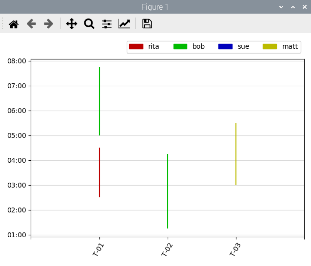
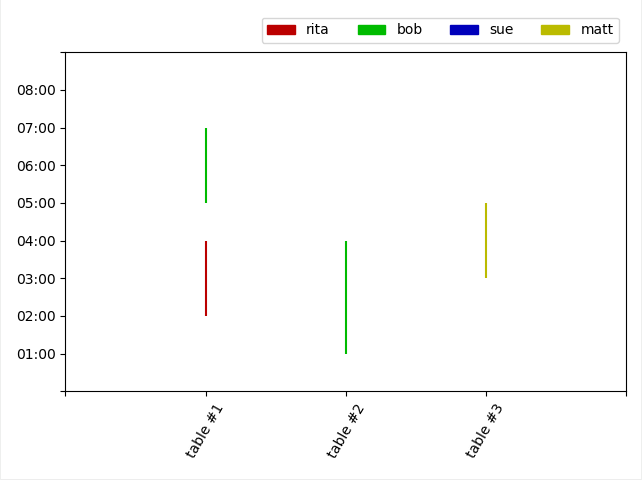
If the suggestion made by @story645 fits your needs, I wonder if you’d need to take this one step further and color-code the lines to represent the people assigned to each table. Here’s a little something I knocked up using the code provided by @story645 as a starting point. It shows the same person (“bob”) being assigned to different tables at different times.
Hope this helps
Laurence
import numpy as np
import matplotlib.pyplot as plt
import matplotlib.patches as mpatches

fig, ax = plt.subplots()

# define color codes and names for each person
color = ['#BB0000', '#00BB00', '#0000BB', '#BBBB00']
name = ['rita', 'bob', 'sue', 'matt']

# plot lines
_ = ax.vlines(x=[1,1,2,3], ymin=[2,5,1,3], ymax=[4, 7, 4, 5],
              colors=[color[0],color[1],color[1],color[3]])

# set x axis labelling, display at an angle (60 degrees)
_ = ax.set_xticks(np.arange(5))
_ = ax.set_xticklabels(['','T-01',' T-02','T-03',''],
                       rotation=60)

# set y axis labelling
_ = ax.set_yticks(np.arange(10))
_ = ax.set_yticklabels(['','01:00','02:00','03:00','04:00',
                        '05:00','06:00','07:00','08:00',''])

# create a legend
legend = [mpatches.Patch(color=p[1], label=f'{name[p[0]]}')
          for p in enumerate(color)]
_ = ax.legend(handles=legend, ncol=len(legend),
              bbox_to_anchor=(0, 1.02, 1, .102))

# required to fit rotated x labels
fig.tight_layout()
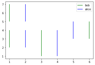
vlines takes a label argument, so you can also loop over/plot each person individually, which might be easier in terms of keeping track:
fig, ax = plt.subplots()
_ = ax.vlines(x=[1,1,3,6], ymin=[2,5,1,3], ymax=[4, 7, 4, 5],
                     color='green', label='bob')
_ = ax.vlines(x=[2,2,4,5], ymin=[2,5,1,3], ymax=[4, 7, 4, 5],
                     color='blue', label='alice')
_ = ax.legend()
1 Like
Ah yes. I like that way of structuring things. One set of vlines per person. Nice. ![]()
1 Like
Thank you @story645 and I love ur effort !!
1 Like
Thank you @laurence.molloy and I love ur effort !!
1 Like
Also the time stamps can be plotted directly rather than having to relabel, I just used integers because it was easier. What format is your data in?
Yah, I was trying but relabeling was quite complex and format of my data is str.
Not a Matplotlib trick as such but, if your timings are by the hour, you can use integers (1,2,3) or integer strings (‘1’,‘2’,‘3’) to represent hours in your input data and a single line of regular expression magic to map those to formatted time strings in your y axis labels, thus
1 / ‘1’ => 01:00
2 / ‘2’ => 02:00
etc…
So, using my previous code snippet, you simply change
# set y axis labelling
_ = ax.set_yticks(np.arange(10))
_ = ax.set_yticklabels(['','01:00','02:00','03:00','04:00',
                        '05:00','06:00','07:00','08:00',''])
to
# set y axis labelling
hours = np.arange(10)
_ = ax.set_yticks(hours)
_ = ax.set_yticklabels(re.sub('(\d+)',r'\1:00', str(i)) for i in hours)
1 Like
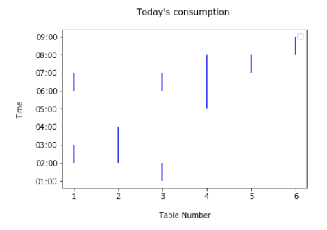
If your input data is of the format ‘02:00’ you can also do something similar prior to plotting to convert it to numerals:
# example data
start_times = ['02:00','05:00','01:00','03:00']
end_times = ['04:00','07:00','04:00','05:00']

# translate time strings to integer numerals
start_times = [int(re.sub('(:.*)$','', s)) for s in start_times]
end_times = [int(re.sub('(:.*)$','', s)) for s in end_times]

# plot lines
_ = ax.vlines(x=[1,1,2,3], ymin=start_times, ymax=end_times)
1 Like
Any chance you can provide the code you’re using, a small subset of the data, and what figure it’s generating? It’ll be a lot easier to provide suggestions with that information.
1 Like
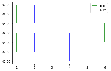
I think going in reverse and using a formatter might be less work. Particularly the FormatStrFormtter
Something like:
import matplotlib.pyplot as plt
import matplotlib.ticker as mticker

fig, ax = plt.subplots()
_ = ax.vlines(x=[1,1,3,6], ymin=[2,5,1,3], ymax=[4, 7, 4, 5], color='green', label='bob')
_ = ax.vlines(x=[2,2,4,5], ymin=[2,5,1,3], ymax=[4, 7, 4, 5], color='blue', label='alice')
_ = ax.yaxis.set_major_formatter(mticker.FormatStrFormatter('%02d:00'))
_ = ax.legend()
2 Likes
@Suraj_Verma You’re welcome. I learned one or two things myself as well.
@story645 nice solution. Matplotlib is full of surprises. I’ll need to read up on ticker formatters. ![]()
2 Likes
Here’s the Python 3 format string version that I couldn’t find the first time:
import matplotlib.pyplot as plt
import matplotlib.ticker as mticker

fig, ax = plt.subplots()
_ = ax.vlines(x=[1,1,3,6], ymin=[2,5,1,3], ymax=[4, 7, 4, 5], color='green', label='bob')
_ = ax.vlines(x=[2,2,4,5], ymin=[2,5,1,3], ymax=[4, 7, 4, 5], color='blue', label='alice')
_ = ax.yaxis.set_major_formatter(mticker.StrMethodFormatter('{x:02.0f}:00'))

_ = ax.legend()
Hey Everyone thanks for your efforts, and now I want to specify the the hours along with minutes , is it possible !
like somebody came at 06:30 but our graph shows that he/she came at 06:00.
Thanks in advance
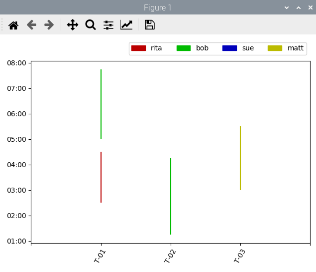
Quick answer, as I have to head out in a few minutes, but here’s a code snippet that shows how you can throw arbitrary times into the plot. Sorry, not in @story645’s one plot per person format as I’m in a hurry.
All it needs is feint major ticker horizontal grid lines, which I can find the code for when I’m back
Hope this helps
Laurence
import matplotlib.dates as mdates

fig, ax = plt.subplots()

# define color codes and names for each person
color = ['#BB0000', '#00BB00', '#0000BB', '#BBBB00']
name = ['rita', 'bob', 'sue', 'matt']

ymin = ['02:30', '05:00', '01:15', '03:00']
ymax = ['04:30', '07:45', '04:15', '05:30']

ymin = pd.to_datetime(ymin, format='%H:%M')
ymax = pd.to_datetime(ymax, format='%H:%M')

myFmt = mdates.DateFormatter('%H:%M')
ax.yaxis.set_major_formatter(myFmt)

# plot lines
_ = ax.vlines(x=[1,1,2,3], ymin=ymin, ymax=ymax,
              colors=[color[0],color[1],color[1],color[3]])
2 Likes