Daryl Herzmann, on 2011-01-21 16:41, wrote:
> I guess I'm not sure what you meant by the fonts looking 'nasty',
> so if font.size doesn't address your issue, could you post a
> small example that does the wrong thing, along with the type of
> output you were hoping to get.
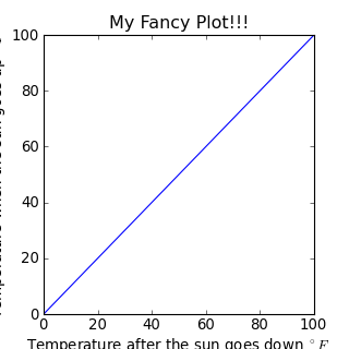
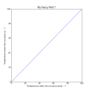
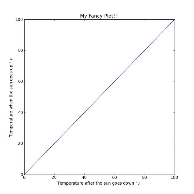
Thanks for the responses and sorry to not be clear. Here is an example script:
import matplotlib.pyplot as plt
fig = plt.figure(figsize=(8,8))
ax = fig.add_subplot(111)
ax.plot( [0,100], [0,100] )
ax.set_xlabel("Temperature after the sun goes down ^\{\\circ\}F")
ax.set_ylabel("Temperature when the sun goes up ^\{\\circ\}F")
ax.set_title("My Fancy Plot!!!")
fig.savefig('test.png', dpi=(40))
with 3 different outputs. First two numbers are figsize settings and
last is DPI.
In my perfect world, I would like to simple to this at the end of my script:
fig.savefig('thumbnail.png', .....)
fig.savefig('fullsize.png', ......)
and get two clean looking images. If I have to rerun the script with
different options to get a thumbnail and then a fullsize, that is okay
too. I just can't figure out what all needs to be tweeked / how to do
it..
Daryl,
ok, much clearer now - what you want is for your text to not be
cut-off the way it is in the 8x8 80dpi plot? In other words,
there's not enough space left in the figure for the axis labels
to be completely displayed.
At the moment, I don't think there's a simple way of doing it,
and the quick way I find myself doing is by adjusting the subplot
parameters using:
plt.subplots_adjust(left=..., bottom=...)
I'm almost certain that one *can* write a function to do this
pro grammatically (without having to hand tweak anything), by
looking at say, the .get_window_extent() but I haven't found the
time to scratch that itch, yet.
If someone wants to beat me to it, here's the sort of thing that
you can do:
def show_labels_by_shrinking(ax):
" adjust subplot parameters to fit the yaxis label"
f = ax.figure
textwidth = ax.yaxis.get_label().get_window_extent().width
labelwidth = max([lab.get_window_extent().width for lab in ax.get_yticklabels()])
plt.subplots_adjust(left=(textwidth+labelwidth+3*ax.yaxis.labelpad)/f.get_window_extent().width)
# the 3 *ax.yaxis.labelpad is just a fudge factor for now, need
# to look into the sourcecode to figure out what the
# appropriate placement is normally, to know how to adjust
# properly
ax.set_ylabel('foo')
show_labels_by_shrinking(ax)
ax.set_ylabel("a\nmulti\nline\nexample")
show_labels_by_shrinking(ax)
best,
···
On Fri, Jan 21, 2011 at 4:15 PM, Paul Ivanov <pivanov314@...287...> wrote:
--
Paul Ivanov
314 address only used for lists, off-list direct email at:
http://pirsquared.org | GPG/PGP key id: 0x0F3E28F7
 My question deals