Hi,
I have a strange (to me) problem with matplotlib version 0.91.2,
installed from source on a Debian Linux system.
I try to generate a plot which combines bitmap data (using "pcolor")
and some lines (using "plot") as in the appended script. I switch off
the coordinate axes using the command axis("off") and I try to set the
displayed coordinate range using the command
axis([x0-p, x1+p, y0-p, y1+p])
near the end of the script.
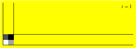
Problem: the output of this script, i.e. the file "out.eps" is
shifted. To me it seems that the PostScript bounding box is wrong.
Some things I noticed:
1) It seems that the pixel data from the pcolor command is centred in
the boundign box. If I plot the pcolor output at different locations,
the bounding box changes. This seems wrong to me, because I expect
the bounding box to be determined by the above axis command.
2) If I comment out the axis("off") command, the output is no longer
shifted and looks perfect, except that it now has the unwanted
coordinate axes.
3) If I output an .png file, using the Agg backend, the problem does
not appear. This does not help, since I need an .eps file.
My questions: What am I doing wrong? How do I get an unshifted .eps
file without coordinate axes? Any help would be very welcome.
Many thanks in advance,
Jochen
== script starts next line ===========================================
#! /usr/bin/env python
import matplotlib
matplotlib.use("PS")
from pylab import *
def create_hist():
X = array([-2.3, -2.0, -1.7 ])
Y = array([-0.3, -0.0, 0.3 ])
hist = array([[ 0.2, 0.4 ], [ 0.6, 0.8 ]])
return X, Y, hist
def generate_figure(fname, X, Y, hist, stamp=None):
width = 4.5
height = 1.6
margin = 0.05
padding = 0.05
x0 = -3.3
x1 = 4.0
q = (x1-x0)/(width - 2*margin - 2*padding)
y0 = -0.3
y1 = y0 + (height - 2*margin - 2*padding)*q
# create an appropriately sized figure
rc('text', usetex=True)
rc('font', family="serif", serif="Times", size=12.0)
rc('xtick', labelsize=12)
rc('ytick', labelsize=12)
rc('figure.subplot', left=margin/width)
rc('figure.subplot', right=(width-margin)/width)
rc('figure.subplot', bottom=margin/height)
rc('figure.subplot', top=(height-margin)/height)
fig = figure(figsize=(width, height))
ax = axes([margin/width, margin/height,
(width-2*margin)/width, (height-2*margin)/height])
p = q*padding
# plot the density data
mycmdata = {
'red': ((0., 1.0, 1.0), (0.01, 0.95, 0.95), (1.0, 0.0, 0.0)),
'green': ((0., 1.0, 1.0), (0.01, 0.95, 0.95), (1.0, 0.0, 0.0)),
'blue': ((0., 1.0, 1.0), (0.01, 0.95, 0.95), (1.0, 0.0, 0.0)),
}
mycm = matplotlib.colors.LinearSegmentedColormap('mycm', mycmdata)
pcolor(X, Y, hist, cmap=mycm, shading='flat')
# plot the corner
plot([x0, x0, x1], [y1, y0, y0], "k-")
plot([x0+0.6, x0+0.6, x1], [y1, y0+0.6, y0+0.6], "k-")
# place the stamp
if stamp is not None:
text(x1-p, y1-p, stamp, va='top', ha='right')
# save the result
axis([x0-p, x1+p, y0-p, y1+p])
axis("off")
savefig(fname, facecolor="yellow")
X, Y, hist = create_hist()
generate_figure("out.eps", X, Y, hist, "$t=1$")