Specific x-tick labels for imshow

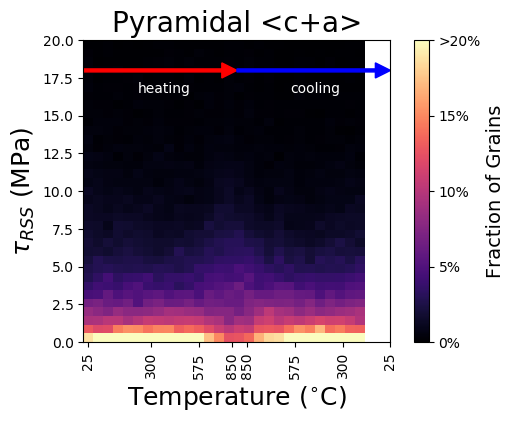
I have a graph that is going to end up looking similar to this, but my temperatures aren’t lined up with the columns on my imshow correctly.
image

I want the center of a column to line up with its correct temperature which it clearly isn’t since the 6th column should be centered around 304 degrees but is at less than 300.

My temperature array is:
[ 25. , 62.52286391, 122.37952437, 183.61504435,
244.48113027, 304.80871299, 365.24825121, 425.72150559,
486.9569831 , 548.13454015, 607.86124051, 668.032111 ,
729.37803655, 789.63400426, 849.11687814, 850.03927429,
848.76808144, 788.36272649, 727.82624368, 664.60197952,
604.50949699, 545.09418284, 483.03350855, 422.78616096,
363.54545748, 300.8530085 , 241.75252009, 180.85414054]

I think I either have to switch from using imshow or figure out how to get the temperatures into specific spots. Ideas?

Thanks for posting, can you please add your plotting code?

This is some of the code creating the data:

    hist_pyramidca = np.zeros([35,28])    
    for i in range(28):
        hist_pyramidca[:,i] = np.histogram(pyramidal_ca[i,:]/1e6,bins=35,range=[0,30])[0]/4788.

Here’s the plotting part of the code:

    extent = [30,2,0,30]
    x_label_list=['25', '300', '575', '850', '850', '575', '300', '25']

    fig4,ax4 = plt.subplots(1,1)
    img = plt.imshow(np.flipud(hist_pyramidca)*100,cmap='magma',extent=extent,vmin=0,vmax=20)
    ax4.arrow(30, 28, -13, 0, width = 0.2,head_width=2, head_length=2, fc='r', ec='r')
    ax4.arrow(15, 28, -13, 0, width = 0.2, head_width=2, head_length=2, fc='b', ec='b')
    ax4.set_xticks([0, 4.66, 9.33, 14, 16, 20.66, 25.33, 30])
    ax4.set_xticklabels(x_label_list,rotation=90)

    ax4.set_ylabel(r'$\tau_{RSS}$ (MPa)',FontSize=18)
    plt.xlabel('Temperature ($^{\circ}$C)',FontSize=18)

    plt.text(22.5,26,'heating',color='w',horizontalalignment='center')
    plt.text(7.5,26,'cooling',color='w',horizontalalignment='center')

    cbar = plt.colorbar()
    cbar.set_ticks([0,5,10,15,20])
    cbar.ax.set_yticklabels(['0%', '5%', '10%', '15%', '20%'])
    cbar.set_label('Fraction of Grains', FontSize=14)

    plt.title('Pyramidal <c+a>',FontSize=20)

The extent is the location of the corners of the image (not the location of the centers of the edge pixels in the image). I suspect you want to add +/-0.5 to the values in your extent.

https://matplotlib.org/tutorials/intermediate/imshow_extent.html may be of use.

I actually did try that yesterday. However, I ended up with this which, if you look at my temperature array, the 6th value should be about 304, yet my plot has it as below 300 still

image

With matplotlib version 3.1.2, I tried reproducing this with some synthetic data & a stripped down version of your code & I’m wondering if there’s some misalignment going on between your raw data and the histogram?
index

here’s my code:

hist_pyramidca = np.random.randint(0,20, size=(35,28))/100

extent = [30,2,0,30]
x_label_list=['25', '300', '575', '850', '850', '575', '300', '25']

fig4,ax4 = plt.subplots(1,1)
img = ax4.imshow(np.flipud(hist_pyramidca)*100,cmap='magma',
                 extent=extent,vmin=0,vmax=20)

ax4.set_xticks([0, 4.66, 9.33, 14, 16, 20.66, 25.33, 30])
ax4.tick_params()
ax4.set_xticklabels(x_label_list,rotation=90)
ax4.set_ylabel(r'$\tau_{RSS}$ (MPa)',FontSize=18)
cbar =  fig4.colorbar(img, ax=ax4)

I don’t understand where “30” is coming from in your list of ticks. You have 28 columns, so at most 29 edges, which will go from 0,1,…28 Your plot is plotting correctly.