Hi all,
I have a code base so that:
from pylab import *
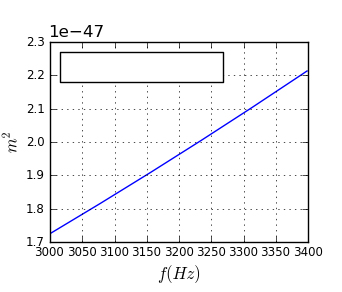
x = arange (3000,3400)
y = -108 * (3.0e14 ** 2)/x**2
pylab…title(“Teste”)
pylab.savefig(“imagem.png”)
plot(x, y)
Well… the values of the function range(3000,3400) are in Hz…i need to pass GHz which would be in scientific notation as follows bellow:
3000 Hz = 3,0 × 10⁻⁶ GHz
3400 Hz = 3,4 x 10⁻⁶ Ghz
How do I make the graph x-axis is shown in figures
scientific notation, for this currently so
3000,3050,3100,…,3400
in scientific notation is: (3.0e-6, 3.4e-6)
Can someone help me?
See my attachment…
I need to show this values in scientific notation…
Waléria
Waleria,
I believe you are looking to use the ticker API. Particularly the FormatStrFormatter that accepts a sprintf()-like format string to express your tick values. For your particular example, --off the top of my head-- the string format would be “%.1e”.
http://matplotlib.sourceforge.net/api/ticker_api.html
I hope this helps.
Ben Root
···
On Thu, Jul 15, 2010 at 8:41 AM, Waléria Antunes David <waleriantunes@…287…> wrote:
Hi all,
I have a code base so that:
from pylab import *
x = arange (3000,3400)
y = -108 * (3.0e14 ** 2)/x**2
pylab…title(“Teste”)
pylab.savefig(“imagem.png”)
plot(x, y)
Well… the values of the function range(3000,3400) are in Hz…i need to pass GHz which would be in scientific notation as follows bellow:
3000 Hz = 3,0 × 10⁻⁶ GHz
3400 Hz = 3,4 x 10⁻⁶ Ghz
How do I make the graph x-axis is shown in figures
scientific notation, for this currently so
3000,3050,3100,…,3400
in scientific notation is: (3.0e-6, 3.4e-6)
Can someone help me?
See my attachment…
I need to show this values in scientific notation…
Waléria
But, i don’t know how do…
I tried, but don’t, most failed…
···
On Thu, Jul 15, 2010 at 11:25 AM, Benjamin Root <ben.root@…1304…> wrote:
On Thu, Jul 15, 2010 at 8:41 AM, Waléria Antunes David <waleriantunes@…287…> wrote:
Hi all,
I have a code base so that:
from pylab import *
x = arange (3000,3400)
y = -108 * (3.0e14 ** 2)/x**2
pylab…title(“Teste”)
pylab.savefig(“imagem.png”)
plot(x, y)
Well… the values of the function range(3000,3400) are in Hz…i need to pass GHz which would be in scientific notation as follows bellow:
3000 Hz = 3,0 × 10⁻⁶ GHz
3400 Hz = 3,4 x 10⁻⁶ Ghz
How do I make the graph x-axis is shown in figures
scientific notation, for this currently so
3000,3050,3100,…,3400
in scientific notation is: (3.0e-6, 3.4e-6)
Can someone help me?
See my attachment…
I need to show this values in scientific notation…
Waléria
Waleria,
I believe you are looking to use the ticker API. Particularly the FormatStrFormatter that accepts a sprintf()-like format string to express your tick values. For your particular example, --off the top of my head-- the string format would be “%.1e”.
http://matplotlib.sourceforge.net/api/ticker_api.html
I hope this helps.
Ben Root
One way is to just change the values in the GHz and plot them:
plot(x/1e9, y)
# Need to change some limits so that they show up in scientific notation:
gca().xaxis.get_major_formatter().set_powerlimits((-5,5))
The other way is make a custom formatter that changes the values of the ticks:
def fmt_ghz(val, pos=None):
return '%g' % (val / 1e9)
plot(x, y)
gca().xaxis.set_major_formatter(FuncFormatter(fmt_ghz))
You can get more information here:
http://matplotlib.sourceforge.net/api/ticker_api.html
Ryan
···
On Thu, Jul 15, 2010 at 8:41 AM, Waléria Antunes David <[email protected]...> wrote:
Hi all,
I have a code base so that:
from pylab import *
x = arange (3000,3400)
y = -108 * (3.0e14 ** 2)/x**2
pylab..title("Teste")
pylab.savefig("imagem.png")
plot(x, y)
Well.... the values of the function range(3000,3400) are in Hz......i need
to pass GHz which would be in scientific notation as follows bellow:
3000 Hz = 3,0 × 10⁻⁶ GHz
3400 Hz = 3,4 x 10⁻⁶ Ghz
How do I make the graph x-axis is shown in figures
scientific notation, for this currently so
3000,3050,3100,....,3400
in scientific notation is: (3.0e-6, 3.4e-6)
--
Ryan May
Graduate Research Assistant
School of Meteorology
University of Oklahoma
Hi…
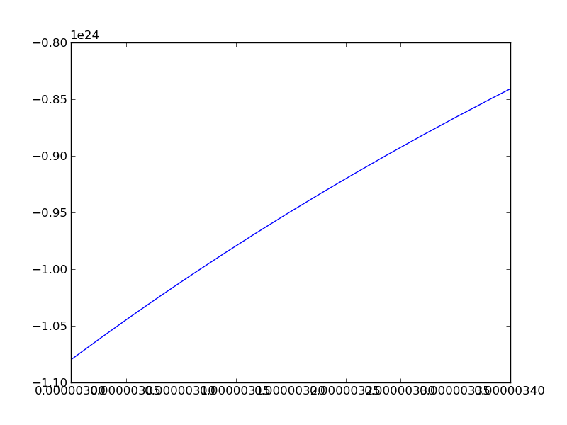
I tried the first option, but failed… see my image attached
And the second option, i don’t understand the variable ‘val’
…?
···
On Thu, Jul 15, 2010 at 3:22 PM, Ryan May <rmay31@…287…> wrote:
On Thu, Jul 15, 2010 at 8:41 AM, Waléria Antunes David > > <waleriantunes@…287…> wrote:
Hi all,
I have a code base so that:
from pylab import *
x = arange (3000,3400)
y = -108 * (3.0e14 ** 2)/x**2
pylab…title(“Teste”)
pylab.savefig(“imagem.png”)
plot(x, y)
Well… the values of the function range(3000,3400) are in Hz…i need
to pass GHz which would be in scientific notation as follows bellow:
3000 Hz = 3,0 × 10⁻⁶ GHz
3400 Hz = 3,4 x 10⁻⁶ Ghz
How do I make the graph x-axis is shown in figures
scientific notation, for this currently so
3000,3050,3100,…,3400
in scientific notation is: (3.0e-6, 3.4e-6)
One way is to just change the values in the GHz and plot them:
plot(x/1e9, y)
Need to change some limits so that they show up in scientific notation:
gca().xaxis.get_major_formatter().set_powerlimits((-5,5))
The other way is make a custom formatter that changes the values of the ticks:
def fmt_ghz(val, pos=None):
return '%g' % (val / 1e9)
plot(x, y)
gca().xaxis.set_major_formatter(FuncFormatter(fmt_ghz))
You can get more information here:
http://matplotlib.sourceforge.net/api/ticker_api.html
Ryan
–
Ryan May
Graduate Research Assistant
School of Meteorology
University of Oklahoma
I forgot of the my image.
···
On Fri, Jul 16, 2010 at 9:10 AM, Waléria Antunes David <waleriantunes@…287…> wrote:
Hi…
I tried the first option, but failed… see my image attached
And the second option, i don’t understand the variable ‘val’
…?
On Thu, Jul 15, 2010 at 3:22 PM, Ryan May <rmay31@…287…> wrote:
On Thu, Jul 15, 2010 at 8:41 AM, Waléria Antunes David > > > > <waleriantunes@…287…> wrote:
Hi all,
I have a code base so that:
from pylab import *
x = arange (3000,3400)
y = -108 * (3.0e14 ** 2)/x**2
pylab…title(“Teste”)
pylab.savefig(“imagem.png”)
plot(x, y)
Well… the values of the function range(3000,3400) are in Hz…i need
to pass GHz which would be in scientific notation as follows bellow:
3000 Hz = 3,0 × 10⁻⁶ GHz
3400 Hz = 3,4 x 10⁻⁶ Ghz
How do I make the graph x-axis is shown in figures
scientific notation, for this currently so
3000,3050,3100,…,3400
in scientific notation is: (3.0e-6, 3.4e-6)
One way is to just change the values in the GHz and plot them:
plot(x/1e9, y)
Need to change some limits so that they show up in scientific notation:
gca().xaxis.get_major_formatter().set_powerlimits((-5,5))
The other way is make a custom formatter that changes the values of the ticks:
def fmt_ghz(val, pos=None):
return '%g' % (val / 1e9)
plot(x, y)
gca().xaxis.set_major_formatter(FuncFormatter(fmt_ghz))
You can get more information here:
http://matplotlib.sourceforge.net/api/ticker_api.html
Ryan
–
Ryan May
Graduate Research Assistant
School of Meteorology
University of Oklahoma
Please attach the code you used to generate this image.
Ben Root
···
On Fri, Jul 16, 2010 at 7:11 AM, Waléria Antunes David <waleriantunes@…287…> wrote:
I forgot of the my image.
On Fri, Jul 16, 2010 at 9:10 AM, Waléria Antunes David <waleriantunes@…287…> wrote:
Hi…
I tried the first option, but failed… see my image attached
And the second option, i don’t understand the variable ‘val’
…?
On Thu, Jul 15, 2010 at 3:22 PM, Ryan May <rmay31@…287…> wrote:
On Thu, Jul 15, 2010 at 8:41 AM, Waléria Antunes David > > > > > > <waleriantunes@…287…> wrote:
Hi all,
I have a code base so that:
from pylab import *
x = arange (3000,3400)
y = -108 * (3.0e14 ** 2)/x**2
pylab…title(“Teste”)
pylab.savefig(“imagem.png”)
plot(x, y)
Well… the values of the function range(3000,3400) are in Hz…i need
to pass GHz which would be in scientific notation as follows bellow:
3000 Hz = 3,0 × 10⁻⁶ GHz
3400 Hz = 3,4 x 10⁻⁶ Ghz
How do I make the graph x-axis is shown in figures
scientific notation, for this currently so
3000,3050,3100,…,3400
in scientific notation is: (3.0e-6, 3.4e-6)
One way is to just change the values in the GHz and plot them:
plot(x/1e9, y)
Need to change some limits so that they show up in scientific notation:
gca().xaxis.get_major_formatter().set_powerlimits((-5,5))
The other way is make a custom formatter that changes the values of the ticks:
def fmt_ghz(val, pos=None):
return '%g' % (val / 1e9)
plot(x, y)
gca().xaxis.set_major_formatter(FuncFormatter(fmt_ghz))
You can get more information here:
http://matplotlib.sourceforge.net/api/ticker_api.html
Ryan
–
Ryan May
Graduate Research Assistant
School of Meteorology
University of Oklahoma
This SF.net email is sponsored by Sprint
What will you do first with EVO, the first 4G phone?
Visit sprint.com/first – http://p.sf.net/sfu/sprint-com-first
Matplotlib-users mailing list
[email protected]
https://lists.sourceforge.net/lists/listinfo/matplotlib-users
2010/7/15 Waléria Antunes David <[email protected]...>:
But, i don't know how do...
I tried, but don't, most failed....
Maybe this is something in the direction you want? You have to adapt
the test file.
Friedrich
embedded_sci_formatter.py (794 Bytes)
test.py (440 Bytes)