Hi there,
the attached figure shows a scatterplot, where the colors indicate the
density of measurement points.
Is there any way to do this with matplotlib?
Thanks for your insight,
Andreas.
Hi there,
the attached figure shows a scatterplot, where the colors indicate the
density of measurement points.
Is there any way to do this with matplotlib?
Thanks for your insight,
Andreas.
Andreas,
Check out hexbin(), it is the easiest way to do what you want.
Ben Root
On Fri, May 21, 2010 at 2:52 PM, Andreas Hilboll <lists@…3067…> wrote:
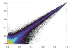
Hi there,
the attached figure shows a scatterplot, where the colors indicate the
density of measurement points.
Is there any way to do this with matplotlib?
Thanks for your insight,
Andreas.
Matplotlib-users mailing list
Matplotlib-users@lists.sourceforge.net
https://lists.sourceforge.net/lists/listinfo/matplotlib-users