Dear developers,
I use Matplotlib to process and display images acquired by microscopes.
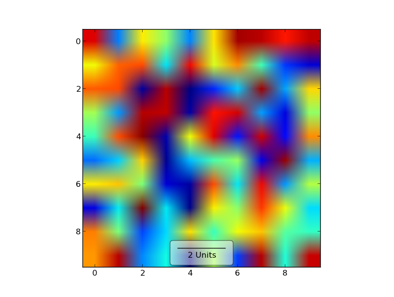
It is quite common to indicate dimensions by displaying scale bar in the
image rather than using axes with labels. Although axes enable you to
refer to specific location in the image, they take up space around the
image, so if you only need to show the scale, scale bar is better.
What is needed:
- The scale bar of given dimension (data units), possibly with bars at
its ends.
- Text (presumably centered under the bar), text size as well as
vertical offset in physical units (= units reflecting the actual image
size, like the font size)
- Semi-transparent rectangle, so the scale and label are more readable
- Dark/bright theme might be a good idea.
I have made an svg file in Inkscape, so you can see what I mean.
First of all, I tried to implement the stuff myself, but later I have
found out that there is something on github. I have forked it, made some
minor modifications, and I think that it is "almost done".
matplotlib: add scale bars to axes - enhanced · GitHub (the add_scalebar function there is
broken ATM)
I also attach the test code for your convenience. You need to run it
with scalebars.py in the same directory.
You are supposed to see a tiny bright scalebar at the bottom right
corner.
There are some outstanding issues, though:
- I have a feeling that bars at the end of the scale bar should be
related to the font size, as well as the actual width of the scale bar.
How to achieve this?
- How to make the semi-transparent background for the bar and label in
a smart way?
Could you help me with those? I would like this to appear in matplotlib
since it is IMO a useful feature, what needs to be done?
Regards,
Matěj Týč
sbars-test.py (296 Bytes)