There may be a better way to do this, but you can manually set xlim, xticks and xticklabels to cover the entire data range. Use ax.legend() and ax2.legend() to show both legends. Use set_ylim and get_ylim to set both y axes to the same scale.
import numpy as np
import pandas as pd
import matplotlib.pyplot as plt
cl1='red'
cl2='blue'
cl3='grey'
df1 = pd.DataFrame(data=np.random.standard_normal(31),
columns=['df1'],
index=pd.date_range('2020-01-01', '2020-01-01 00:30', freq='T'))
df2 = pd.DataFrame(data=np.random.standard_normal(61) * 4,
columns=['df2'],
index=pd.date_range('2020-01-01', '2020-01-01 01', freq='T'))
fig, ax = plt.subplots(1, 1, figsize=(16, 9), dpi=90,
tight_layout=True)
df1.plot(ax=ax, color=cl1)
ax.set_xlabel('time', color=cl3, fontsize=20)
ax.tick_params(axis='x', rotation=0, labelcolor=cl3, labelsize=12)
ax.set_ylabel('SEND', color=cl1, fontsize=20)
ax.tick_params(axis='y', rotation=0, labelcolor=cl1)
ax.grid(alpha=.4)
ax.set_title('Title', color=cl3)
ax2 = ax.twinx()
ax2.tick_params(axis='x', rotation=0, labelcolor=cl3, labelsize=12)
df2.plot(ax=ax2, color=cl2)
ax2.set_ylabel('RECV', color=cl2, fontsize=20)
ax2.tick_params(axis='y', labelcolor=cl2)
# pandas sets the label to the column name so set labels here
ax.legend(loc='upper left', labels=['leftfilter'])
ax2.legend(loc='upper right', labels=['rightreceived'])
# set x ticks and tick labels. Use start, end and freq values
# valid for your data
tiks = pd.date_range(start=df1.index.min(),
end=df2.index.max(),
freq='5T')
ax.set_xlim(tiks[0], tiks[-1])
ax.set_xticks(tiks);
ax.set_xticklabels(tiks.time)
# set left y limits to the right y limit values that were automatically
# set by df2.plot(). could also set both ax and ax2 y limits to the same
# values you choose
ax.set_ylim(ax2.get_ylim());
# ylimits = [0, 20]
# ax.set_ylim(ylimits)
# ax2.set_ylim(ylimits)
···
On Mar 25, 2020, at 7:05 AM, Duncan Kerr <[email protected]> wrote:
I have a couple of issues, trying to plot two y axes. How do I
make grid cover whole area of plot
make xaxis labels go all way to right
make both y axes use same scale
get a legend for both plots onto the graph.
my graph and code are as follows:
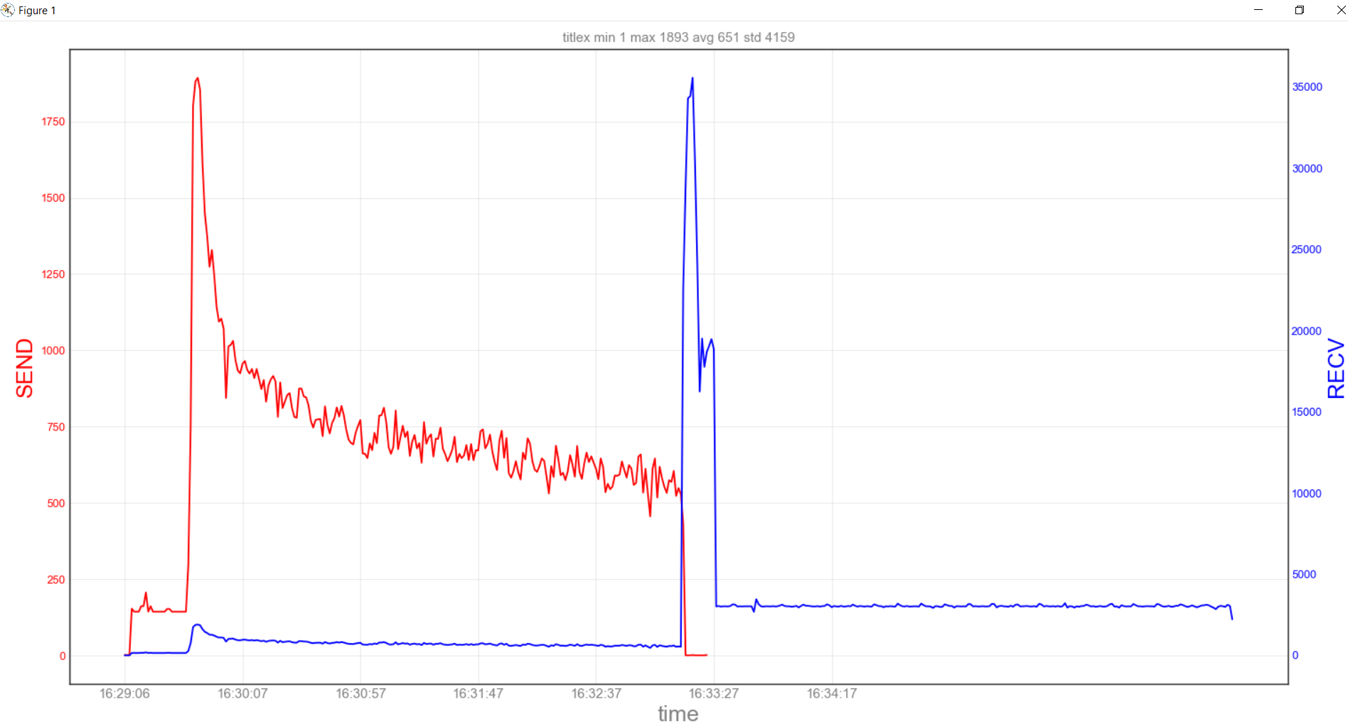
<decchfafllgghohe.png>
#!c:/python/python
import
sys
import numpy as
np
import pandas as
pd
import matplotlib as
mpl
import matplotlib.pyplot as
plt
import seaborn as
sns
import
warnings;
warnings.filterwarnings(
action='once'
)
plt.style.use(
'seaborn-whitegrid'
)
sns.set_style(
"white"
)
cl1=
'red'
cl2=
'blue'
cl3=
'grey'
print("expected title filter1 filter3 file1 file2"
)
print("called with "+sys.argv[1]+","+sys.argv[2]+","+sys.argv[3]+","+sys.argv[4
])
# Version
print(mpl.__version__)
# > 3.0.0
print(sns.__version__)
# > 0.9.0
# Import Data
dfr = pd.read_csv(sys.argv[4
])
dfs = pd.read_csv(sys.argv[
5
])
xyr = dfr.groupby([
'c1']).count()['c2'
]
xys = dfs.groupby([
'c1']).count()['c2'
]
fig, ax = plt.subplots(
1, 1, figsize=(16, 9), dpi=90
)
# print data for plots
print(dfr.groupby('c1'
).count())
dfr.groupby([
'c1']).count()['c2'].plot(ax=ax,color=cl1, label='leftfilter'
)
# Decorations
# ax1 (left Y axis)
ax.set_xlabel('time', color=cl3, fontsize=20
)
ax.tick_params(
axis='x', rotation=0, labelcolor=cl3, labelsize=12
)
ax.set_ylabel(sys.argv[
2], color=cl1, fontsize=20
)
ax.tick_params(
axis='y', rotation=0, labelcolor
=cl1)
ax.grid(
alpha=.4
)
s =
"%s min %d max %d avg %d std %d"
% (
sys.argv[
1], dfr.groupby('c1').count().min()['c2'], dfr.groupby('c1').count().max()['c2'
],
dfr.groupby(
'c1').count().mean()['c2'], dfs.groupby('c1').count().std()['c2'
])
ax.set_title(s,
color
=cl3)
# ax2 (right Y axis)
ax2 = ax.twinx()
# instantiate a second axes that shares the same x-axis
ax2.tick_params(axis='x', rotation=0, labelcolor=cl3, labelsize=12
)
dfs.groupby([
'c1']).count()['c2'].plot(ax=ax2, color
=cl2)
ax2.set_ylabel(sys.argv[
3], color=cl2, fontsize=20
)
ax2.tick_params(
axis='y', labelcolor
=cl2)
fig.tight_layout()
# place legend in good spot
#plt.legend(loc=0)
plt.show()
_______________________________________________
Matplotlib-users mailing list
[email protected]
Matplotlib-users Info Page
_______________________________________________
Matplotlib-users mailing list
[email protected]
https://mail.python.org/mailman/listinfo/matplotlib-users