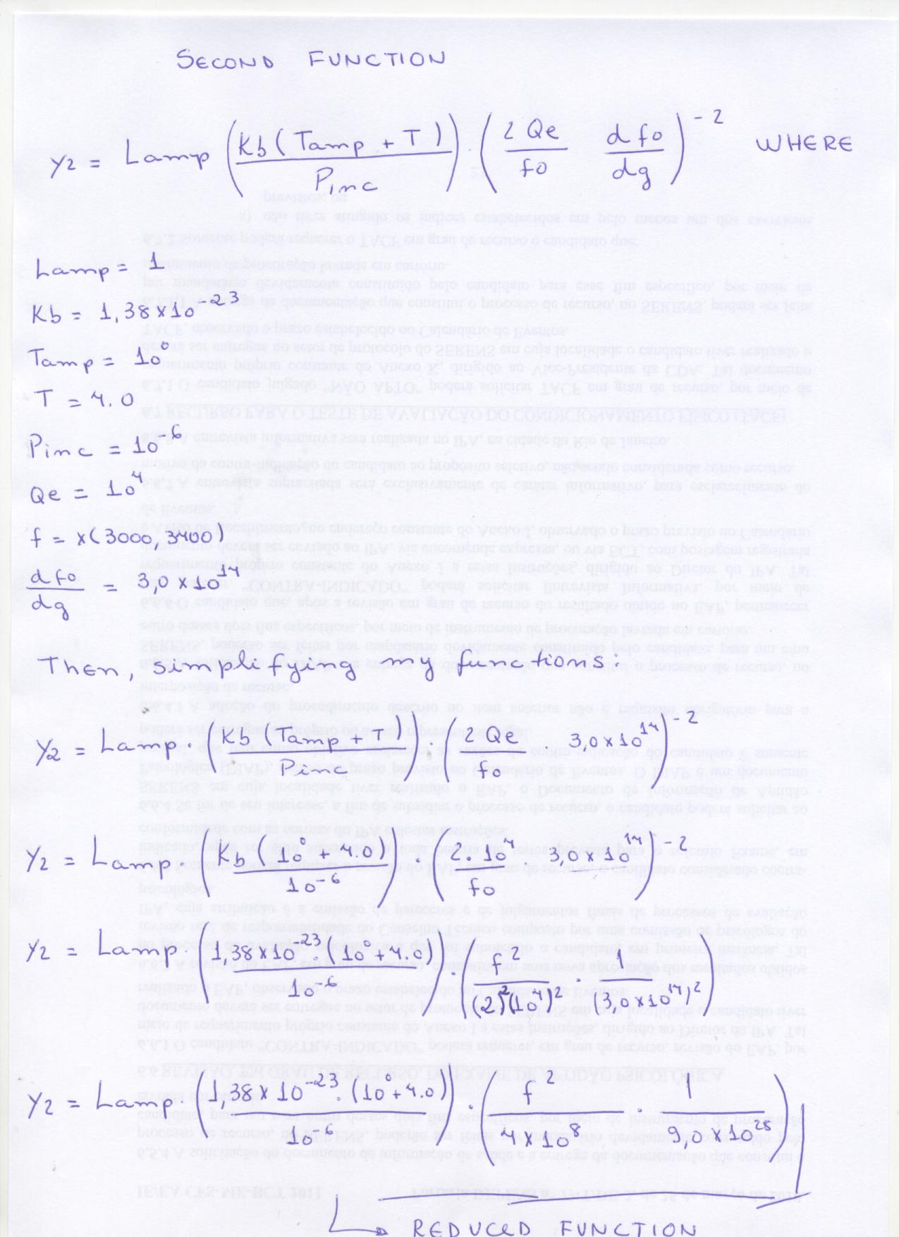
Hello!!!
My name is Waleria. I
work at INPE in Sao Jose dos Campos, Brazil. And I’d like to make a question. I’m in trouble to generate a two functions graph.
I have a problem to generate a graph of the two functions. I have this functions, is bellow:
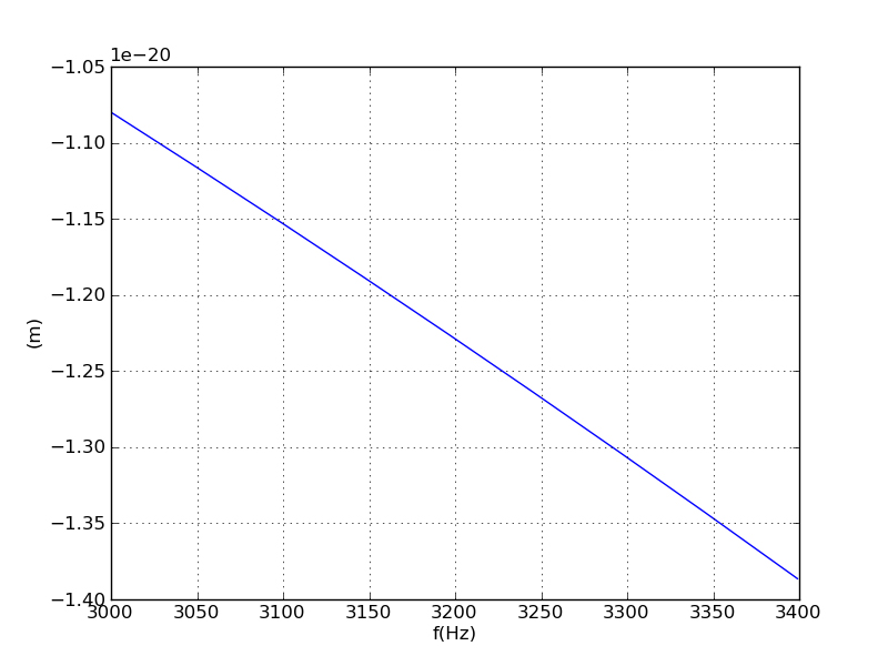
__y1 = -108*(x**2)/(3e14**2)__
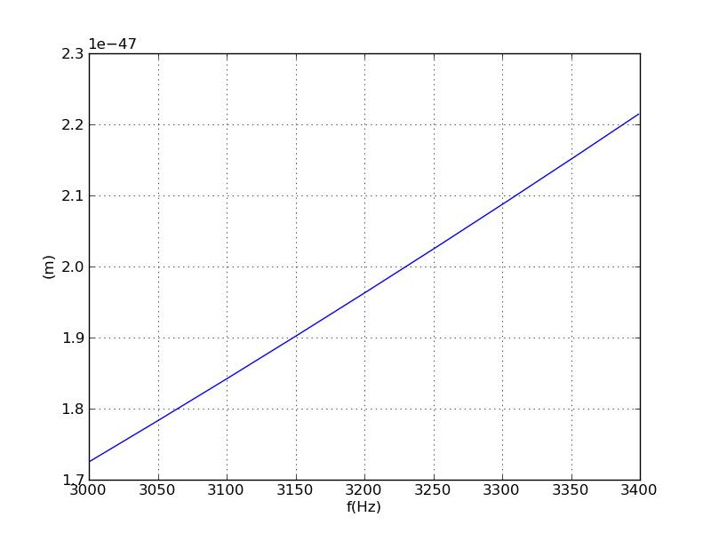
__y2 = 1*((1.38e-23*(1e0+4)/1e-6)*((x**2)/4*(1e4**2)*(3e14**2))))__
However, i need to plot a graph these two functions, the first function is decrescent an the second is crescent. I made some tests that cite below:
1 - I plotted only function at a time and the result was, the result of the first test is attached;
2- Then, I see the example below: [http://matplotlib.sourceforge.net/examples/pylab_examples/set_and_get.html](http://matplotlib.sourceforge.net/examples/pylab_examples/set_and_get.html)
So, I made a change in the example over, I changed the functions in the example and added my functions as falows below:
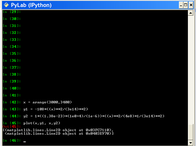
__from pylab import *
x = arange(3000,3400)
y1 = -108*(x**2)/(3e14**2)
y2 = 1*((1.38e-23*(1e0+4)/1e-6)*((x**2)/4*(1e4**2)*(3e14**2)))
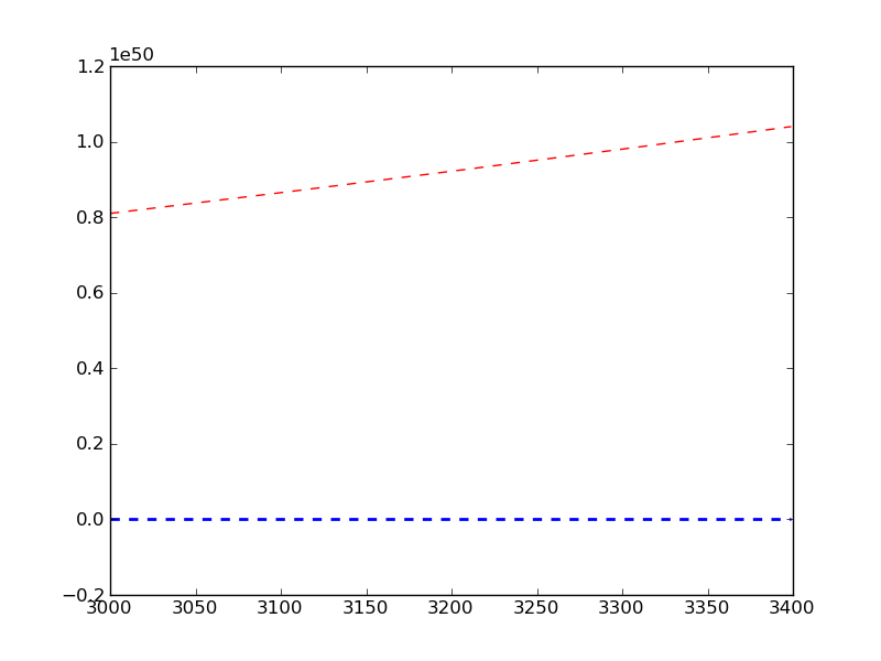
lines = plot(x, y1, x, y2)__
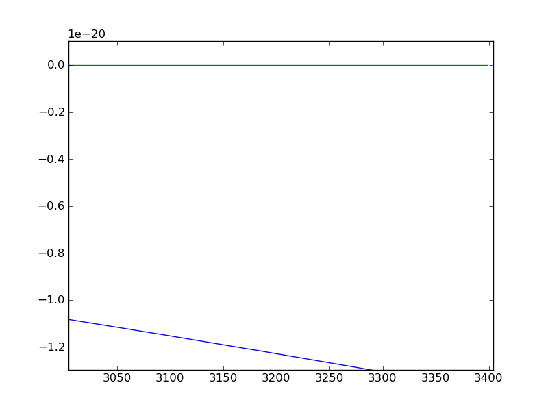
However, the result in my opinion is incorrect, because the first function is decrescent and second is crescent, see the result of second test, is attached.
As can see in the image, first appers a continuous line and to ber a constant function should be of the type y=x for the example, the second function is crescent, ou seja, the first function is incorrect, i gave a print in the
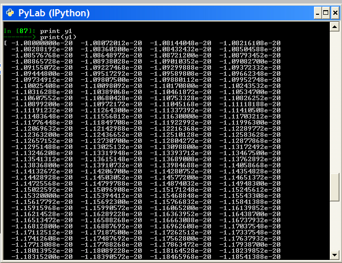
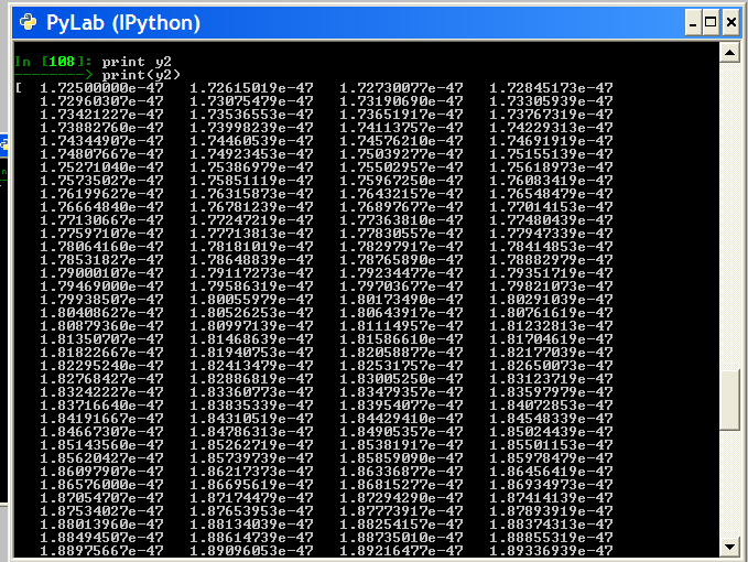
functions y1 and y2, the output values are correct, for function y1 the values are always decrescent and function(negative values) and for y2 the values are crescent ( positive values).
As you
can see in the image first appears a continuous line, and to be a
constant function should be of the type y = x for example, the second
function is increasing, ie, the first function is being displayed
incorrectly.
Already relize tests using GNUPLOT and the results is equal to the tests over.
I would like to thank your support.
Best regards