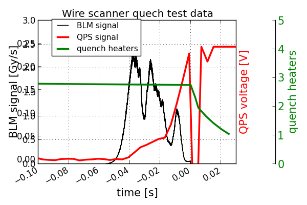
Hi, I’m trying to get a plot with multiple axes on the righ, and it does not work. Attached is the plot: the second axis (ax2) is not correctly plotted. The code is below. What is wrong? Why the labels and ticks are displayed on the left axis?
Many thanks for your suggestions,
Claude
import numpy
import pylab
function needed:
def make_patch_spines_invisible(ax):
ax.set_frame_on(True)
ax.patch.set_visible(False)
for sp in ax.spines.itervalues():
sp.set_visible(False)
lists:
timeBLM=[]
sigBLM=[]
timeQPS=[]
sigQPS=[]
file to open:
file = open(“WSQT_PMdata.csv”,“r”)
for line in file:
tokens=line.split()
i=len(tokens)
timeBLM.append(float(tokens[0]))
sigBLM.append(float(tokens[1]))
if i==4:
timeQPS.append(float(tokens[2]))
sigQPS.append(float(tokens[3]))
file.close()
convert lists to numpy arrays:
NtimeQPS = numpy.array(timeQPS)
NsigQPS = numpy.array(sigQPS)
NtimeBLM = numpy.array(timeBLM)
NsigBLM = numpy.array(sigBLM)
#now also QPS heaters:
timeHeaters=numpy.array([-0.56, 0, 0.003, 0.005, 0.01, 0.015, 0.02, 0.025])
sigHeaters=numpy.array([2.999,2.753,2.316,1.960,1.667,1.422,1.218,1.047])
B data:
fig = pylab.figure(1,figsize=(8,6))
pylab.grid(True)
pylab.title(“Wire scanner quech test data”)
fig.autofmt_xdate()
fig.subplots_adjust(right=0.77)
ax1 = fig.add_subplot(111)
ax1.set_xlabel(“time [s]”,fontsize=15)
ax1.set_ylabel(“BLM signal [Gy/s]”,fontsize=15)
ax1.set_xlim([-0.1,0.027])
ax1.set_ylim([0.,3.]);
ax1.plot(NtimeBLM,NsigBLM,‘black’,label=‘BLM signal’)
Q signal axis:
ax2 = ax1.twinx()
ax2.set_ylabel(“QPS voltage [V]”,fontsize=15,color = ‘red’)
ax2.set_xlim([-0.1,0.027])
ax2.set_ylim([-0.01,0.3])
for tl2 in ax2.get_yticklabels():
tl2.set_color(‘red’)
tl2.set_fontsize(15)
ax2.plot(NtimeQPS,NsigQPS,color=‘red’,lw=2.5,label = ‘QPS signal’)
Q heaters:
ax3 = ax2.twinx()
make_patch_spines_invisible(ax3)
ax3.spines[“right”].set_position((“axes”, 1.2))
ax3.spines[“right”].set_visible(True)
ax3.set_ylabel(“quench heaters”, fontsize=15, color = ‘green’)
ax3.set_xlim([-0.1,0.03])
ax3.set_ylim([0.,5.])
ax3.set_color(‘green’)
for tl in ax3.get_yticklabels():
tl.set_color(‘green’)
tl.set_fontsize(15)
ax3.plot(timeHeaters,sigHeaters,color = ‘green’,lw=2.5,label = ‘quench heaters’)
check object ID
print ‘idax1=’,id(ax1)
print ‘idax2=’,id(ax2)
print ‘idax3=’,id(ax3)
handles1, labels1 = ax1.get_legend_handles_labels()
handles2, labels2 = ax2.get_legend_handles_labels()
handles3, labels3 = ax3.get_legend_handles_labels()
ax1.legend(handles1+handles2+handles3, labels1+labels2+labels3,loc =(0.07,0.75),prop={‘size’:11}, shadow = False)
show plot on the screen:
pylab.show()