'''Hi,
I use the following program in a simulation class to demonstrate the
niftyness of matplotlib. The combination of Python, Numeric, and matplotlib
really makes a great set of tools for biologists who are largely
non-programmers these days. Thanks.
I just did a big upgrade from 0.6-before pylab to 0.80. This is the only
tested program that didn't produce the same results before and after:
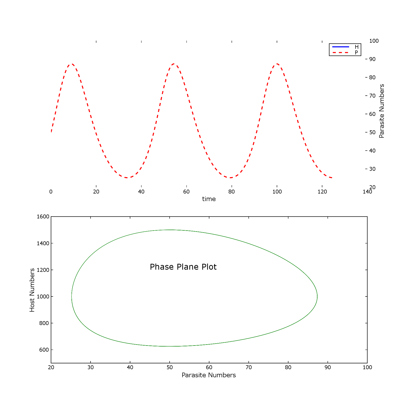
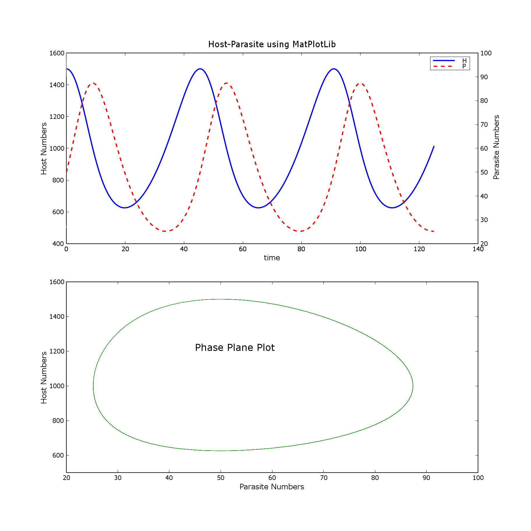
Attached are matlab and pylab png files.
Is there another way of doing this that gets back to the original output?
Also, is it just my imagination, or does 0.8 take longer to display graphs
than previous versions. I haven't done any formal timing, but the delay
seems longer.
Thanks,
Wendell Cropper '''
from pylab import *
r = 0.1
g = 0.002
h = 0.0002
m = 0.2
def derivs(x, t):
d1dt = r* x[0] - g * x[0] * x[1] # host
d2dt = h * x[0] * x[1] - m * x[1] #parasite
return (d1dt, d2dt)
dt = 0.01 #delta t
tim = arange(0.0, 125.0, dt)
x0 = (1500.0, 50.0) #initial numbers of host, parasite
xint = rk4(derivs, x0, tim) #Runge-Kutta 4th order numerical integration
#print xint[0]
#print xint[1]
host, parasite = [[x[0] for x in xint], [x[1] for x in xint]] #extract
variables
figure(1, [11.0, 11.0]) #size of window
ax1 = subplot(211)
title('Host-Parasite using MatPlotLib')
L1 = plot(tim, host, 'b', linewidth=2)
plot ([0.0, 0.1], [500.0, 510.0], 'w')
ax1.yaxis.tick_left()
ylabel('Host Numbers')
ax2 = subplot(211, frameon = False)
ax2.yaxis.tick_right()
text (145.0, 47.0, 'Parasite Numbers', rotation = 'vertical')
xlabel('time')
L2 = plot(tim, parasite, 'r--', linewidth=2)
plot ([0.0, 0.1], [90.0, 100.0], 'w')
legend((L1, L2), ('H', 'P'))
subplot(212)
plot(parasite, host, 'g')
axis([20.0, 100.0, 500.0, 1600.0]) #min x, max x, min y, max y
xlabel('Parasite Numbers')
ylabel('Host Numbers')
text (45.0, 1200.0, 'Phase Plane Plot', fontsize = 16)
show()