Possible to get four y axes on a single plot?

I'd like to create a plot showing motor current, efficiency, speed, and
output power versus input power, with all four curves on a single plot and
four y axes. I've looked at the example in
http://matplotlib.sourceforge.net/examples/api/two_scales.html, and also at
the doc string for twinx. It looks as though twinx will let me create two y
axes, but in this case I need four. Can this be done with matplotlib?

···


View this message in context: http://www.nabble.com/Possible-to-get-four-y-axes-on-a-single-plot--tp26041500p26041500.html
Sent from the matplotlib - users mailing list archive at Nabble.com.

I’d like to create a plot showing motor current, efficiency, speed, and

output power versus input power, with all four curves on a single plot and

four y axes. I’ve looked at the example in

http://matplotlib.sourceforge.net/examples/api/two_scales.html, and also at

the doc string for twinx. It looks as though twinx will let me create two y

axes, but in this case I need four. Can this be done with matplotlib?

View this message in context: http://www.nabble.com/Possible-to-get-four-y-axes-on-a-single-plot–tp26041500p26041500.html

Sent from the matplotlib - users mailing list archive at Nabble.com.

Using axes_grid you can get multiple y-axes. See for example:

http://matplotlib.sourceforge.net/examples/axes_grid/demo_parasite_axes2.html

···

On Sat, Oct 24, 2009 at 1:02 PM, Dr. Phillip M. Feldman <pfeldman@…2440…> wrote:


Come build with us! The BlackBerry(R) Developer Conference in SF, CA

is the only developer event you need to attend this year. Jumpstart your

developing skills, take BlackBerry mobile applications to market and stay

ahead of the curve. Join us from November 9 - 12, 2009. Register now!

http://p.sf.net/sfu/devconference


Matplotlib-users mailing list

Matplotlib-users@lists.sourceforge.net

https://lists.sourceforge.net/lists/listinfo/matplotlib-users


Gökhan

Using axes_grid toolkit is not recommended unless you're familiar with
some of the internals of matplotlib. Instead, you should use spines.
While the current example gallery does not have such an example, I
just added one in the svn.
The result should be identical to the axes_grid example. While not
tested, I believe the example will work fine with matplotlib 0.99.1.

Regards,

-JJ

···

On Sat, Oct 24, 2009 at 2:40 PM, Gökhan Sever <gokhansever@...287...> wrote:

On Sat, Oct 24, 2009 at 1:02 PM, Dr. Phillip M. Feldman > <pfeldman@...2440...> wrote:

I'd like to create a plot showing motor current, efficiency, speed, and
output power versus input power, with all four curves on a single plot and
four y axes. I've looked at the example in
http://matplotlib.sourceforge.net/examples/api/two_scales.html, and also
at
the doc string for twinx. It looks as though twinx will let me create two
y
axes, but in this case I need four. Can this be done with matplotlib?
--
View this message in context:
http://www.nabble.com/Possible-to-get-four-y-axes-on-a-single-plot--tp26041500p26041500.html
Sent from the matplotlib - users mailing list archive at Nabble.com.

Using axes_grid you can get multiple y-axes. See for example:

http://matplotlib.sourceforge.net/examples/axes_grid/demo_parasite_axes2.html

------------------------------------------------------------------------------
Come build with us! The BlackBerry(R) Developer Conference in SF, CA
is the only developer event you need to attend this year. Jumpstart your
developing skills, take BlackBerry mobile applications to market and stay
ahead of the curve. Join us from November 9 - 12, 2009. Register now!
http://p.sf.net/sfu/devconference
_______________________________________________
Matplotlib-users mailing list
Matplotlib-users@lists.sourceforge.net
matplotlib-users List Signup and Options

--
Gökhan

------------------------------------------------------------------------------
Come build with us! The BlackBerry(R) Developer Conference in SF, CA
is the only developer event you need to attend this year. Jumpstart your
developing skills, take BlackBerry mobile applications to market and stay
ahead of the curve. Join us from November 9 - 12, 2009. Register now!
http://p.sf.net/sfu/devconference
_______________________________________________
Matplotlib-users mailing list
Matplotlib-users@lists.sourceforge.net
matplotlib-users List Signup and Options

Jae-Joon and Gokhan-

Thanks very much to both of you for the help with this!

I’ve been trying to create a template plotting program for the students
in the Engineering Academy at Dos Pueblos High School. This program
has to be able to create plots with 2, 3, or 4 y axes. The idea is
that the students would only have to insert their data into the code
and change the variable names to be able to generate plots. I’ve
created something that does almost exactly what they need, except that
there is glitch that I have not been able to fix. In the attached
plot, not that the tick marks and labels for the first y axis appear on
both the right and the left. I have tried various things, but have not
been able to suppress the copy on the right without also suppressing
the ones on the left. Any suggestions will be appreciated.

Phillip

Jae-Joon Lee wrote:

multiple_yaxes_with_spines.py (4.97 KB)

multiple_yaxes_with_spines.png

···

http://matplotlib.svn.sourceforge.net/viewvc/matplotlib/trunk/matplotlib/examples/pylab_examples/multiple_yaxis_with_spines.py?revision=7908&view=markup<gokhansever@…287…><pfeldman@…2440…>http://matplotlib.sourceforge.net/examples/api/two_scales.htmlhttp://www.nabble.com/Possible-to-get-four-y-axes-on-a-single-plot–tp26041500p26041500.htmlhttp://matplotlib.sourceforge.net/examples/axes_grid/demo_parasite_axes2.htmlhttp://p.sf.net/sfu/devconferenceMatplotlib-users@lists.sourceforge.nethttps://lists.sourceforge.net/lists/listinfo/matplotlib-usershttp://p.sf.net/sfu/devconferenceMatplotlib-users@lists.sourceforge.nethttps://lists.sourceforge.net/lists/listinfo/matplotlib-users

I've noticed that make_patch_spines_invisible does not use the input argument
`ax`. Shouldn't the body of the function def be using `ax` instead of
`par2`?

Thanks! Phillip

<snip>

http://matplotlib.svn.sourceforge.net/viewvc/matplotlib/trunk/matplotlib/examples/pylab_examples/multiple_yaxis_with_spines.py?revision=7908&view=markup

Regards,

-JJ

···


View this message in context: http://www.nabble.com/Possible-to-get-four-y-axes-on-a-single-plot--tp26041500p26087257.html
Sent from the matplotlib - users mailing list archive at Nabble.com.

Jae-Joon and Gokhan-

Thanks very much to both of you for the help with this!

I've been trying to create a template plotting program for the students in
the Engineering Academy at Dos Pueblos High School. This program has to be
able to create plots with 2, 3, or 4 y axes. The idea is that the students
would only have to insert their data into the code and change the variable
names to be able to generate plots. I've created something that does almost
exactly what they need, except that there is glitch that I have not been
able to fix. In the attached plot, not that the tick marks and labels for
the first y axis appear on both the right and the left. I have tried
various things, but have not been able to suppress the copy on the right
without also suppressing the ones on the left. Any suggestions will be
appreciated.

Phillip

http://www.nabble.com/file/p26088227/multiple_yaxes_with_spines.py
multiple_yaxes_with_spines.py
http://www.nabble.com/file/p26088227/multiple_yaxes_with_spines.png
multiple_yaxes_with_spines.png

Jae-Joon Lee wrote:

···

Using axes_grid toolkit is not recommended unless you're familiar with
some of the internals of matplotlib. Instead, you should use spines.
While the current example gallery does not have such an example, I
just added one in the svn.
The result should be identical to the axes_grid example. While not
tested, I believe the example will work fine with matplotlib 0.99.1.

matplotlib download | SourceForge.net

Regards,

-JJ

On Sat, Oct 24, 2009 at 2:40 PM, Gökhan Sever <gokhansever@...287...> > wrote:

On Sat, Oct 24, 2009 at 1:02 PM, Dr. Phillip M. Feldman >> <pfeldman@...2440...> wrote:

I'd like to create a plot showing motor current, efficiency, speed, and
output power versus input power, with all four curves on a single plot
and
four y axes. I've looked at the example in
http://matplotlib.sourceforge.net/examples/api/two_scales.html, and also
at
the doc string for twinx. It looks as though twinx will let me create
two
y
axes, but in this case I need four. Can this be done with matplotlib?
--
View this message in context:
http://www.nabble.com/Possible-to-get-four-y-axes-on-a-single-plot--tp26041500p26041500.html
Sent from the matplotlib - users mailing list archive at Nabble.com.

Using axes_grid you can get multiple y-axes. See for example:

http://matplotlib.sourceforge.net/examples/axes_grid/demo_parasite_axes2.html

------------------------------------------------------------------------------
Come build with us! The BlackBerry(R) Developer Conference in SF, CA
is the only developer event you need to attend this year. Jumpstart your
developing skills, take BlackBerry mobile applications to market and
stay
ahead of the curve. Join us from November 9 - 12, 2009. Register now!
http://p.sf.net/sfu/devconference
_______________________________________________
Matplotlib-users mailing list
Matplotlib-users@lists.sourceforge.net
matplotlib-users List Signup and Options

--
Gökhan

------------------------------------------------------------------------------
Come build with us! The BlackBerry(R) Developer Conference in SF, CA
is the only developer event you need to attend this year. Jumpstart your
developing skills, take BlackBerry mobile applications to market and stay
ahead of the curve. Join us from November 9 - 12, 2009. Register now!
http://p.sf.net/sfu/devconference
_______________________________________________
Matplotlib-users mailing list
Matplotlib-users@lists.sourceforge.net
matplotlib-users List Signup and Options

--
View this message in context: http://www.nabble.com/Possible-to-get-four-y-axes-on-a-single-plot--tp26041500p26088227.html
Sent from the matplotlib - users mailing list archive at Nabble.com.

Here's my code (now nicely organized and documented, but still buggy):

# multiple_yaxes_with_spines.py

# This is a template Python program for creating plots (line graphs) with 2,
3,
# or 4 y-axes. (A template program is one that you can readily modify to
meet
# your needs). Almost all user-modifiable code is in Section 2. For most
# purposes, it should not be necessary to modify anything else.

# Dr. Phillip M. Feldman, 27 Oct, 2009

# Acknowledgment: This program is based on code written by Jae-Joon Lee,
# URL=
http://matplotlib.svn.sourceforge.net/viewvc/matplotlib/trunk/matplotlib/

···

#
examples/pylab_examples/multiple_yaxis_with_spines.py?revision=7908&view=markup

# Section 1: Import modules, define functions, and allocate storage.

import matplotlib.pyplot as plt
from numpy import *

def make_patch_spines_invisible(ax):
    ax.set_frame_on(True)
    ax.patch.set_visible(False)
    for sp in ax.spines.itervalues():
        sp.set_visible(False)

def make_spine_invisible(ax, direction):
    if direction in ["right", "left"]:
        ax.yaxis.set_ticks_position(direction)
        ax.yaxis.set_label_position(direction)
    elif direction in ["top", "bottom"]:
        ax.xaxis.set_ticks_position(direction)
        ax.xaxis.set_label_position(direction)
    else:
        raise ValueError("Unknown Direction : %s" % (direction,))

    ax.spines[direction].set_visible(True)

# Create list to store dependent variable data:
y= [0, 0, 0, 0, 0]

# Section 2: Define names of variables and the data to be plotted.

# `labels` stores the names of the independent and dependent variables).
The
# first (zeroth) item in the list is the x-axis label; remaining labels are
the
# first y-axis label, second y-axis label, and so on. There must be at
least
# two dependent variables and not more than four.

labels= ['Indep. Variable', 'Dep. Variable #1', 'Dep. Variable #2',
  'Dep. Variable #3', 'Dep. Variable #4']

# Plug in your data here, or code equations to generate the data if you wish
to
# plot mathematical functions. x stores values of the independent variable;
# y[1], y[2], ... store values of the dependent variable. (y[0] is not
used).
# All of these objects should be NumPy arrays.

# If you are plotting mathematical functions, you will probably want an
array of
# uniformly spaced values of x; such an array can be created using the
# `linspace` function. For example, to define x as an array of 51 values
# uniformly spaced between 0 and 2, use the following command:

# x= linspace(0., 2., 51)

# Here is an example of 6 experimentally measured y1-values:

# y[1]= array( [3, 2.5, 7.3e4, 4, 8, 3] )

# Note that the above statement requires both parentheses and square
brackets.

# With a bit of work, one could make this program read the data from a text
file
# or Excel worksheet.

# Independent variable:
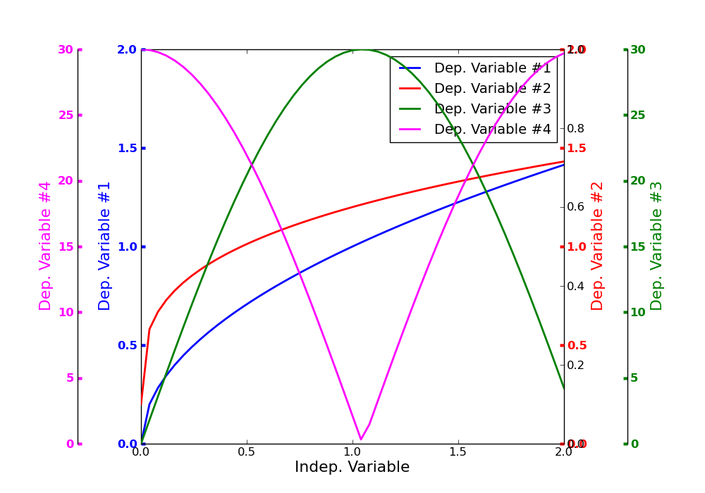
x = linspace(0., 2., 51)
# First dependent variable:
y[1]= sqrt(x)
# Second dependent variable:
y[2]= 0.2 + x**0.3
y[3]= 30.*sin(1.5*x)
y[4]= 30.*abs(cos(1.5*x))

# Set line colors here; each color can be specified using a single-letter
color
# identifier ('b'= blue, 'r'= red, 'g'= green, 'k'= black, 'y'= yellow,
# 'm'= magenta, 'y'= yellow), an RGB tuple, or almost any standard English
color
# name written without spaces, e.g., 'darkred'. The first element of this
list
# is not used.
colors= [' ', 'b', 'darkred', 'g', 'magenta']

# Set the line width here. linewidth=2 is recommended.
linewidth= 2

# Section 3: Generate the plot.

N_dependents= len(labels) - 1
if N_dependents > 4: raise Exception, \
   'This code currently handles a maximum of four independent variables.'

# Open a new figure window, setting the size to 10-by-7 inches and the
facecolor
# to white:
fig= plt.figure(figsize=(10,7), dpi=120, facecolor=[1,1,1])

host= fig.add_subplot(111)

host.set_xlabel(labels[0])

# Use twinx() to create extra axes for all dependent variables except the
first
# (we get the first as part of the host axes). The first element of y_axis
is
# not used.
y_axis= (N_dependents+2) * [0]
y_axis[1]= host
for i in range(2,len(labels)+1): y_axis[i]= host.twinx()

if N_dependents >= 3:
   # The following statement positions the third y-axis to the right of the
   # frame, with the space between the frame and the axis controlled by the
   # numerical argument to set_position; this value should be between 1.10
and
   # 1.2.
   y_axis[3].spines["right"].set_position(("axes", 1.15))
   make_patch_spines_invisible(y_axis[3])
   make_spine_invisible(y_axis[3], "right")
   plt.subplots_adjust(left=0.0, right=0.8)

if N_dependents >= 4:
   # The following statement positions the fourth y-axis to the left of the
   # frame, with the space between the frame and the axis controlled by the
   # numerical argument to set_position; this value should be between 1.10
and
   # 1.2.
   y_axis[4].spines["left"].set_position(("axes", -0.15))
   make_patch_spines_invisible(y_axis[4])
   make_spine_invisible(y_axis[4], "left")
   plt.subplots_adjust(left=0.2, right=0.8)

p= (N_dependents+1) * [0]

# Plot the curves:
for i in range(1,N_dependents+1):
   p[i], = y_axis[i].plot(x, y[i], colors[i],
     linewidth=linewidth, label=labels[i])

# Set axis limits. Use ceil() to force upper y-axis limits to be round
numbers.
host.set_xlim(x.min(), x.max())

host.set_xlabel(labels[0], size=16)

for i in range(1,N_dependents+1):
   y_axis[i].set_ylim(0.0, ceil(y[i].max()))
   y_axis[i].set_ylabel(labels[i], size=16)
   y_axis[i].yaxis.label.set_color(colors[i])

   for obj in y_axis[i].yaxis.get_ticklines():
      # `obj` is a matplotlib.lines.Line2D instance
      obj.set_color(colors[i])
      obj.set_markeredgewidth(3)

   for obj in y_axis[i].yaxis.get_ticklabels():
      obj.set_color(colors[i])
      obj.set_size(12)
      obj.set_weight(600)

# To get rid of the legend, comment out the following two lines:
lines= p[1:]
host.legend(lines, [l.get_label() for l in lines])

plt.draw(); plt.show()

View this message in context: http://www.nabble.com/Possible-to-get-four-y-axes-on-a-single-plot--tp26041500p26088240.html
Sent from the matplotlib - users mailing list archive at Nabble.com.