Hello Mike,
Thanks for your advice. I think this is exactly what I need. I am not sure
how to use this option, might you help me?
I use simply the following lines in my code:
self.figure.clf()
self.axes = self.figure.add_axes([0.1,0.1,0.8,0.8], projection='polar',
aspect='equal')
and later:
self.axes.plot(angle(data),abs(data),label=title,linewidth = 2,zorder=10)
Where should I change the resolution feature? With each plot or with figure
object?
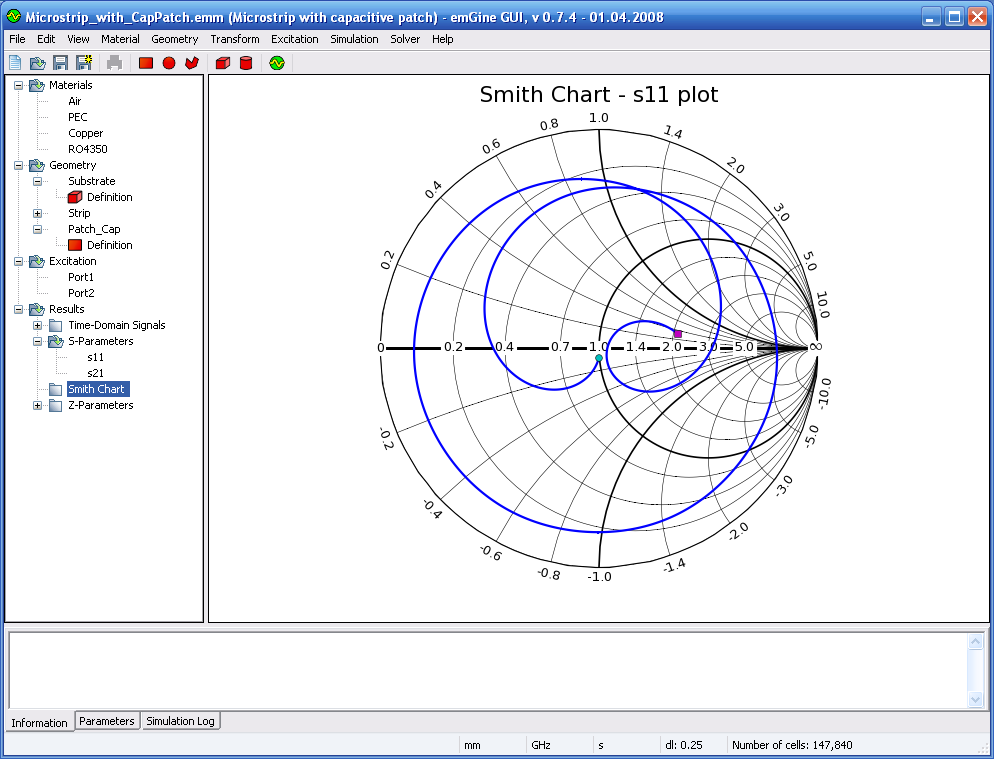
The code is currently open source and available via emGine software
(http://www.petr-lorenz.com/emgine/index.php?option=com_content&view=article
&id=46&Itemid=56)
I am also willing to split smithchart plot as part of matplotlib, this would
be great I think.
Best regards,
Sherif
···
-----Original Message-----
From: Michael Droettboom [mailto:mdroe@…31…]
Sent: Thursday, March 19, 2009 1:01 PM
To: Sherif Ahmed
Cc: [email protected]
Subject: Re: [matplotlib-devel] Polar Plot
Sherif Ahmed wrote:
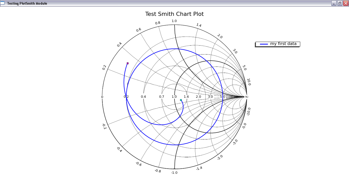
Hello all,
I am using matplotlib in order to generate a scientific drawing called
Smith Chart. It consists of many shifted circles drawn in polar
plot. This chart is widely used in electrical engineering field.
I am facing a problem now with the new version of matplotlib. After
trying around I figured out that the plot function does not connect
the given points in straight lines however by a circle or a circle
sector. This causes a very wrong drawing and producing parasitic,
false, circles when the points are to cross the theta=180° line.
You can turn off this feature by passing "resolution=1" to the polar()
method. This is the default in SVN versions of matplotlib, and will be
in the next releases.
You've clearly done a lot of work on the Smith chart plotting already...
It would be great to package that code into something for general use
and include in the matplotlib core.
Mike
------------------------------------------------------------------------
------------------------------------------------------------------------
------------------------------------------------------------------------
----------------------------------------------------------------------------
--
Apps built with the Adobe(R) Flex(R) framework and Flex Builder(TM) are
powering Web 2.0 with engaging, cross-platform capabilities. Quickly and
easily build your RIAs with Flex Builder, the Eclipse(TM)based development
software that enables intelligent coding and step-through debugging.
Download the free 60 day trial. http://p.sf.net/sfu/www-adobe-com
------------------------------------------------------------------------
_______________________________________________
Matplotlib-devel mailing list
[email protected]
matplotlib-devel List Signup and Options
--
Michael Droettboom
Science Software Branch
Operations and Engineering Division
Space Telescope Science Institute
Operated by AURA for NASA