Hello,
I am plotting polar graphs for a university project, the data is confidential but I based the work on this example http://matplotlib.sourceforge.net/examples/pylab_examples/polar_demo.html and fortunately the same problem occurs with this. If you take that code and change the last four lines from:
ax.set_rmax(2.0)
grid(True)

ax.set_title("And there was much rejoicing!", fontsize=20)
show()
To:
ax.set_rmax(3.01)
ax.set_rmin(2.91)
grid(True)
ax.set_title("And there was much rejoicing!", fontsize=20)
show()
and then run the script.
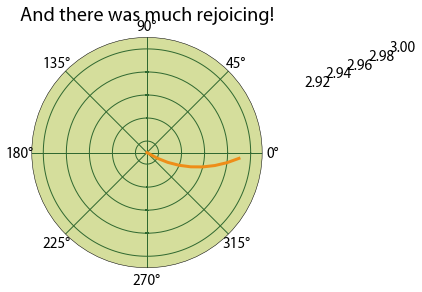
The min and max needs to be very tight so that the data I am looking at can be displayed properly. With the tight axis range, the labels end up of to the top right, they are just visible on my screen (1920x1080) when the graph is maximised.
After some experimenting the smaller the range between the maximum and minimum values the further to the right the labels go. I have not looked into the coding of the polar module as my python knowledge is not great, but my guess is that the labels are a set distance from the radial markers.
So my question is how do I move the radial labels back to the correct location?
I hope I have not missed the answer in the documentation. I have installed version 1.1.0 of matplotlib and its still a problem in it, thanks for the good instructions on how to do it on ubuntu.
I look forward to any help.
Luke
Hello
I sent this email just after Christmas and would appreciate it if anyone has any suggestions. I am unsure if I have missed a parameter or should I file a bug?
Thanks
Luke
···
---------- Forwarded message ----------
From: Luke Jennings <ubuntujenkins@…982…>
Date: Mon, Dec 26, 2011 at 8:52 PM
Subject: Polar graph radial labels
To: [email protected]
Hello,
I am plotting polar graphs for a university project, the data is confidential but I based the work on this example http://matplotlib.sourceforge.net/examples/pylab_examples/polar_demo.html and fortunately the same problem occurs with this. If you take that code and change the last four lines from:
ax.set_rmax(2.0)
grid(True)

ax.set_title("And there was much rejoicing!", fontsize=20)
show()
To:
ax.set_rmax(3.01)
ax.set_rmin(2.91)
grid(True)
ax.set_title("And there was much rejoicing!", fontsize=20)
show()
and then run the script.
The min and max needs to be very tight so that the data I am looking at can be displayed properly. With the tight axis range, the labels end up of to the top right, they are just visible on my screen (1920x1080) when the graph is maximised.
After some experimenting the smaller the range between the maximum and minimum values the further to the right the labels go. I have not looked into the coding of the polar module as my python knowledge is not great, but my guess is that the labels are a set distance from the radial markers.
So my question is how do I move the radial labels back to the correct location?
I hope I have not missed the answer in the documentation. I have installed version 1.1.0 of matplotlib and its still a problem in it, thanks for the good instructions on how to do it on ubuntu.
I look forward to any help.
Luke
Luke,
I don't have an answer to your question, but I can confirm what your
seeing with the attached image. I generated this figure with MPL
1.1.0, Python 2.7.1, on Windows 7 with ipythonqt and the inline
backend. I filed an issue here:
polar axes labels error with small radial range by mdboom · Pull Request #680 · matplotlib/matplotlib · GitHub. If I find time
tonight, I'll take a stab at tracking this down.
Thanks,
-paul
···
On Sun, Jan 15, 2012 at 8:17 AM, Luke Jennings <[email protected]...> wrote:
Hello
I sent this email just after Christmas and would appreciate it if anyone has
any suggestions. I am unsure if I have missed a parameter or should I file a
bug?
Thanks
Luke
---------- Forwarded message ----------
From: Luke Jennings <[email protected]...>
Date: Mon, Dec 26, 2011 at 8:52 PM
Subject: Polar graph radial labels
To: [email protected]
Hello,
I am plotting polar graphs for a university project, the data is
confidential but I based the work on this
example http://matplotlib.sourceforge.net/examples/pylab_examples/polar_demo.html and fortunately
the same problem occurs with this. If you take that code and change the last
four lines from:
ax.set_rmax(2.0)
grid(True)
ax.set_title("And there was much rejoicing!", fontsize=20)
show()
To:
ax.set_rmax(3.01)
ax.set_rmin(2.91)
grid(True)
ax.set_title("And there was much rejoicing!", fontsize=20)
show()
and then run the script.
The min and max needs to be very tight so that the data I am looking at can
be displayed properly. With the tight axis range, the labels end up of to
the top right, they are just visible on my screen (1920x1080) when the graph
is maximised.
After some experimenting the smaller the range between the maximum and
minimum values the further to the right the labels go. I have not looked
into the coding of the polar module as my python knowledge is not great, but
my guess is that the labels are a set distance from the radial markers.
So my question is how do I move the radial labels back to the correct
location?
I hope I have not missed the answer in the documentation. I have installed
version 1.1.0 of matplotlib and its still a problem in it, thanks for the
good instructions on how to do it on ubuntu.
I look forward to any help.
Luke
------------------------------------------------------------------------------
RSA(R) Conference 2012
Mar 27 - Feb 2
Save $400 by Jan. 27
Register now!
http://p.sf.net/sfu/rsa-sfdev2dev2
_______________________________________________
Matplotlib-users mailing list
[email protected]
matplotlib-users List Signup and Options
Hello Paul,
Sorry for the late reply I have been away for a couple of days. Thanks for filing the issue, I would very much appreciate it if you manage to track it down.
Luke
···
On Tue, Jan 17, 2012 at 1:47 AM, Paul Hobson <pmhobson@…287…> wrote:
Luke,
I don’t have an answer to your question, but I can confirm what your
seeing with the attached image. I generated this figure with MPL
1.1.0, Python 2.7.1, on Windows 7 with ipythonqt and the inline
backend. I filed an issue here:
https://github.com/matplotlib/matplotlib/issues/680. If I find time
tonight, I’ll take a stab at tracking this down.
Thanks,
-paul
On Sun, Jan 15, 2012 at 8:17 AM, Luke Jennings > > <ubuntujenkins@…982…> wrote:
Hello
I sent this email just after Christmas and would appreciate it if anyone has
any suggestions. I am unsure if I have missed a parameter or should I file a
bug?
Thanks
Luke
---------- Forwarded message ----------
From: Luke Jennings <ubuntujenkins@…982…>
Date: Mon, Dec 26, 2011 at 8:52 PM
Subject: Polar graph radial labels
To: [email protected]
Hello,
I am plotting polar graphs for a university project, the data is
confidential but I based the work on this
example http://matplotlib.sourceforge.net/examples/pylab_examples/polar_demo.html and fortunately
the same problem occurs with this. If you take that code and change the last
four lines from:
ax.set_rmax(2.0)
grid(True)
ax.set_title(“And there was much rejoicing!”, fontsize=20)
show()
To:
ax.set_rmax(3.01)
ax.set_rmin(2.91)
grid(True)
ax.set_title(“And there was much rejoicing!”, fontsize=20)
show()
and then run the script.
The min and max needs to be very tight so that the data I am looking at can
be displayed properly. With the tight axis range, the labels end up of to
the top right, they are just visible on my screen (1920x1080) when the graph
is maximised.
After some experimenting the smaller the range between the maximum and
minimum values the further to the right the labels go. I have not looked
into the coding of the polar module as my python knowledge is not great, but
my guess is that the labels are a set distance from the radial markers.
So my question is how do I move the radial labels back to the correct
location?
I hope I have not missed the answer in the documentation. I have installed
version 1.1.0 of matplotlib and its still a problem in it, thanks for the
good instructions on how to do it on ubuntu.
I look forward to any help.
Luke
RSA(R) Conference 2012
Mar 27 - Feb 2
Save $400 by Jan. 27
Register now!
http://p.sf.net/sfu/rsa-sfdev2dev2
Matplotlib-users mailing list
[email protected]
https://lists.sourceforge.net/lists/listinfo/matplotlib-users