Dear all,
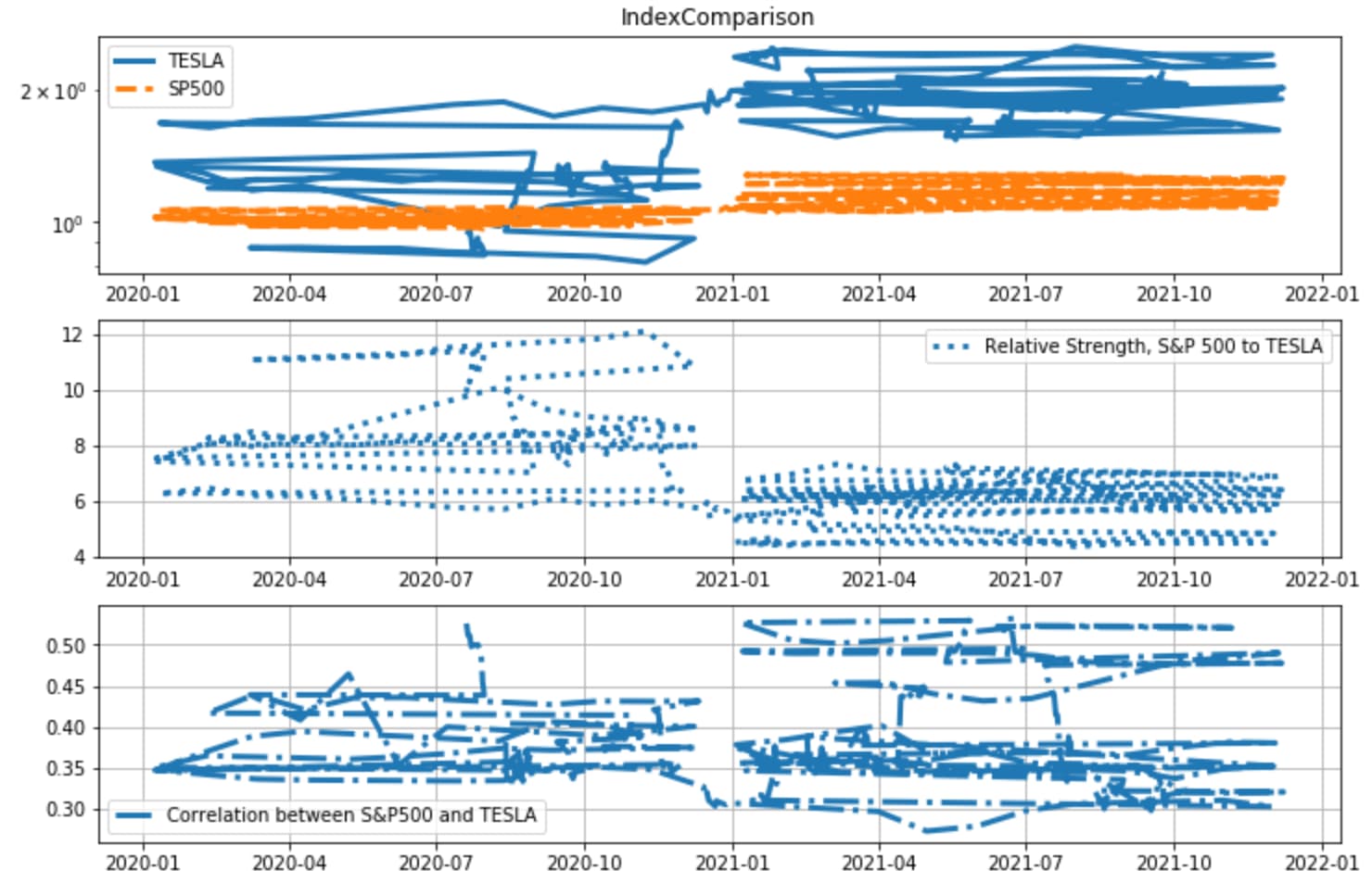
My issue is related to the pyplot joining up the points of my data in the wrong order. I verified the data type and it is all set on float. The different points a sorted by “Date” since these represent the closing values in the stock market. I have attempted to draw the chart on Excel and it drew it successfully, however I checked the code again and again but don’t seem to see any error. Any idea what may be happening in the background? The codes are attached here as well as what the graph looks like currently
import matplotlib.pyplot as plt
import pandas as pd

def get_data(file):
    '''Fetch data from where it is'''
    data=pd.read_csv(('../data/')+file+'.csv', index_col= 'Date', parse_dates=['Date'])
    return data

def calc_corr(ser1, ser2, window):
    '''
    Calculates correlation between two series.
    '''
    ret1=ser1.pct_change()
    ret2=ser2.pct_change()
    corr=ret1.rolling(window).corr(ret2)
    return corr

#Define how many points we intend to plot. Points in this case would be trading days.

points_to_plot=300

#getting the log return data
data= get_data('Stocks')

'''rebase the two series to the same point in time,
starting where the plot will start.
'''
for ind in data:
    data[ind+'_rebased'] = (data[-points_to_plot:]
                            [ind].pct_change()+1).cumprod()

#Relative strength, SP500 to TESLA
data['rel_str']=data['SP500']/data['TSLA']

#Calculate 100 days rolling correlation
data['corr']= calc_corr(data['SP500'], data['TSLA'], 100)

'''
Slice the data, by cuting the points we do not intend to plot'''

plot_data=data[-points_to_plot:]

#Make new figure and set the size
fig=plt.figure(figsize=(12,8))

'''The first subplot, planning for 3 plots high, 1 plot wide,
this being the first.'''
ax=fig.add_subplot(311)
ax.set_title('Index Comparison')
ax.semilogy(plot_data['TSLA_rebased'], linestyle='-',label='TESLA',linewidth=3.0)
ax.semilogy(plot_data['SP500_rebased'], linestyle='--',label='SP500', linewidth=3.0)
ax.legend()
ax.grid(False)

#second subplot
ax=fig.add_subplot(312)
ax.plot(plot_data['rel_str'],label='Relative Strength, S&P 500 to TESLA', linestyle=':', linewidth=3.0)
ax.legend()
ax.grid(True)

#Third subplot
ax=fig.add_subplot(313)
ax.plot(plot_data['corr'],label='Correlation between S&P500 and TESLA',linestyle='-.',linewidth=3.0)
ax.legend()
ax.grid(True)