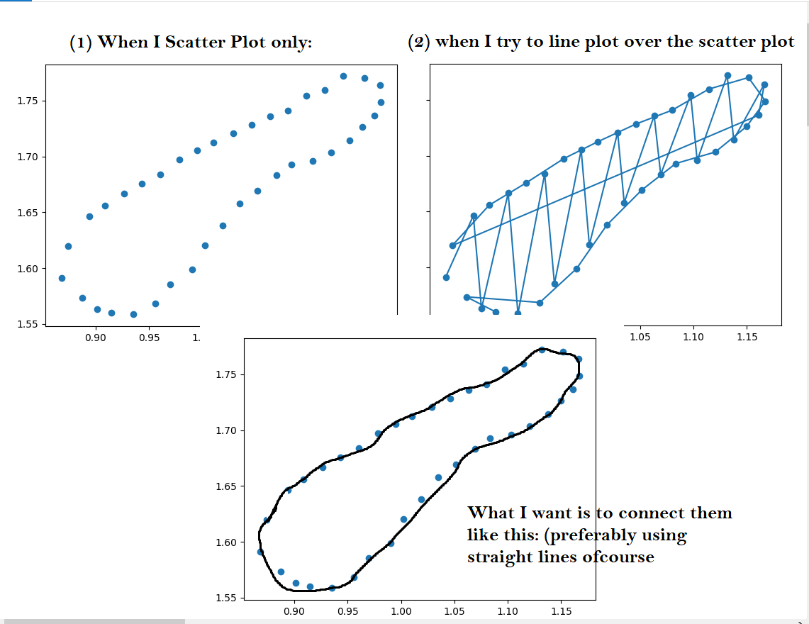
I have a set of data which, when I scatter plot looks like in (1)
What I want to do is connect the dots to from a ring( bottom figure). However, if I try to plot over it with a line it becomes like figure of (2).
My code:
import numpy as np
import pandas as pd
import matplotlib.pyplot as plt
file=pd.read_csv(r’F:\DU END\efficiency values.csv’)
x=file[‘Ebot (eV)’]
y=file[‘Etop (eV)’]
plt.plot(x,y,zorder=2)
plt.scatter(x,y,zorder=1)
plt.show()
Thanks a lot in advance any help would be appreciated. I am quite new to the forum and python so sorry if I messed up any formatting usually done for posting questions