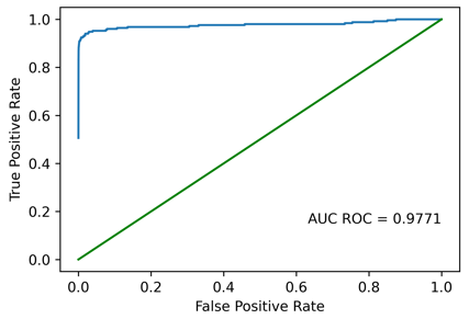
I found the problem when I tried to set up a minimum working example. The problem was that I appended a 0 to all lists, regardless of whether they already go through (0,0) or not. For lists like
x = [0.1, 0.5, 1.0]
y = [0.5, 0.9, 1.0]
this was ok, as they became
x = [0.0, 0.1, 0.5, 1.0]
y = [0.0, 0.5, 0.9, 1.0]
and could be plotted as expected. However, when the list already had 0.0 as first x-value like
x = [0.0, 0.5, 1.0]
y = [0.5, 0.9, 1.0]
the padding led to
x = [0.0, 0.0, 0.5, 1.0]
y = [0.0, 0.5, 0.9, 1.0]
and matplotlib got confused when having 2 y-values for the same x-value. I solved this by adding a small epsilon of 1e-10 to the second 0.0 in x and it works:
x = [0.0, 1e-10, 0.5, 1.0]
y = [0.0, 0.5, 0.9, 1.0]
The epsilon is small enough that it is not visible in the final plot, so it’s good enough as a workaraound.
![]()
