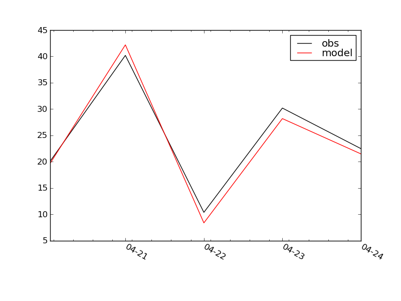
I am plotting time-series 1-minute cadence data for specific multiple-day validation periods.
Sometimes the data have a gap between the start of the validation period and the start of the data. Attached is a stand-alone Python script that demonstrates the problem, along with the plot that the script produces.
April 20 is the start of the validation period. I want 04-20 to appear at the plot origin. This does not happen unless either the model or observed dictionary contain a key/value pair for 1998,4,20,0.
I tried adding datetime(1998,4,20,0):None to one or both dictionaries, but it is ignored.
Also the minor tick marks do not look right, especially the ones just to the right of each x-axis label.
Do you have any suggestions?
Thanks,
Ann
I am working on a Windows PC; O/S is Windows XP Professional, Version 2002, Service Pack 3.
I am running matplotlib, version '0.99.0' which I obtained from the matplotlib Sourceforge site.
I have not customized matplotlibrc.
I am running python version 2.6.2.
Attached is output.txt, the result of running my script with a verbose-helpful
test_plot.py (1.85 KB)
output.txt (947 Bytes)
Hi Ann,
I'm not sure I understood correctly, but maybe it is useful to change the
xlimits slightly, e.g. datetime(1998,4,20,0) instead of (the default value in
this case) datetime(1998,4,20,1):
ax.set_xlim( date2num(datetime(1998,4,20,0)), ax.get_xlim()[1] )
Also the minor tick marks do not look right, especially the ones just to
the right of each x-axis label.
I cannot see these unexpected behaviour of the tick marks (as in your png)
with current svn, but I'm not sure this is the reason.
Kind regards,
Matthias
···
On Tuesday 06 October 2009 22:15:25 Ann Newman wrote:
I am plotting time-series 1-minute cadence data for specific
multiple-day validation periods.
Sometimes the data have a gap between the start of the validation period
and the start of the data. Attached is a stand-alone Python script that
demonstrates the problem, along with the plot that the script produces.
April 20 is the start of the validation period. I want 04-20 to appear
at the plot origin. This does not happen unless either the model or
observed dictionary contain a key/value pair for 1998,4,20,0.
I tried adding datetime(1998,4,20,0):None to one or both
dictionaries, but it is ignored.
Also the minor tick marks do not look right, especially the ones just to
the right of each x-axis label.
Do you have any suggestions?
Thanks,
Ann
I am working on a Windows PC; O/S is Windows XP Professional, Version
2002, Service Pack 3.
I am running matplotlib, version '0.99.0' which I obtained from the
matplotlib Sourceforge site.
I have not customized matplotlibrc.
I am running python version 2.6.2.
Attached is output.txt, the result of running my script with a
verbose-helpful
Thanks, Matthias,
Your code suggestion works. I was aware of xlim but must not have used it correctly, before contacting matplotlib-users. I think I tried set_xlim, but did not use the get_xlim function. With your code added, the minor tick mark locations line up correctly too.
Thanks again,
Ann
Matthias Michler wrote:
···
Hi Ann,
I'm not sure I understood correctly, but maybe it is useful to change the xlimits slightly, e.g. datetime(1998,4,20,0) instead of (the default value in this case) datetime(1998,4,20,1):
ax.set_xlim( date2num(datetime(1998,4,20,0)), ax.get_xlim()[1] )
Also the minor tick marks do not look right, especially the ones just to
the right of each x-axis label.
I cannot see these unexpected behaviour of the tick marks (as in your png) with current svn, but I'm not sure this is the reason.
Kind regards,
Matthias
On Tuesday 06 October 2009 22:15:25 Ann Newman wrote:
I am plotting time-series 1-minute cadence data for specific
multiple-day validation periods.
Sometimes the data have a gap between the start of the validation period
and the start of the data. Attached is a stand-alone Python script that
demonstrates the problem, along with the plot that the script produces.
April 20 is the start of the validation period. I want 04-20 to appear
at the plot origin. This does not happen unless either the model or
observed dictionary contain a key/value pair for 1998,4,20,0.
I tried adding datetime(1998,4,20,0):None to one or both
dictionaries, but it is ignored.
Also the minor tick marks do not look right, especially the ones just to
the right of each x-axis label.
Do you have any suggestions?
Thanks,
Ann
I am working on a Windows PC; O/S is Windows XP Professional, Version
2002, Service Pack 3.
I am running matplotlib, version '0.99.0' which I obtained from the
matplotlib Sourceforge site.
I have not customized matplotlibrc.
I am running python version 2.6.2.
Attached is output.txt, the result of running my script with a
verbose-helpful
------------------------------------------------------------------------------
Come build with us! The BlackBerry(R) Developer Conference in SF, CA
is the only developer event you need to attend this year. Jumpstart your
developing skills, take BlackBerry mobile applications to market and stay ahead of the curve. Join us from November 9 - 12, 2009. Register now!
http://p.sf.net/sfu/devconference
_______________________________________________
Matplotlib-users mailing list
[email protected]
matplotlib-users List Signup and Options