I want to plot a filled contour between gridlines and tick marks. The order of plotting will be like grid -> contourf -> ticks. Is it possible to do so? I have tried a lot of hacks but it didn’t work for me! I will be very grateful if someone can provide some suggestions or pointers. The original issue is here: JuliaPlots/Plots.jl/issues/1881
Did you try adjusting the z-order of the artists (either pushing the ticks up or the contour down)?
That was also suggested the linked julia issue. Could you give us a bit more detail about what you have tried? It is not clear to me from your post or the julia issue if this is a problem on the Matplotlib side or in the julia wrappers. Is it possible to give us a (Python) example that shows the problem?
https://matplotlib.org/3.3.0/api/_as_gen/matplotlib.artist.Artist.set_zorder.html
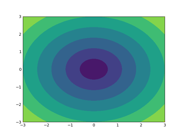
Hello @tacaswell, Thanks for your response. Here’s the python code that reproduces the plot:
import matplotlib.pyplot as plt
import numpy as np

xlist = np.linspace(-3.0, 3.0, 100)
ylist = np.linspace(-3.0, 3.0, 100)
X, Y = np.meshgrid(xlist, ylist)
Z = np.sqrt(X**2 + Y**2)
fig, ax = plt.subplots()

ax.grid(zorder=0)
ax.contourf(X, Y, Z, zorder=2.0)
ax.tick_params(axis="both", direction="in")
This is creating the following plot and hiding the tics:
What I want
I want gridlines to be drawn behind the contour but the ticks to be drawn in front of the contour.
I have tried the following things till now:
- Tweaking
zorderof ticks, grid and contour. - Using
Axes.twinxandAxes.twinyfor creating extra ticks (in this case only one extra axis is created so you can only bring up the ticks of a single axis). - Creating two instances of the
subplot(111)and setting the facecolor of later one to transparent.
My observation:
- The
gridandtickare properties of the same class (or something similar) so tweaking one thing affects another. For example, usingtick_paramsaffect gridlines too.
I might have to check the zorder of the artist. I have never tried that.
As a new user, I am allowed to put only a single image in a reply. So here’s the other one.
The ticks are being drawn, but they are behind the filled contour:
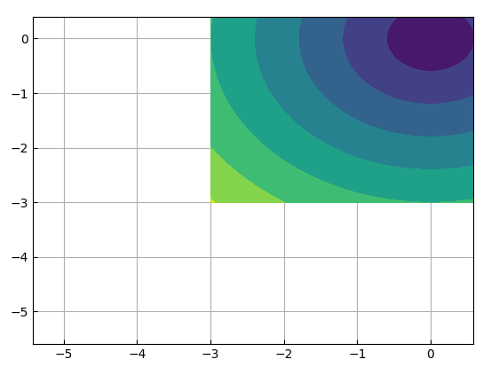
(zorder doesn’t work because If I increase the zorder of ticks then the zorder of grids also increases automatically)
Passing zorder to ax.countourf is setting the zorder on the artist (that is created by calling that method).
As you noted, the ticks and gridlines are drawn as part of the same Artist so have a shared zorder
so you can’t get the grid lines above but the tick marks below as you want.
Practically (short of re-writing the ticker system), I suggest one of the followiing:
- have the ticks go out. When we changed the default direction in 2.0 the most persuasive (to me) argument was that ink from the ticks collides with the ink from 2D artists like this. Not great because I am asking you to change your visualiaztion.
- use
ax.axvlineandax.axhlineto fake up the grid. Not great because it will not stay in sync with where the ticks are located - the
twinx\twinyroute is not bad, but not great because it is a whole bunch of extra ceremony - you might be able to use the (newish) secondary-axis functionality to achieve this https://matplotlib.org/3.2.1/gallery/subplots_axes_and_figures/secondary_axis.html again, not great because it is a bunch of extra ceremony to get what you want.
We probably should look into making discourses “new user auto-moderation” a bit more forgiving as we (knocks on wood) have not had a major problem with spam / abuse yet.
1 Like
Thanks @tacaswell. I can now discuss these things with the maintainers of Plots.jl and we will see what comes out.
Thanks again. I am so grateful for this response. 