There don’t appear to be any good ways. Depending on the range of your data, you may find these two options usable:
A) a fancy box, which is what I’ve done below. It has some problems with short bars - try removing the if statement.
B) a slightly more complex thing where you reduce the height of each bar, add a circle patch at each corner, then add an additional rectangle if needed to fill any gaps. Bit of a faff either way.
full code:
import numpy as np
from matplotlib.patches import FancyBboxPatch, Rectangle
columns_to_plot_labels = ['a', 'b', 'c', 'd', 'e', 'f']
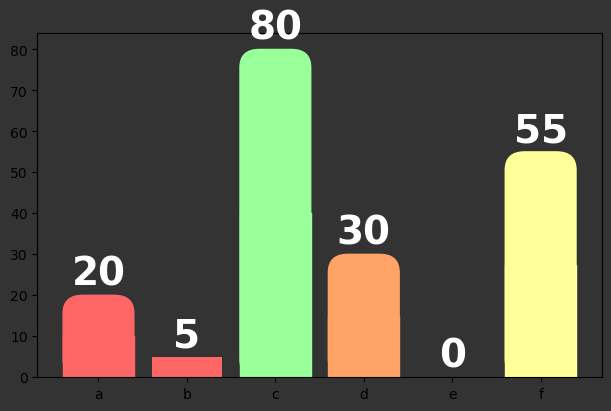
player_values = [20, 5, 80, 30, None, 55]
# Handle null values _before_ plotting your data
values_replacing_nans = [x if x is not None else 0 for x in player_values ]
max_col_height = max(values_replacing_nans)
min_col_height = min(values_replacing_nans)
# create a dark grey figure
fig, ax = plt.subplots(figsize=(6,4), constrained_layout=True)
fig.set_facecolor('#333333')
ax.set_facecolor('#333333')
# set the colors for each range
colors = ['#FF6666', '#FFA366', '#FFFF99', '#99FF99']
color_thresholds = [1, 25, 50, 75]
# Set the rounding values
bar_width = 0.5
bar_separation = 0.1
bar_pad_factor = 0 # proportion of bar_width to add for rounding, 0 means no additional width
bar_rounding_factor = 0.2 # proportion of bar_width to add for rounding, 0 means no rounding, 0.5 means a circlular top
# Plot all bars together
bars = ax.bar(
x=columns_to_plot_labels,
height=values_replacing_nans,
color=[colors[c] for c in np.digitize(values_replacing_nans, color_thresholds)-1],
)
# loop through the bars
for i, bar in enumerate(bars):
# add the text on top of the bars
ax.text(bar.get_x() + bar.get_width()/2, bar.get_height()+0.5, values_replacing_nans[i],
ha='center', va='bottom', color='white', weight='bold', fontsize=28)
if bar.get_height() > bar_rounding_factor*max_col_height:
# add the rounded bar on top of the original bar, note - this is rounded at both ends
round_top = FancyBboxPatch(
xy = bar.get_xy(), # use the original bar's values to fill the new bar
width=bar.get_width(),
height=bar.get_height(),
color=bar.get_facecolor(),
boxstyle=f"round,pad={bar_pad_factor},rounding_size={bar_rounding_factor}",
transform=ax.transData,
mutation_scale=1.1,
mutation_aspect=20,
)
# Over write the bottom half of the original bar with a Rectangle patch
square_bottom = Rectangle(
xy = bar.get_xy(),
width=bar.get_width(),
height=bar.get_height()/2,
color=bar.get_facecolor(),
transform=ax.transData,
)
# remove the original bar from the plot
bar.remove()
# add the new artists to the plot
ax.add_patch(round_top)
ax.add_patch(square_bottom)
plt.show()
Which produces this plot: