Hi,
I use matplotlib as my python graphics library. I happen to see the following problems with the plot() function and would appreciate any help to resolve these problems!
-
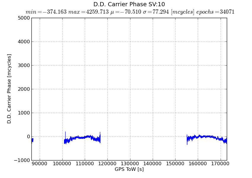
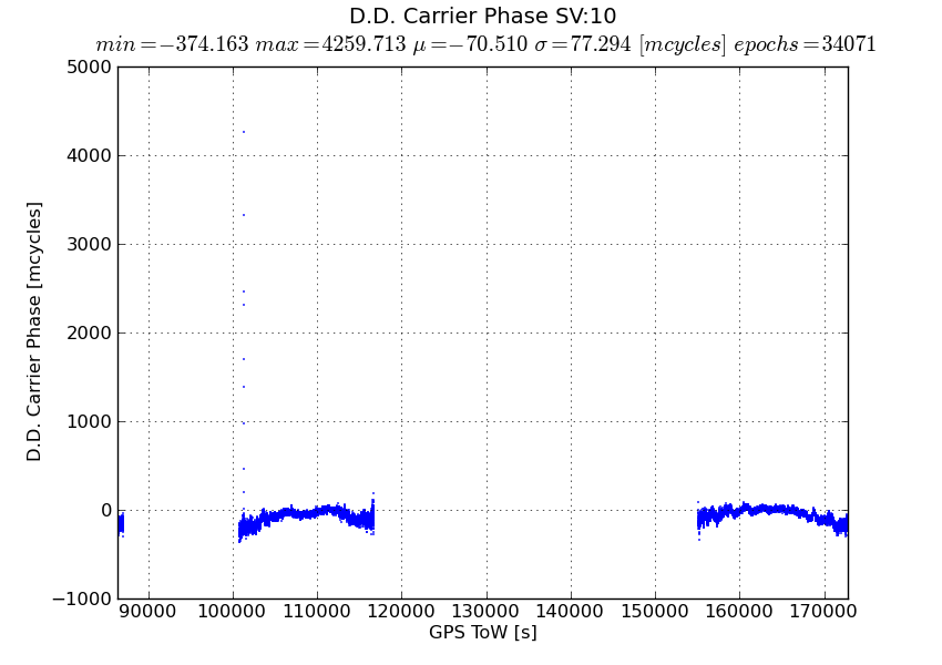
Using the default line style under plot() results in the function dropping data points from the plot. Plotting the same data with a ‘dot’ linestyle shows the missing data points.
-
Any large outliers in a data set are generally excluded from the resulting plot.
The original plot generated using the default linestyle does not show the large outliers in the dataset. Further comparing against the second plot shows missing data points which were not connected by the default linestyle. Several missing data points are not necessarily large outliers. My initial guess for missing large outliers was that the function was aliasing down large values.
Missing nominal data points makes me wonder if the plot function internally generates a “best-fit” or least squares plot of the data points? This inconsistent plot occurs only with large data sets. The two plots were generated with over 100000 (hundred thousand) data points.
Would be happy to send you the original data if that may help troubleshoot this problem.
Thanks,
Shankar
In all liklihood, you are using an older version of matplotlib which had a bug in the path.simplify logic that caused some points to be dropped. The solution is to either upgrade to the latest matplotlib (1.0.1) or turn off path simplification by setting ‘path.simplify : False’ in your matplotlibrc
http://matplotlib.sourceforge.net/users/customizing.html
You can find out what version of matplotlib you are running by doing
In [127]: import matplotlib
In [128]: matplotlib.version
Out[128]: ‘1.0.1’
JDH
···
On Tue, Jun 7, 2011 at 5:16 PM, Shankararaman Ramakrishnan <Shankararaman_Ramakrishnan@…3621…> wrote:
Hi,
I use matplotlib as my python graphics library. I happen to see the following problems with the plot() function and would appreciate any help to resolve these problems!
-
Using the default line style under plot() results in the function dropping data points from the plot. Plotting the same data with a ‘dot’ linestyle shows the missing data points.
-
Any large outliers in a data set are generally excluded from the resulting plot.
The original plot generated using the default linestyle does not show the large outliers in the dataset. Further comparing against the second plot shows missing data points which were not connected by the default linestyle. Several missing data points are not necessarily large outliers. My initial guess for missing large outliers was that the function was aliasing down large values.
Missing nominal data points makes me wonder if the plot function internally generates a “best-fit” or least squares plot of the data points? This inconsistent plot occurs only with large data sets. The two plots were generated with over 100000 (hundred thousand) data points.
Would be happy to send you the original data if that may help troubleshoot this problem.