Hi Nathaniel,
> Basically, it allows you to pick the start/end color of a colormap from
> two
> cross sections in CIELab space and interpolates those colors linearly
> (see
> the README file for more details).
There's a downside to this approach for the kinds of colormaps we've
been talking about in this thread, where we want both a large
lightness range plus a colorful result. The problem is that the way
color space is shaped, you can't simultaneously have both high
saturation (colorfulness) *and* high/low lightness. So if you pick
your extreme points to be near black and white, then they can only
have a slight tinting of color, and then if you linearly interpolate
between these, then you end up with slightly tinted greyscale.
You raise an excellent point here. It explains nicely what I have
experienced while playing with my GUI. Indeed, I found that a simple linear
interpolation did not result in totally satisfactory colormaps (see my
previous reply to Federico). I couldn't quite explain why, but your
explanation makes this clear.
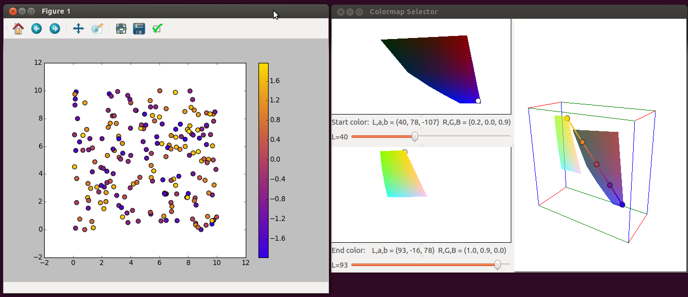
One exception I encountered is an interpolation between dark blue and yellow
as in the attached screenshot (which I hope makes it through to the mailing
list) - probably because it mostly avoids the low-saturation (grey-ish)
region of the color space.
I guess this probably also has to do with another weird feature of how
the colorspace is shaped. You'll often see pictures in books that
illustrate it like two cones:
http://www.tvtechnology.com/BE_Files/uploads/2013/05/ColorTopCones-305be18.jpg
which does capture the general idea that your range of saturations is
widest when lightness is in the middle, and narrows down when you move
towards black or white. But it's actually a bit more complicated than
that -- the actual shape is sorta lumpy, more like the picture here:
http://www.gamutvision.com/
In particular, you can have pretty-saturated blues even at very low
lightnesses, and pretty-saturated yellows even at high lightnesses.
E.g. there literally does not exist a dark red that's as intense as
the most intense dark blue.
So this makes dark-blue-to-light-yellow the obvious way to go if you
want a dark-to-light colormap that is also colorful.
I don't think it's a coincidence that parula does exactly this 
There is an obvious degree of freedom here though -- the color wheel
is, like, a wheel, so if you want to go from blue to yellow you can do
that either clockwise or counterclockwise, i.e., you can go through
green or you can go through red. Parula goes via green (and so does
matplotlib's YlGnBu, for that matter). If we want to have a
distinctive colormap that people won't confuse with Matlab(R)(TM) then
maybe we should make a blue-purple-red-yellow one.
And in fact, this is probably theoretically optimal! As another weird
quirk of how color works, the 4 focal colors (red/green/blue/yellow)
are not actually at right angles to each other on the hue circle --
see the lower diagram on this figure:
Measuring Colour - R. W. G. Hunt, M. R. Pointer - Google Books
From yellow-to-blue via red is a ~213 degree angle, while
yellow-to-blue-via-green is only a ~147 degree angle (in a space where
we define our "hue angle" based on perceptual
just-noticeable-differences). So a blue-purple-red-yellow colormap
should theoretically have higher perceptual resolution than a
blue-green-yellow colormap.
But I agree with you that using a curved, rather
than linear, interpolation can probably yield better results.
It sounds like you have a good deal of experience with various color spaces
and colormaps. Do you have an idea for a good "recipe" how to pick a curve
in a given colorspace that leads to a satisfactory colormap?
I haven't tried it yet, but my first idea would be to say that I want
a linear ramp in lightness (CIECAM02's "J"), and a linear ramp in hue
(CIECAM02's "h"), that starts at blue and ends at yellow, and then run
an optimizer to try and find a set of colorfulness values (CIECAM02's
"M") that maximize some criteria, i.e.:
-- need to stay within the sRGB gamut
-- the points should be as close to equidistant as possible
(measured in CAM02-UCS space)
-- the total arc should be as long as possible (measured in
CAM02-UCS space) (this forces it to use the large colorfulness values
when available)
-- and maybe some sort of wiggliness penalty (integral of squared
third derivative or something?) to smooth it out a bit
Then it just becomes an optimization problem -- given any proposed set
of JMh values we can convert into sRGB to check the gamut, convert in
CAM02-UCS to check the distances, etc., and compute an objective
function.
My first idea
was to change the interpolating line to a circular arc passing through an
"intermediate" color, but it's not clear to me whether there is any
preferred "direction" for nudging the line into an arc. Also, most other
colormaps, such as the examples "YlGnBu" and "cubehelix" which you
mentioned, use more complicated curves than mere circular arcs (btw, kudos
for your script - it's a great way of visualising these colormaps). I don't
have enough knowledge yet to decide whether either approach is better. I've
started toying with curved interpolations in my code but this is not quite
ready to be pushed to Github yet. Anyway, if you have any suggestions I'd
love to hear them.
I also found a few more blog posts and papers which I hadn't seen before and
which look extremely useful:
(i) "Subtleties of color"
Elegant Figures - Subtleties of Color (Part 1 of 6)
A series of six blog posts with an excellent introduction to color theory
and the issues around choosing colormaps. Well worth a read! It also
suggests that CIE L*c*h* space (which uses the three variables lightness,
chroma (saturation) and hue), may be a better choice than CIE L*a*b*, which
I have been using so far.
They're kinda the same thing -- c*h* is just the polar coordinates
version of a*b*, so you can switch back and forth depending on which
way of thinking about things feels more natural for a given task. Of
course if you do linear interpolation in polar coordinates you get
some sort of funky curve, so I guess it would make a difference that
way :-). (And the Mh that I talk about above are also conceptually
just a polar coordinates version of a and b -- the CIECAM02
calculations literally have intermediate values called a and b that
play the same role as CIEL*a*b*'s a* and b*.)
-n
···
On Thu, Jan 8, 2015 at 10:30 PM, Maximilian Albert <[email protected]...> wrote:
--
Nathaniel J. Smith
Postdoctoral researcher - Informatics - University of Edinburgh
