What I am trying to do:
I am trying to plot some stock data retrieved from the yfinance python package.
The Error:
Matplotlib seems to be creating additional dates on the x-axis. The dates are not present in the Pandas dataframe returned from yfinance, so I’m not exactly sure where they are coming from.
Code to replicate the error:
import yfinance as yf
import matplotlib.pyplot as plt

# change period to "1mo" if running on a friday to view error
data = yf.download("AAPL", period="5d", interval="1d")

plt.bar(data.index, data["Close"])

plt.tick_params("both", labelsize=7)

plt.show()
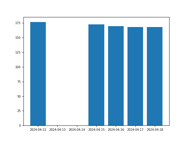
As you will see matplotlib is adding room for two (empty) additional columns. Which if you print the
dataframe returned from yfinance, are not actual columns with data.
Any help would be greatly appreciated!
I am also curious why this would be the default behavior?
Thanks!
Here is the output of the data variable (type pandas.Dataframe):
                  Open        High         Low       Close   Adj Close     Volume
Date
2024-04-12  174.259995  178.360001  174.210007  176.550003  176.550003  101593300
2024-04-15  175.360001  176.630005  172.500000  172.690002  172.690002   73531800
2024-04-16  171.750000  173.759995  168.270004  169.380005  169.380005   73711200
2024-04-17  169.610001  170.649994  168.000000  168.000000  168.000000   50843400
2024-04-18  168.000000  168.639999  167.330002  168.039993  168.039993    9927884
and here is the respective chart:
As you can see, matplotlib is generating room for two columns that, as a result, alter the chart.
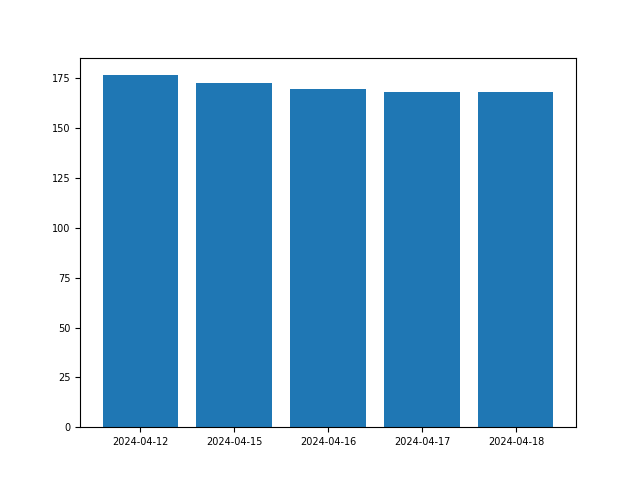
I have found a solution to this be using the code:
import yfinance as yf
import matplotlib.pyplot as plt

# change period to "1mo" if running on a friday to view error
data = yf.download("AAPL", period="5d", interval="1d")

dates = data.index.strftime('%Y-%m-%d')

plt.bar(dates, data["Close"])

plt.tick_params("both", labelsize=7)

plt.show()
This replaces creating the bar chart with data.index of type pandas.Index with the dates variable of now type pandas.DatetimeIndex
This creates the following chart:
I still find the behavior of matplotlib to be strange? It at least seems like there should be some type of boolean toggle to turn this feature on or off (maybe there is and I’m just missing it).