Hi there,
For some reason, when I plot what should be line plots by default, they are getting filled in. I have no indicated for it to do this. My code is below and the resulting image:
Load the CSV files into DataFrames
dfs_event1 = [pd.read_csv(filename, index_col=0) for filename in filenames_event1]
dfs_event2 = [pd.read_csv(filename, index_col=0) for filename in filenames_event2]def average_across_participants(dfs):
# Assuming all DataFrames have the same structure and index
return pd.concat(dfs).groupby(level=0).mean()Calculate the averages
avg_event1 = average_across_participants(dfs_event1)
avg_event2 = average_across_participants(dfs_event2)def plot_networks(df, event_number):
plt.figure(figsize=(10, 6))# Plot each network using plt.plot() to ensure standard line plots for network in df.columns: plt.plot(df.index, df[network], label=network, linestyle='-', linewidth=1.5) plt.title(f'Average Activation Across Participants for Event {event_number}') plt.xlabel('Time') plt.ylabel('Average Activation') plt.legend() plt.show()Plot for Event 1
plot_networks(avg_event1, 1)
Plot for Event 2
plot_networks(avg_event2, 2)
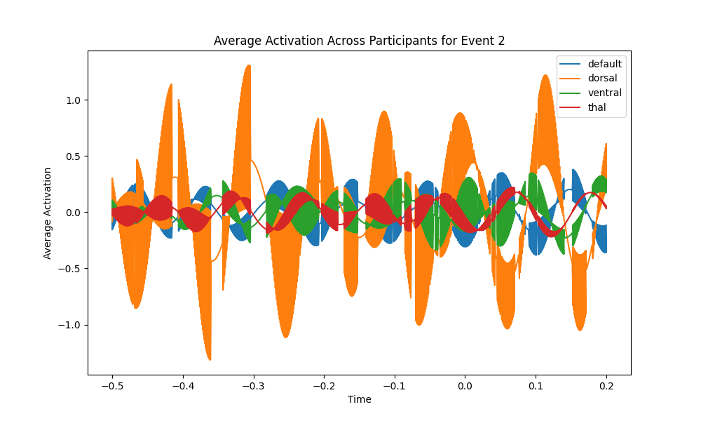
Is there a way to get it to stop filling in the lines? Thanks!
Cheers,
Emily