Hi, matplotlib list.
I would like a twinx()'ed x/y date plot with three kinds of data:
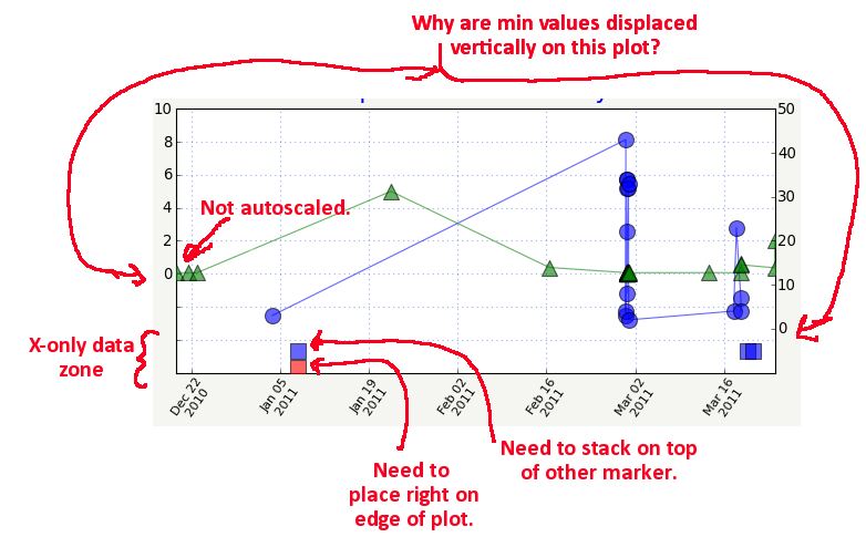
(See image)
- Right y axis data.
- Left y axis data.
- x axis data that have no y values. (“x-only”) in a bottom “margin”
I’ve struggled to use a loose autoscaling to the plot such that there is an ample margin (but still part of the plot) around all four sides. In the bottom margin–which has no ticks due to a custom formatter–I want to plot the x-only data at the appropriate x values and placed directly on the bottom edge of the plot, no matter the y scaling.
Given that there may be more than one set of values for the x-only data, I’d like x-only line’s worth of markers to be stacked on top of each other so they never overlap and obscure each other. (I.e., you can see that more than one thing happened on that day).
See plot_with_x-only_zone.jpg image for the basic idea and my problems…
The issues are:
ISSUE 1:
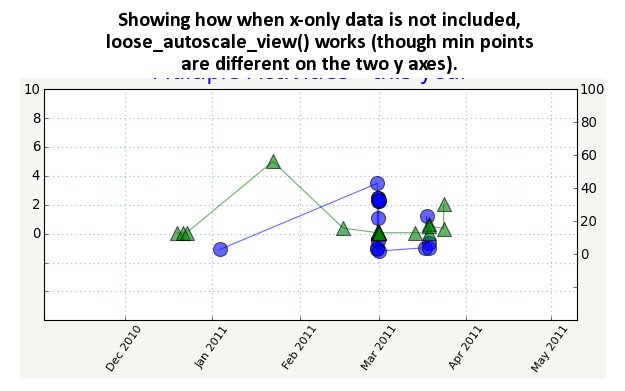
I am using a “loose_autoscale_view()” function[1] on each axis to autoscale the data loose enough to provide the margins. If the x-only data is not included, it works (see attached image, loose_autoscale_view_works_without_x-only_data.jpg which has an obvious huge margin on all sides)
But if I add the x-only data–even after I call loose_autoscale_view()–it messes up the autoscaling so that now the margins are different or just not there as they obviously are in the first image. This is using the same margin sizes in both images.
Qs: Why is that? Why should adding lines after autoscaling rescale the plot? Is there a way to autoscale such that the x-only data is not taken into account when setting the scaling?
Also, my autoscaling is such that the minimum values of the two axes (in this case, near 0) are displaced a bit. 0 on the left y axis is somewhat above 0 on the right y axis. I’d prefer they be better lined up. Is there a way to do that?
ISSUE 2:
I am using the ScaledTranslation transform to stack the x-only squares by adding an offset, based on the mpl tutorial about creating a shadow effect[2]. However, I am positioning the red squares to begin with in data coordinates based on one of the y axes’ bottom y_lim–and therefore the squares’ y positions vary as the scale changes. I don’t want their y positions to change, but always be frozen to the bottom of the plot.
Q: So how can I use transforms (or whatever) to make sure the red square’s bottom edge is flush directly to the edge of the plot AND the additional lines worth of squares are stacked above it?
Or is there a better way to go about doing all this?
Any hints or help is appreciated as always.
Thanks,
Che
[1]http://old.nabble.com/Re%3A-make-autoscale_view-even-less-tight–p27570077.html