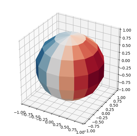
I have a grid of longitudes and latitudes of a visible hemisphere as well as a function of those longitudes and latitudes. I would like to plot a “disco ball” with the color of each facet/grid point representing the value of the function. The grid is initialized like so:
longs = np.linspace(-np.pi, np.pi, 15)
lats = np.linspace(-np.pi, np.pi, 15)u, v = np.meshgrid(longs, lats)
and the function is something like:
func = N * np.sin(u) * np.cos(v).
At first, I tried to project these onto (x,y) coordinates and plot with pcolormesh, however the cells are not centered on my grid points. The following code yields the below plot:
plt.figure(figsize=(8,6))
#plot the grid points
plt.plot(x, y, ‘ko’)
#colormesh
plt.pcolormesh(x, y, func, cmap=‘RdBu_r’)
plt.colorbar()
plt.show()
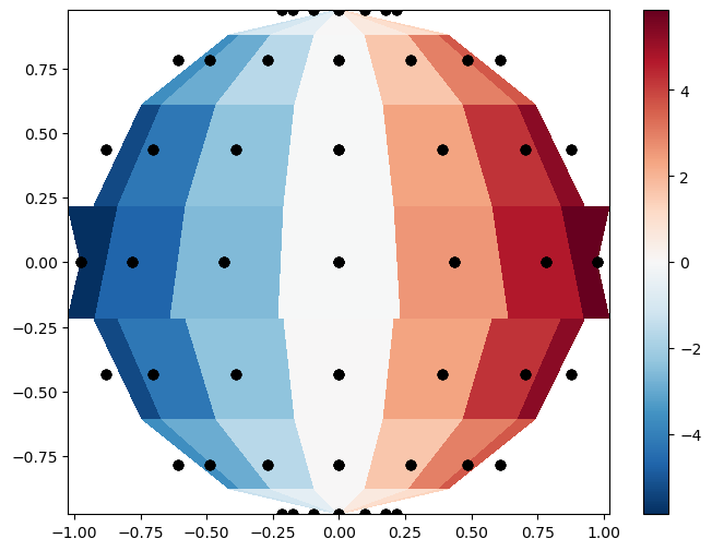
As can be seen, near the edges, the cells aren’t centered on the black grid points, and there is an odd behavior near the equator.
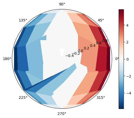
I then tried converting to polar coordinates to see if that would help. In terms of cell location, things are better, but there is still some odd behavior as shown in the picture:
phi = np.arctan2(y,x)
Rs = np.sqrt(x2 + y2)
theta = np.arcsin(Rs)fig = plt.figure()
fig.add_axes([0.1,0.1,0.8,0.8],polar=True)
plt.pcolormesh(phi, Rs , func, shading=‘nearest’, cmap=‘RdBu_r’)
plt.colorbar()
plt.show()
How can I fix these behaviors and/or is there a better way for me to create this visualization?