Cc:
cc:
Reply-To:
In-Reply-To: <[email protected]...>
X-PGP-Key: http://pirsquared.org/PaulIvanov0F3E28F7.asc
Francois Maltey, on 2011-02-02 15:51, wrote:
Hello,
I use matplolib by the mathematical system Sage in order to plot a function.
The Sage code calls matplotlib and uses its options : The Sage command is
plot (sin, x, -5, 5)
I add labels par axes_labels or remove axes by :
plot (sin(x), x, -5, 5, axes_label = ['x', 'y'])
plot (sin(x), x, -5, 5, axes=false)
French users (and maybe others) uses arrows and not lines for axes.
I'm looking for a plot (sin(x), x, -5, 5, axes="arrows")
Is there a pretty way to get these arrows. The result of this code isn't
so fine.
length, width and color don't match.
plot (sin(x), x, -5, 5, axes=false) + arrow ((-5,0),(5,0)) + arrow
((0,-1),(0,1))
What options do you propose ?
I don't find relevant answers in the archive.
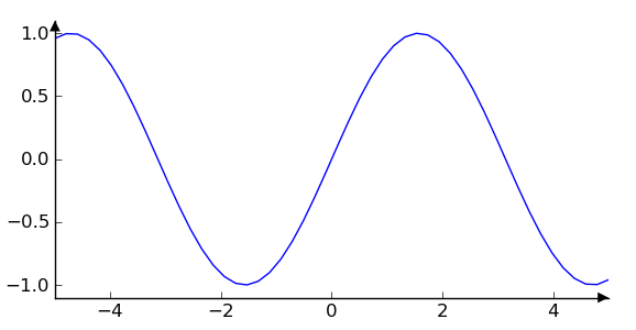
Hi Francois,
I'm not sure I understand - but do you want the arrows at the end
of the axes spines? I don't think there's a direct way to adjust
the spines to become arrows at the moment, but we can remedy that
by making annotations in axes coordinates. The important thing
to know here is that in axes coordinates, which are always
between 0-1, spine endpoints are at these locations: (0,0),
(0,1), (1,0), and (1,1). Here's the code, and attached is the
resulting image
import matplotlib.pyplot as plt
ax = plt.subplot(1,1,1)
al = 7 # arrow length in points
arrowprops=dict(clip_on=False, # plotting outside axes on purpose
frac=1., # make end arrowhead the whole size of arrow
headwidth=al, # in points
facecolor='k')
kwargs = dict(
xycoords='axes fraction',
textcoords='offset points',
arrowprops= arrowprops,
)
ax.annotate("",(1,0),xytext=(-al,0), **kwargs) # bottom spine arrow
ax.annotate("",(0,1),xytext=(0,-al), **kwargs) # left spin arrow
# hide the top and right spines
[sp.set_visible(False) for sp in ax.spines['top'],ax.spines['right']]
#hide the right and top tick marks
ax.yaxis.tick_left()
ax.xaxis.tick_bottom()
x = np.linspace(-5,5,50)
ax.plot(x, np.sin(x))
# adjust the view a little bit
ax.set_xlim(-5,5)
ax.set_ylim(-1.1,1.1)
plt.draw()
I'm not familiar with how SAGE exposes matplotlib functionality,
though, since the syntax you used differs from how matplotlib is
utilized.
best,
···
From: Paul Ivanov <[email protected]...>
To: Francois Maltey <[email protected]...>
Subject: Re: [Matplotlib-users] Is it possible to plot axes with arrows ?
--
Paul Ivanov
314 address only used for lists, off-list direct email at:
http://pirsquared.org | GPG/PGP key id: 0x0F3E28F7