Can anyone guide me how to format the x-axis with date and time.
Here is the graphic as I currently do it::
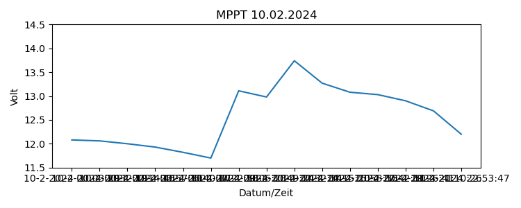
This is the data file (csv):
DateTime,Stat,Volt,Amp,VPv
10-2-2024 00:03:29,0,12.08,0,0
10-2-2024 00:32:19,0,12.06,0,0
10-2-2024 02:14:45,0,12,0,0
10-2-2024 03:57:31,0,11.93,0,0
10-2-2024 05:40:07,0,11.82,0,0
10-2-2024 07:22:58,3,11.7,0.1,13.32
10-2-2024 09:06:23,3,13.11,16.1,30.8
10-2-2024 10:49:24,3,12.98,7.5,29.95
10-2-2024 12:32:34,3,13.74,33.6,27.1
10-2-2024 14:15:20,3,13.27,6.4,29.42
10-2-2024 15:58:55,3,13.08,0.3,15.46
10-2-2024 17:42:51,0,13.03,0,0
10-2-2024 19:26:41,0,12.9,0,0
10-2-2024 21:10:26,0,12.69,0,0
10-2-2024 22:53:47,0,12.2,0,0
Here my code:
#!/usr/bin/python

# Import
import datetime
import pandas as pd
from matplotlib import pyplot as plt
from datetime import timedelta

# Datumstrings definieren
filedatum = datetime.datetime.now()
datumg = filedatum - timedelta(days = 1)
datumgestern = datumg.strftime('%d.%m.%Y')

# Diagramm formatieren
plt.rcParams["figure.figsize"] = [7.50, 3.00]
plt.rcParams["figure.autolayout"] = True

#Lesen Heutedatei
columns = ["DateTime", "Volt"]
df = pd.read_csv("heute_kom_test.csv", usecols=columns)

# Diagramm drucken
plt.plot(df.DateTime, df.Volt)
plt.ylabel('Volt')
plt.xlabel('Datum/Zeit')
plt.title('MPPT '+ datumgestern)
plt.ylim(11.5,14.5)

plt.savefig('/home/horst/xachse/xachse_gestern.png')
First, I would have liked to put limits on the x-axis
Thanks,
Horst