Dear all,
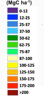
In the colorbar label for contourf or imshow plot, I want the effect like that in the attached figure. Is there some way to move the position of colorbar label? could someone give any hints?
Thanks!
Chao
···
–
Chao YUE
Laboratoire des Sciences du Climat et de l’Environnement (LSCE-IPSL)
UMR 1572 CEA-CNRS-UVSQ
Batiment 712 - Pe 119
91191 GIF Sur YVETTE Cedex
Tel: (33) 01 69 08 29 02; Fax:01.69.08.77.16
Chao,
It's not clear what you mean. What's distinctive about the image you
attached? Is it:
- The ranges of values listed to the side?
- The discrete blocks for each value range?
- The units being listed above the colorbar?
I think I can help you do any of those things. I just need to know
what you're specifically trying to do.
-paul
···
On Sat, Nov 10, 2012 at 6:25 AM, Chao YUE <[email protected]...> wrote:
Dear all,
In the colorbar label for contourf or imshow plot, I want the effect like
that in the attached figure. Is there some way to move the position of
colorbar label? could someone give any hints?
Thanks a lot Paul. Oh, I even didn’t think about the second point raised by you. but it would be great to have.
The
main point is the first point raised by you, I just didn’t know how to put the label (in the example figure it’s value range) exactly beside the colorbar. In the attached figure you can see the labels (here the label is a number) are put at the place of connection interface of two different colors but not beside the colorbar. like for the first top blue block, I would like to have 0-10 beside it, but not to put 0 at the
top and 10 at the bottom. I hope I am clear.
The code that generate attached figure is here:
a = np.arange(100).reshape(10,10)
contourf(a,levels=np.arange(0,
101,10))
cbar = colorbar()
cbar.set_ticks(np.arange(0,101,10))
cbar.set_ticklabels(np.arange(0,101,10))
could you please indicate how can I have the first and second points raised by you?
thanks a lot!
Chao
···
On Sat, Nov 10, 2012 at 4:53 PM, Paul Hobson <pmhobson@…1972…> wrote:
On Sat, Nov 10, 2012 at 6:25 AM, Chao YUE <chaoyuejoy@…2015…87…> wrote:
Dear all,
In the colorbar label for contourf or imshow plot, I want the effect like
that in the attached figure. Is there some way to move the position of
colorbar label? could someone give any hints?
Chao,
It’s not clear what you mean. What’s distinctive about the image you
attached? Is it:
-
The ranges of values listed to the side?
-
The discrete blocks for each value range?
-
The units being listed above the colorbar?
I think I can help you do any of those things. I just need to know
what you’re specifically trying to do.
-paul
–
Chao YUE
Laboratoire des Sciences du Climat et de l’Environnement (LSCE-IPSL)
UMR 1572 CEA-CNRS-UVSQ
Batiment 712 - Pe 119
91191 GIF Sur YVETTE Cedex
Tel: (33) 01 69 08 29 02; Fax:01.69.08.77.16
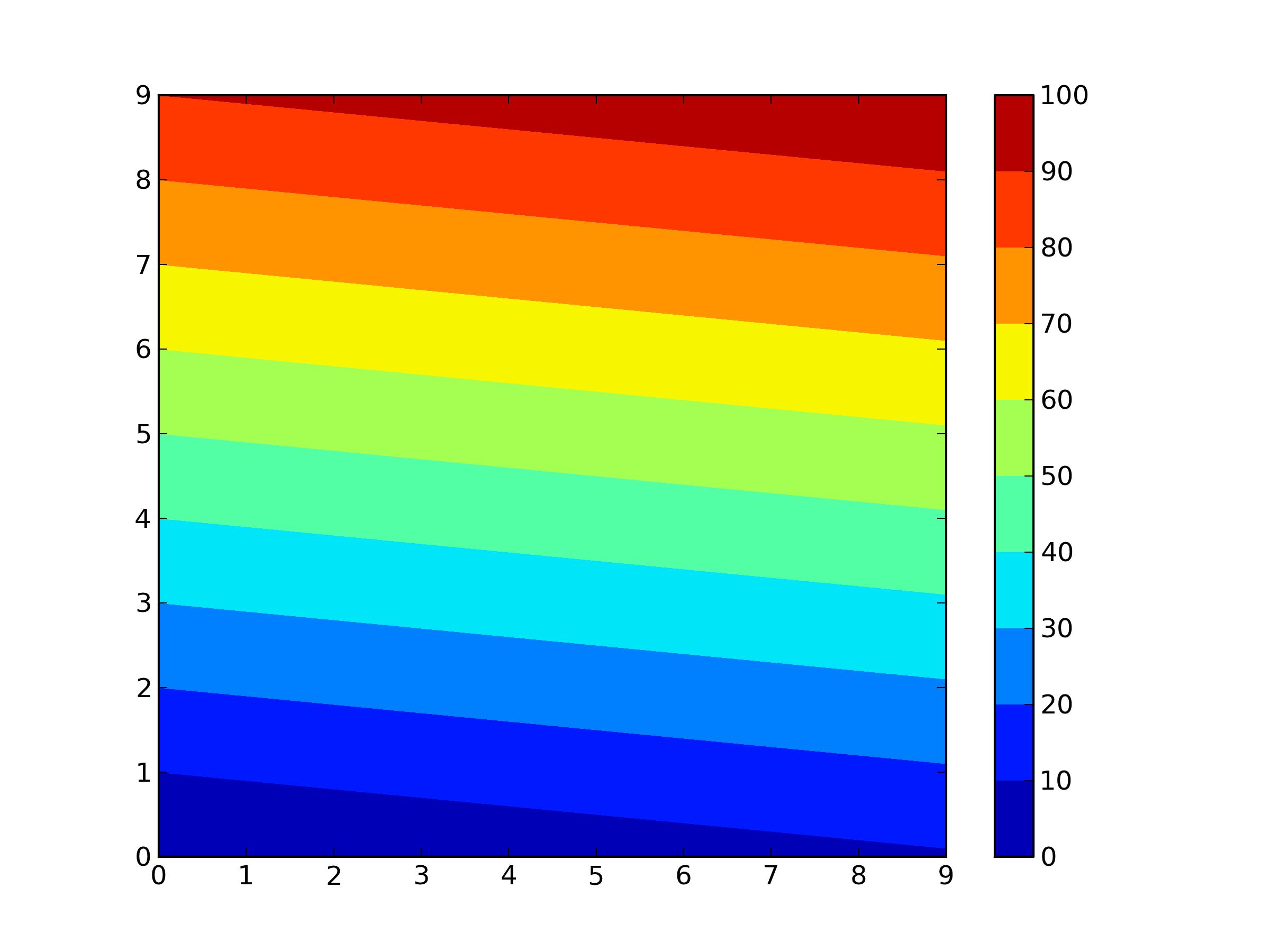
I have a bit progress, but still not very well.
#to have a contourf plot
a = np.arange(100).reshape(10,10)
cbarlevel=np.arange(0,101,10)
contourf(a,levels=cbarlevel)
cbar = colorbar()
cbar.set_ticks(cbarlevel)
#to manipulate the range:
cbar_label = []
for i in range(len(cbarlevel)-1):
cbar_label.append("{0}-{1}".format(cbarlevel[i],cbarlevel[i+1]))
cbar_label.append('')
In [54]: print cbar_label
['0-10', '10-20', '20-30', '30-40', '40-50', '50-60', '60-70', '70-80',
'80-90', '90-100', '']
#Then to apply on the colorbar:
cbar.set_ticklabels(cbar_label)
The generated figure is attached. But how can I put the labels a little bit
upward to make them parallel with the respective small rectangles in the
colorbar? <http://matplotlib.1069221.n5.nabble.com/file/n39786/fig.jpg>
···
--
View this message in context: http://matplotlib.1069221.n5.nabble.com/how-to-put-colorbar-label-beside-the-handle-tp39705p39786.html
Sent from the matplotlib - users mailing list archive at Nabble.com.
Chao,
The secret is positioning your ticks. I list here an untested attempt at putting the labels at the average of the current and next levels:
cbar.set_ticks((cbarlevel[1:]+cbarlevel[:-1])/2.)
Because you have less ticks, then you will want to remove the line
cbar_level.append('')
Hope that helps,
Sterling
···
On Nov 16, 2012, at 7:46AM, ChaoYue wrote:
I have a bit progress, but still not very well.
#to have a contourf plot
a = np.arange(100).reshape(10,10)
cbarlevel=np.arange(0,101,10)
contourf(a,levels=cbarlevel)
cbar = colorbar()
cbar.set_ticks(cbarlevel)
#to manipulate the range:
cbar_label =
for i in range(len(cbarlevel)-1):
cbar_label.append("{0}-{1}".format(cbarlevel[i],cbarlevel[i+1]))
cbar_label.append('')
In [54]: print cbar_label
['0-10', '10-20', '20-30', '30-40', '40-50', '50-60', '60-70', '70-80',
'80-90', '90-100', '']
#Then to apply on the colorbar:
cbar.set_ticklabels(cbar_label)
The generated figure is attached. But how can I put the labels a little bit
upward to make them parallel with the respective small rectangles in the
colorbar? <http://matplotlib.1069221.n5.nabble.com/file/n39786/fig.jpg>
--
View this message in context: http://matplotlib.1069221.n5.nabble.com/how-to-put-colorbar-label-beside-the-handle-tp39705p39786.html
Sent from the matplotlib - users mailing list archive at Nabble.com.
------------------------------------------------------------------------------
Monitor your physical, virtual and cloud infrastructure from a single
web console. Get in-depth insight into apps, servers, databases, vmware,
SAP, cloud infrastructure, etc. Download 30-day Free Trial.
Pricing starts from $795 for 25 servers or applications!
http://p.sf.net/sfu/zoho_dev2dev_nov
_______________________________________________
Matplotlib-users mailing list
[email protected]
matplotlib-users List Signup and Options