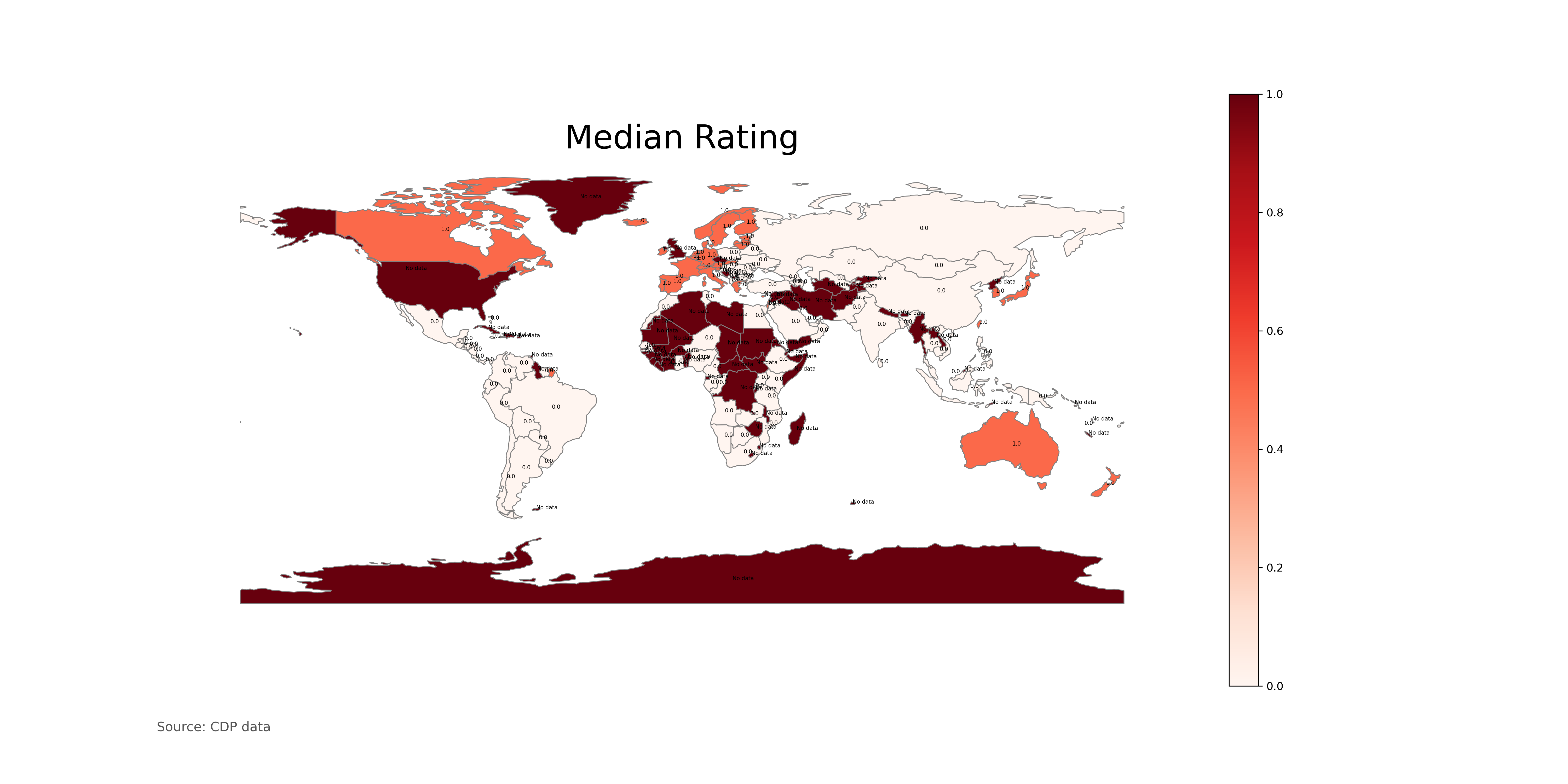
Using this code * see attachment *, I have built this map where the color scale is white = 0 (undeveloped countries) and red = 1 (developed countries), only the map colors me in fire red even the states where it is not I have the data. How do I make a gray or black color those states that no data ???
import matplotlib
map_df.plot()
datafile = (r"/Users/airpier/Desktop/PWCDP/datasetcdp0.csv")
df = pd.read_csv(datafile, skiprows = 0, sep=';')
df.head()
data_for_map = df.rename(index=str, columns={'CountryName': 'Country', 'median_rating': 'rating'})
data_for_map.head()
merged = map_df.set_index('NAME').join(data_for_map.set_index('Country'))
merged.fillna('No data', inplace = True)
merged
%matplotlib inline
from matplotlib import pyplot as plt
variable = ('IMF_adv_econ')

# set the range for the choropleth
vmin, vmax = [0,1]
# create figure and axes for Matplotlib
fig, ax = plt.subplots(1, figsize=(20, 10))

# create map
merged.plot(column=variable, cmap='Reds', linewidth=0.8, ax=ax, edgecolor='0.5')

for _,region in merged.iterrows():
    if pd.notna(region['IMF_adv_econ']):
        ax.annotate(region['IMF_adv_econ'],
                      xy=(region.geometry.centroid.x,
                      region.geometry.centroid.y),fontsize=5)


# remove the axis
ax.axis('off')

# add a title
ax.set_title('Median Rating', fontdict={'fontsize': '30', 'fontweight' : '3'})
# create an annotation for the data source
ax.annotate('Source: CDP data',xy=(0.1, .08),  xycoords='figure fraction', horizontalalignment='left', verticalalignment='top', fontsize=12, color='#555555')

# Create colorbar as a legend
sm = plt.cm.ScalarMappable(cmap='Reds', norm=plt.Normalize(vmin=vmin, vmax=vmax))
# empty array for the data range
sm._A = []
# add the colorbar to the figure
cbar = fig.colorbar(sm)

fig.savefig('map_export.png', dpi=300)