I’m a beginning learner to Matplotlib and I’m confused about how to plot the “endpoint ticks” of a given line chart with Matplotlib.
Here is my sample script:
import matplotlib.pyplot as plt
import numpy as np
import matplotlib
from matplotlib import rc
rc(‘mathtext’, default=‘regular’)
matplotlib.rcParams.update({‘font.family’: ‘Times New Roman’})fig, ax = plt.subplots()
ax.grid()
x = np.linspace(-np.pi, np.pi, 100)
x_ticks = np.arange(-3, 3, 0.5)
y_ticks = np.arange(-1, 1, 0.25)
plt.xticks(x_ticks)
plt.yticks(y_ticks)
ax.set_xlabel(‘X Axis’)
ax.set_ylabel(‘Y Axis’)
plt.plot(x, np.sin(x)np.cos(2x + 1), label = ‘Sin() Function’, color = ‘#27408b’, linewidth = 2.5)
plt.legend()plt.title(“Template Plotting for Sin() Function”)
plt.show()
And my generated plot is shown below:
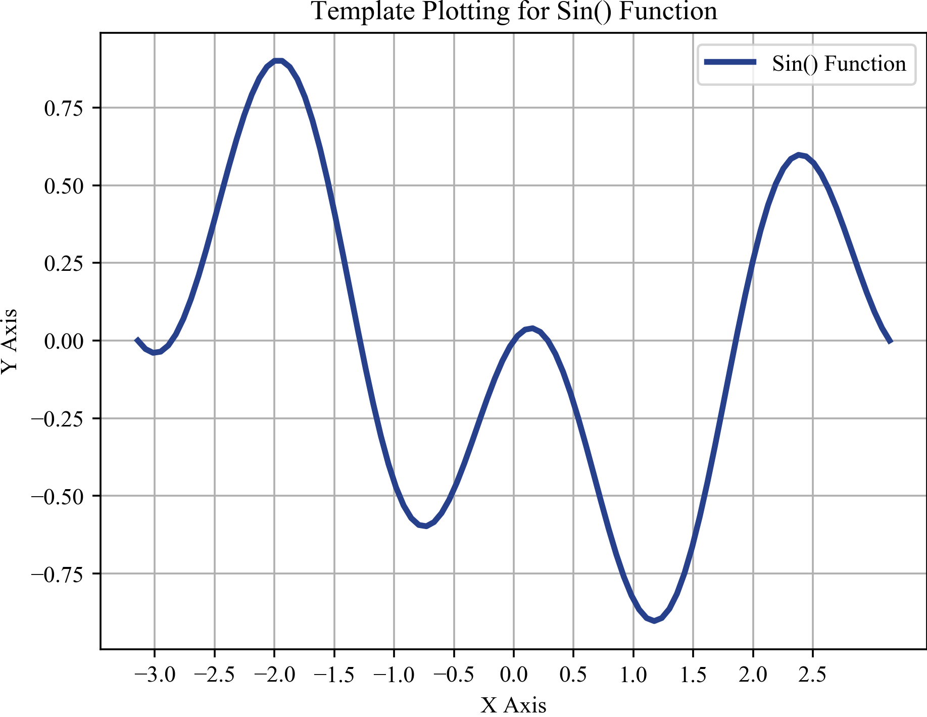
From this plot, we can find the “endpoint ticks” (x=3.0, y=1/-1) of the chart are missing.
I’ve tried several approaches including add comment “endpoint=True” into the function of np.linspace(), or set “ax.set_xticklabels” and etc. But the issue cannot be resolved properly. So how could I force the Matplotlib to display the endpoint ticks in a line chart? What is the standard approach or the widely used strategy?