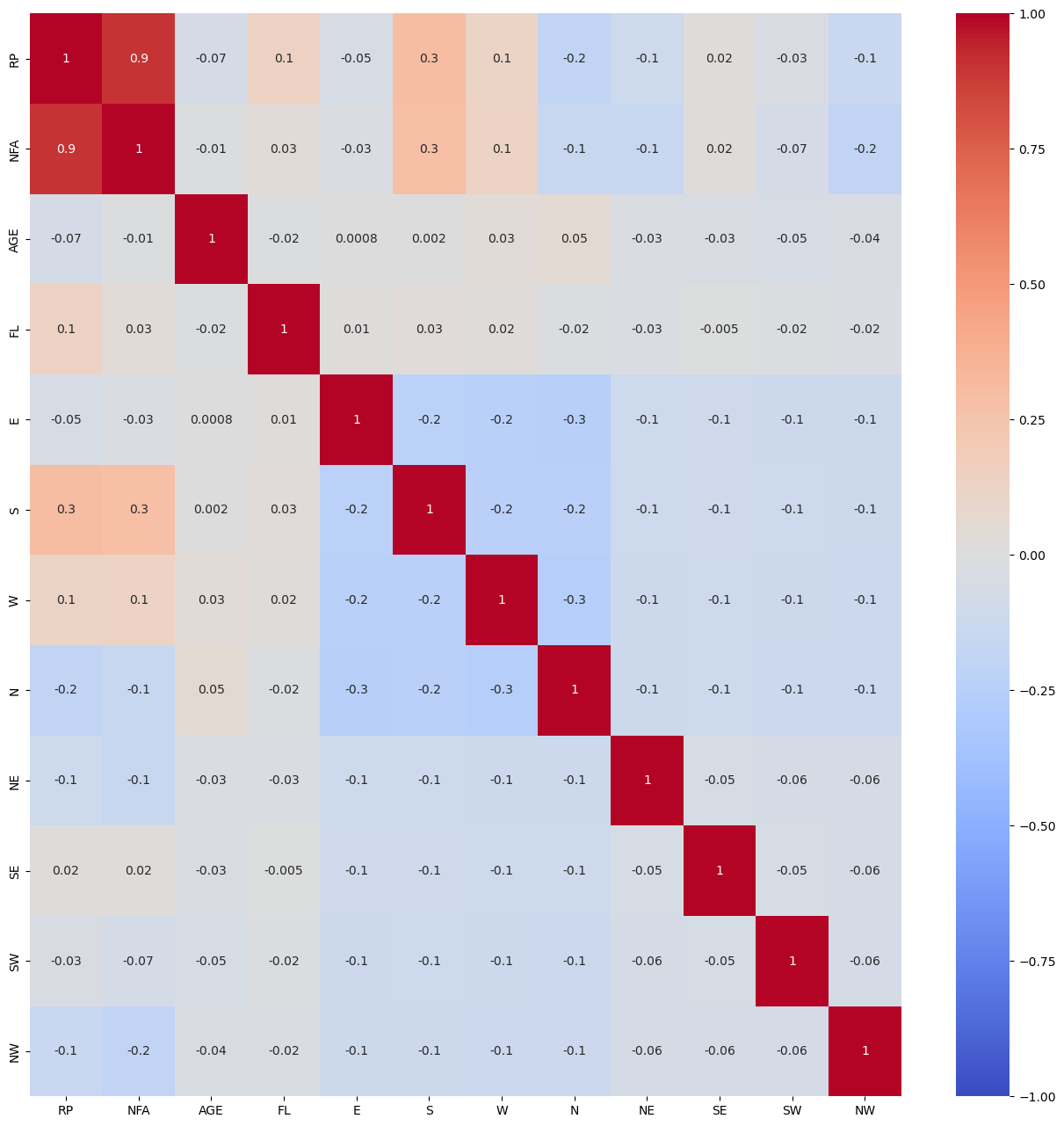
correlation plot
My codes:
plt.figure(figsize=(16, 16))
g = sns.heatmap(data.corr(), annot=True, cmap='coolwarm', fmt='.1g', vmin=-1, vmax=1, center=0)
# save correlation plot
plt.savefig('Correlation.png', dpi=600)
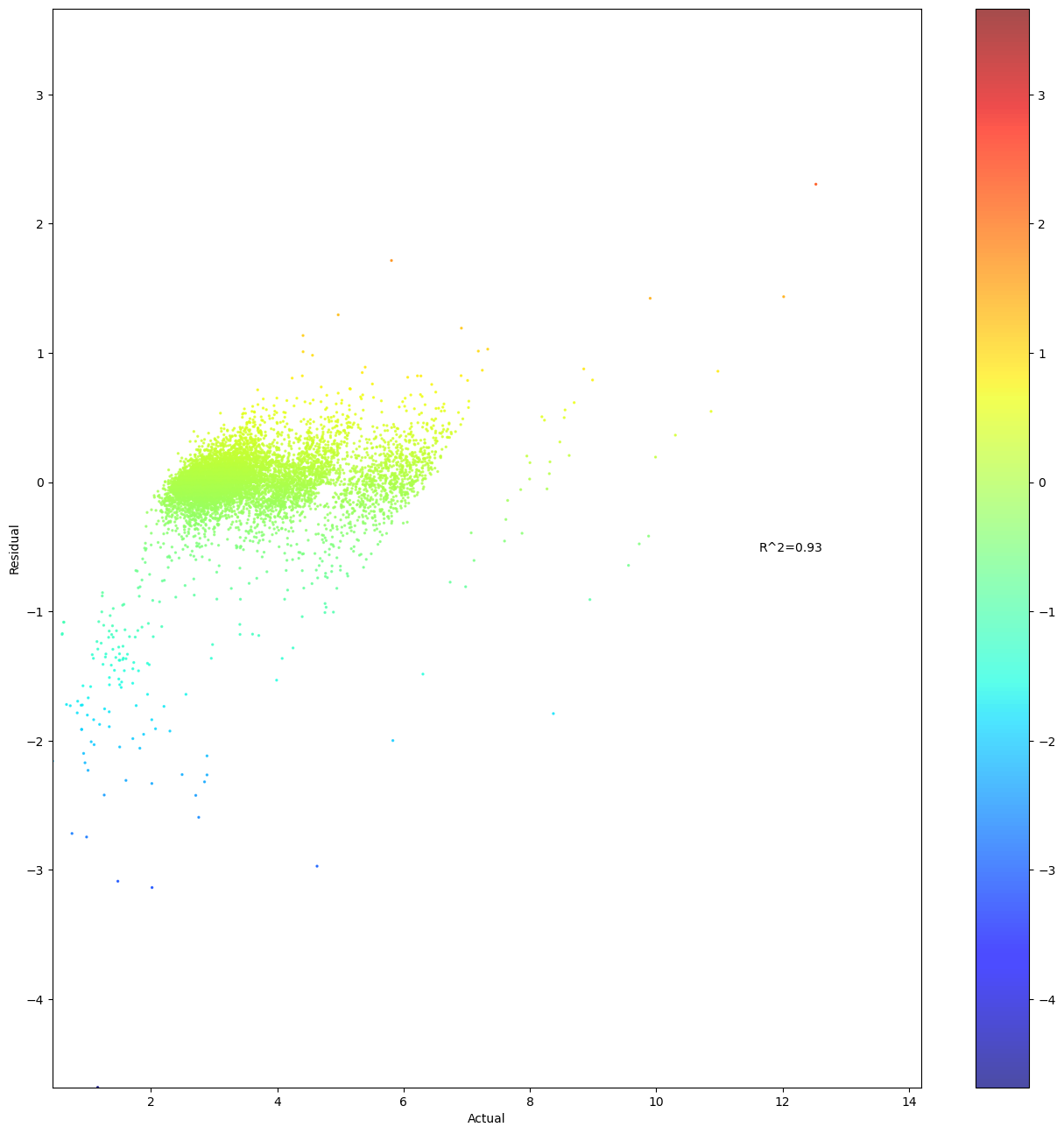
Similar question about a scatterplot of residuals and actual values with a heatmap. How can I make both axises equally long?
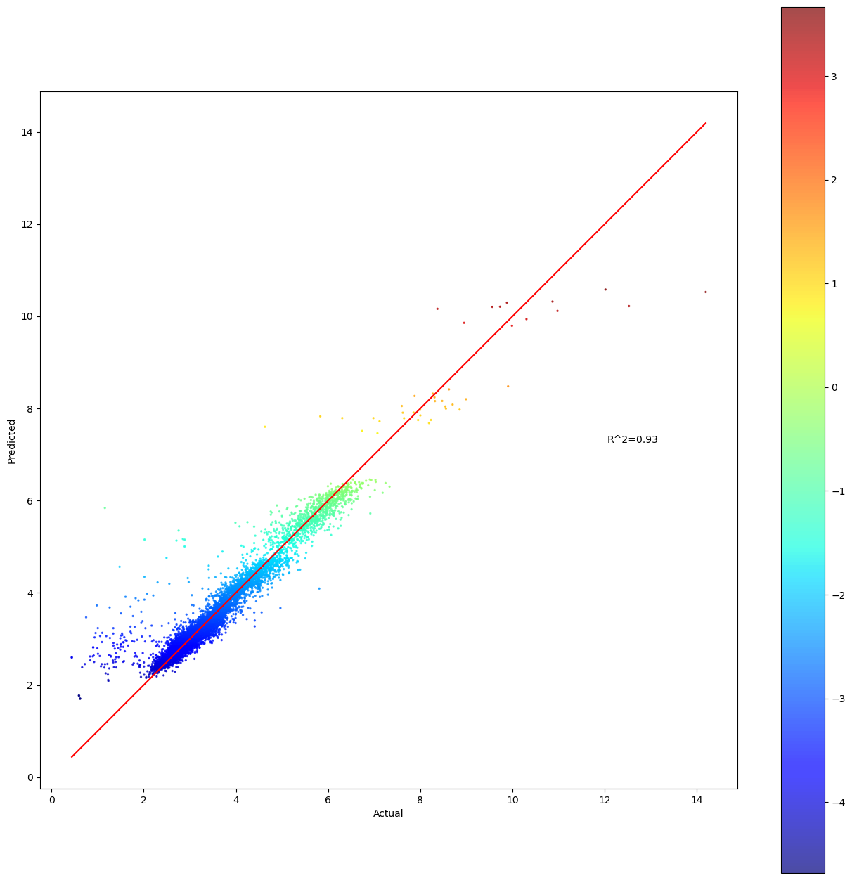
plot chart based on predicted value
fig, ax = plt.subplots()
colorsMap = ‘jet’
cm = plt.get_cmap(colorsMap)
cNorm = matplotlib.colors.Normalize(vmin=min(yhat), vmax=max(yhat))
scalarMap = cmx.ScalarMappable(norm=cNorm, cmap=cm)
ax.scatter(Y, yhat, c=scalarMap.to_rgba(yhat), s=2, alpha=0.7)
scalarMap.set_array(yhat)
fig.colorbar(scalarMap)
ax.set_xlabel(‘Actual’)
ax.set_ylabel(‘Predicted’)
ax.text(0.85, 0.5, ‘R^2=0.76’, horizontalalignment=‘center’, verticalalignment=‘center’, transform=ax.transAxes)
add diagonal line
ident = [np.min(Y), np.max(Y)]
plt.plot(ident, ident, color=‘red’)
save yhat plot
plt.savefig(‘Predicted.png’, dpi=600)