Friends,
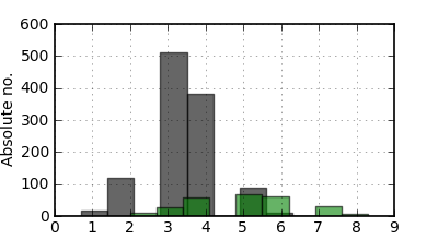
I created a histogram plot using data files that have discrete values (sample file attached ‘test.dat’).However when i view the plot, i see that the bars are not located exactly over the values. For example in the attached figure (test.png), i see a bar (gray) placed between values 1 and 2, while there is no such value between 1 and 2. Precisely i would like to know how to make histogram for discrete data values.
The following is my code.
#!/usr/bin/env python
import matplotlib.pyplot as plt
import numpy as np
import matplotlib as mpl
import matplotlib.mlab as mlb
#Creating input file list
flist=open(‘list’).read().split()
#Assignments
FIG=plt.figure(figsize=(4.,2.2),dpi=300)
FIG.subplots_adjust(hspace=0.04,wspace=0.06)
NROW=1;NCOL=1
mpl.rcParams[‘font.size’]=10
mpl.rcParams[‘lines.linewidth’]=0.8
mpl.rcParams[‘axes.linewidth’]=1.2
mpl.rcParams[‘legend.handletextpad’]=0.05
mpl.rcParams[‘legend.fontsize’]=10
mpl.rcParams[‘legend.labelspacing’]=0.009
pattern=[‘k’,‘r’]
color=[‘black’,‘green’,‘red’]
ax1=FIG.add_subplot(111)
for value in range(len(flist)):
data=np.loadtxt(flist[value])
n, bins, patches = ax1.hist(data,facecolor=color[value], alpha=0.60,visible=True,histtype=‘bar’,align=‘mid’)
ax1.grid(True,alpha=1.5)
ax1.set_ylabel(‘Absolute no.’,size=10)
plt.savefig(‘test.png’,dpi=100)
ax1.set_xlim([0,9])
plt.show()
test.dat (2.21 KB)