Hi Jerzy,
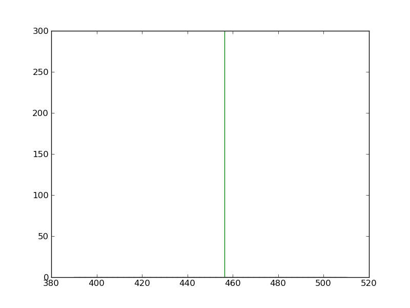
Thank you for your answer. With the code below I get only a green line (see attached line.png):
import numpy as np
import matplotlib.pyplot as plt
hist_data =
heigth = max(hist_data) + 10
mean = np.mean(hist_data)
f = plt.figure()
h = f.add_subplot(111)
h.hist(hist_data, bins=50, normed=True)
h.plot([mean,mean],[0,height])
f.savefig('myhist.png')
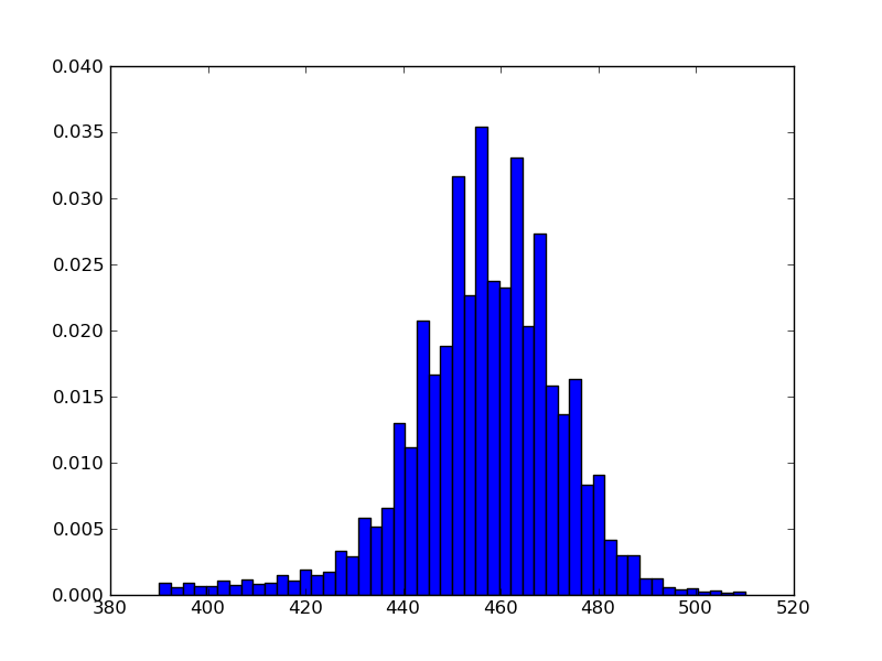
without h.plot() I get a histogram (see attached matplot_hist.png).
How can I get the line and the histogram at the same time in the picture?
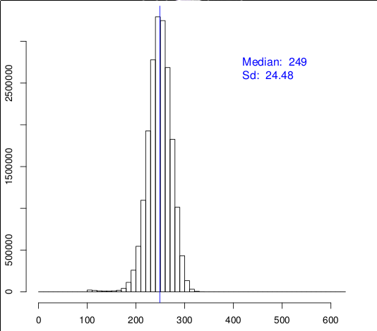
How is it possible to norm the vertical axis in order to get similar results like in this picture (see attached hist.png)?
Thank you in advance.
On Wed, Mar 7, 2012 at 6:41 PM, Jerzy Karczmarczuk <[email protected]...> wrote:
Mic:
Hello,
I am able to draw a histogram with the following code:
...
h.hist(hist_data, bins=50, normed=True)
However, I don't know how to draw a line for median at 249 position like in attachment.
Are your axes really matplotlib axes? (I have doubts, since the vertical is not normed, although your histogram is).
In your real axes, the command plot([249,249],[0,height]) draws a vertical line (there is a primitive vert. line as well), what is the problem??
Jerzy Karczmarczuk
------------------------------------------------------------------------------
Virtualization & Cloud Management Using Capacity Planning
Cloud computing makes use of virtualization - but cloud computing
also focuses on allowing computing to be delivered as a service. http://www.accelacomm.com/jaw/sfnl/114/51521223/
_______________________________________________
Matplotlib-users mailing list [email protected] matplotlib-users List Signup and Options
Nicolas Rougier, (to Mic, who can't see a histogram and a line simultaneously):
You need to specify the ylim because your height may be larger than your histogram and then you cannot see it.
I suspect something similar. The height of matplot_hist.png is 0.040. The line goes from 0 to 300. The histogram reduces to the bottom line. There is no immediate relation between max(hist_data) and the height of a *normed* histogram.
And, please, if you want to point out the difficulties in making your programs fulfil your aims, show the REAL, COMPLETE programs, perhaps with fake, random data, but without useless : "hist_data="
And don't call a mean: "median" or vice-versa...
Scaling the axes is easy. "ylim" should be changed, use also the "extent" parameter (see doc). Drawing axes shifted, as in hist.png is a bit more involved, and I don't know if you really want that as well.
Check out the axvline method (of pyplot or an axes object). You'll
only have to specify the x-value, and it'll won't rescale your y-axis.
-paul
···
On Thu, Mar 8, 2012 at 4:50 AM, Jerzy Karczmarczuk <[email protected]...> wrote:
Nicolas Rougier, (to Mic, who can't see a histogram and a line
simultaneously):
You need to specify the ylim because your height may be larger than your histogram and then you cannot see it.
I suspect something similar. The height of matplot_hist.png is 0.040.
The line goes from 0 to 300. The histogram reduces to the bottom line.
There is no immediate relation between max(hist_data) and the height of
a *normed* histogram.
And, please, if you want to point out the difficulties in making your
programs fulfil your aims, show the REAL, COMPLETE programs, perhaps
with fake, random data, but without useless : "hist_data="
And don't call a mean: "median" or vice-versa...
Scaling the axes is easy. "ylim" should be changed, use also the
"extent" parameter (see doc). Drawing axes shifted, as in hist.png is a
bit more involved, and I don't know if you really want that as well.
Jerzy K.
------------------------------------------------------------------------------
Virtualization & Cloud Management Using Capacity Planning
Cloud computing makes use of virtualization - but cloud computing
also focuses on allowing computing to be delivered as a service. http://www.accelacomm.com/jaw/sfnl/114/51521223/
_______________________________________________
Matplotlib-users mailing list [email protected] matplotlib-users List Signup and Options