Hi,
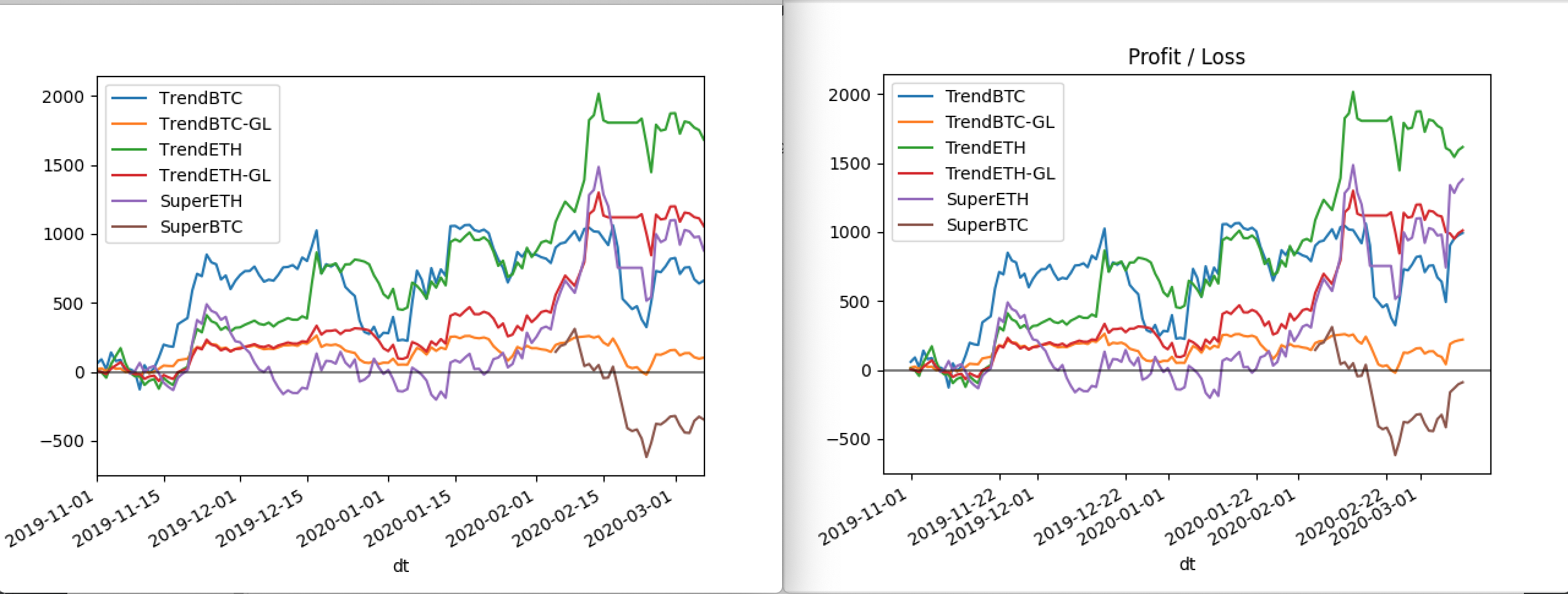
I regularly have been generating charts which looked fine, but all of a sudden some padding has appeared on the left and right of the plot, does anyone know why, and how to remove?
I also noticed the dates seem to have squashed together and the legend box text looks squashed.
I have added images of before and after. I did not change any plot code.
import pandas as pd
import matplotlib.pyplot as plt
from datetime import date

import factories

ax = plt.gca()  # get plot current axis and pass to df.plot() call to reuse

for func in factories.LAZY_STRATEGY_LIST:

    data = # get data

    df = pd.DataFrame(data)
    df['dt'] = df.timestamp.astype('int')
    df['dt'] = pd.to_datetime(df.dt, unit='s')
    df.drop(columns=['timestamp'], inplace=True)
    df.set_index('dt', inplace=True)

    cumsum = df.cumsum()
    cumsum.rename(columns={'pnl': s.name}, inplace=True)

    cumsum.plot(ax=ax)

plt.axhline(y=0, color='#000000', linestyle='-', alpha=0.5)

plt.savefig(f'plots/pnl-ALL-latest.png')
plt.savefig(f'plots/pnl-ALL-{date.today()}.png')
Thanks.