Hey guys,
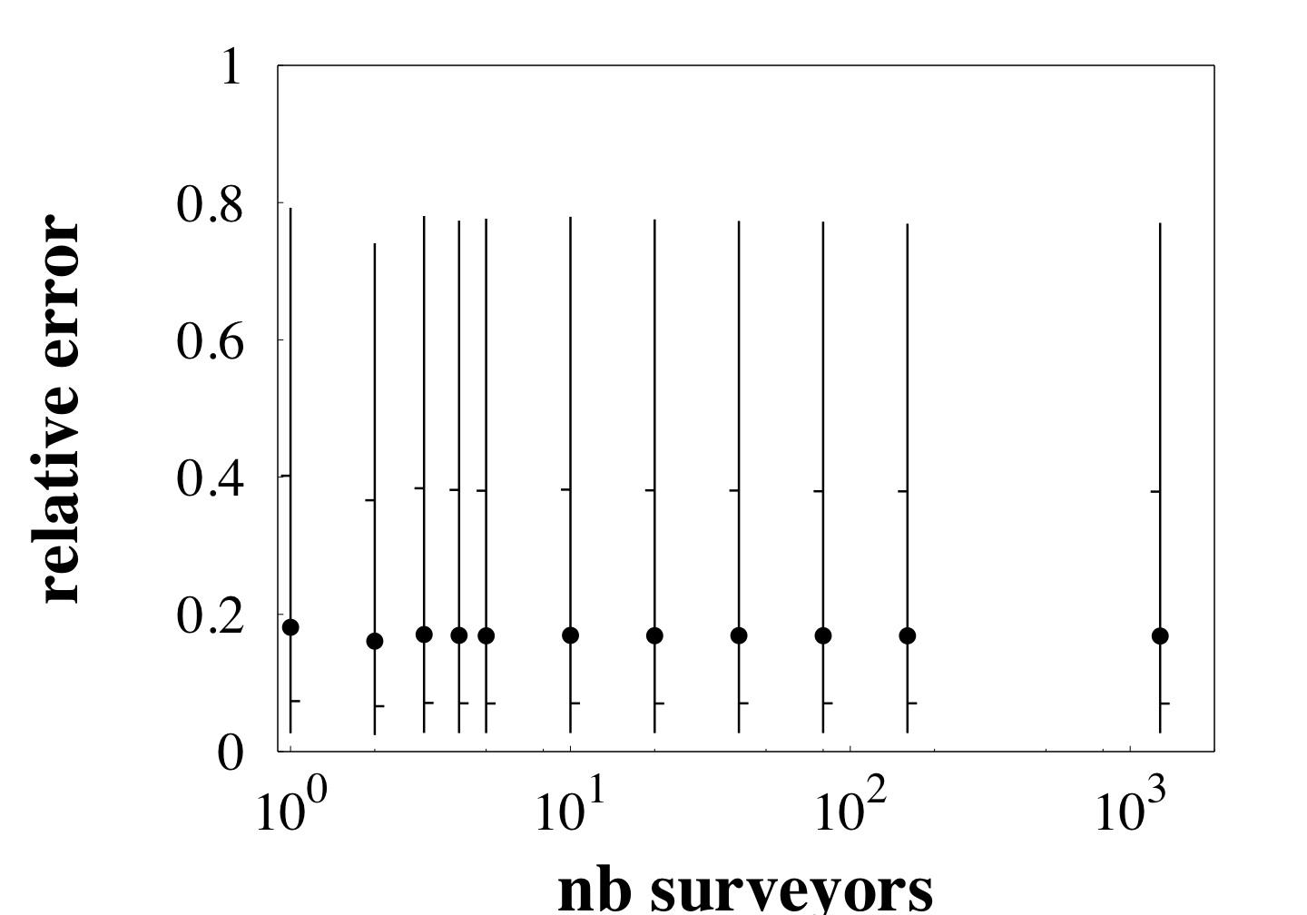
I'm trying to plot quantiles information (percentile 10, 25, 50, 75 and 90). Attached, you'll find a jpged of what I would like to do (this was done using Gnuplot): the vertical line delineates the range from the 10th to the 90th percentile. Small tick bars to either side of the lines mark some additional percentiles: bar to the left for the 25th and bar to the right for the 75th. Finally, dots mark the median.
I attempted to use matplotlib.finance modules. In particular, the candlestick stuffs are quite close to what I want. But it didn't work as the X-Axis does not correspond to a date information (X-Axis values are within the range [1:1780]).
Have you got an idea on how I can plot that using matplotlib?
Thanks in advance.
Keep on rockin'
Benoit
Benoit Donnet wrote:
Hey guys,
I'm trying to plot quantiles information (percentile 10, 25, 50, 75 and 90). Attached, you'll find a jpged of what I would like to do (this was done using Gnuplot): the vertical line delineates the range from the 10th to the 90th percentile. Small tick bars to either side of the lines mark some additional percentiles: bar to the left for the 25th and bar to the right for the 75th. Finally, dots mark the median.
I attempted to use matplotlib.finance modules. In particular, the candlestick stuffs are quite close to what I want. But it didn't work as the X-Axis does not correspond to a date information (X-Axis values are within the range [1:1780]).
Have you got an idea on how I can plot that using matplotlib?
Thanks in advance.
Keep on rockin'
Benoit
Benoit: This looks very similar to what the boxplot function does (see http://matplotlib.sourceforge.net/matplotlib.pylab.html#-boxplot and boxplot_demo.py). If you want to tweak it, the boxplot function in axes.py might be a good starting point.
-Jeff
···
--
Jeffrey S. Whitaker Phone : (303)497-6313
Meteorologist FAX : (303)497-6449
NOAA/OAR/PSD R/PSD1 Email : Jeffrey.S.Whitaker@...259...
325 Broadway Office : Skaggs Research Cntr 1D-124
Boulder, CO, USA 80303-3328 Web : Jeffrey S. Whitaker: NOAA Physical Sciences Laboratory
Thanks for the advice, Jeff. That's really what I was looking for.
I still have another question (I'm sorry for that). Is it possible to increase the linewidth of the box plot (and change the color - i.e., from blue to black)? In the documentation, I don't see any option for boxplot regarding that point (the "widths" option refers to the width of the box, not the line).
I agree it is a cosmetic question but I think it would be better in a paper if I can change the linewidth and color.
Thanks in advance.
Keep on rockin'
Benoit
···
Le 03-juil.-07 à 19:52, Jeff Whitaker a écrit :
Benoit Donnet wrote:
Hey guys,
I'm trying to plot quantiles information (percentile 10, 25, 50, 75 and 90). Attached, you'll find a jpged of what I would like to do (this was done using Gnuplot): the vertical line delineates the range from the 10th to the 90th percentile. Small tick bars to either side of the lines mark some additional percentiles: bar to the left for the 25th and bar to the right for the 75th. Finally, dots mark the median.
I attempted to use matplotlib.finance modules. In particular, the candlestick stuffs are quite close to what I want. But it didn't work as the X-Axis does not correspond to a date information (X-Axis values are within the range [1:1780]).
Have you got an idea on how I can plot that using matplotlib?
Thanks in advance.
Keep on rockin'
Benoit
Benoit: This looks very similar to what the boxplot function does (see http://matplotlib.sourceforge.net/matplotlib.pylab.html#-boxplot and boxplot_demo.py). If you want to tweak it, the boxplot function in axes.py might be a good starting point.
-Jeff
--
Jeffrey S. Whitaker Phone : (303)497-6313
Meteorologist FAX : (303)497-6449
NOAA/OAR/PSD R/PSD1 Email : Jeffrey.S.Whitaker@...259...
325 Broadway Office : Skaggs Research Cntr 1D-124
Boulder, CO, USA 80303-3328 Web : Jeffrey S. Whitaker: NOAA Physical Sciences Laboratory
--
Dr. Benoit Donnet
Université Catholique de Louvain (UCL)
Faculté des Sciences Appliquées - Département d'Ingénierie Informatique (INGI)
Place Sainte Barbe, 2
1348 Louvain-la-Neuve
Belgium
Phone: +32 10 47 87 18
Home page: http://inl.info.ucl.ac.be/donnet
Guys,
Is it possible
to increase the linewidth of the box plot (and change the color -
i.e., from blue to black)? In the documentation, I don't see any
option for boxplot regarding that point (the "widths" option refers
to the width of the box, not the line).
Looking in the matplotlib-devel mailing-list, I found a brand new version of the boxplot method (written by Rob Clewley). This method allows me to have a monochrome plot. This is quite better.
I then modified Rob's code for getting linewidth (that's 100% hacking - I'm not proud of it).
Sorry for the disturbance.
Benoit
···
I agree it is a cosmetic question but I think it would be better in a
paper if I can change the linewidth and color.
Thanks in advance.
Keep on rockin'
Benoit
Le 03-juil.-07 à 19:52, Jeff Whitaker a écrit :
Benoit Donnet wrote:
Hey guys,
I'm trying to plot quantiles information (percentile 10, 25, 50,
75 and 90). Attached, you'll find a jpged of what I would like to
do (this was done using Gnuplot): the vertical line delineates the
range from the 10th to the 90th percentile. Small tick bars to
either side of the lines mark some additional percentiles: bar to
the left for the 25th and bar to the right for the 75th. Finally,
dots mark the median.
I attempted to use matplotlib.finance modules. In particular, the
candlestick stuffs are quite close to what I want. But it didn't
work as the X-Axis does not correspond to a date information (X-
Axis values are within the range [1:1780]).
Have you got an idea on how I can plot that using matplotlib?
Thanks in advance.
Keep on rockin'
Benoit
Benoit: This looks very similar to what the boxplot function does
(see http://matplotlib.sourceforge.net/matplotlib.pylab.html#-
boxplot and boxplot_demo.py). If you want to tweak it, the boxplot
function in axes.py might be a good starting point.
-Jeff
--
Jeffrey S. Whitaker Phone : (303)497-6313
Meteorologist FAX : (303)497-6449
NOAA/OAR/PSD R/PSD1 Email : Jeffrey.S.Whitaker@...259...
325 Broadway Office : Skaggs Research Cntr 1D-124
Boulder, CO, USA 80303-3328 Web : Jeffrey S. Whitaker: NOAA Physical Sciences Laboratory
--
Dr. Benoit Donnet
Université Catholique de Louvain (UCL)
Faculté des Sciences Appliquées - Département d'Ingénierie
Informatique (INGI)
Place Sainte Barbe, 2
1348 Louvain-la-Neuve
Belgium
Phone: +32 10 47 87 18
Home page: http://inl.info.ucl.ac.be/donnet
-------------------------------------------------------------------------
This SF.net email is sponsored by DB2 Express
Download DB2 Express C - the FREE version of DB2 express and take
control of your XML. No limits. Just data. Click to get it now.
http://sourceforge.net/powerbar/db2/
_______________________________________________
Matplotlib-users mailing list
Matplotlib-users@lists.sourceforge.net
matplotlib-users List Signup and Options
--
Dr. Benoit Donnet
Université Catholique de Louvain (UCL)
Faculté des Sciences Appliquées - Département d'Ingénierie Informatique (INGI)
Place Sainte Barbe, 2
1348 Louvain-la-Neuve
Belgium
Phone: +32 10 47 87 18
Home page: http://inl.info.ucl.ac.be/donnet
Benoit,
Thanks for pointing this out. I am not a boxplot-user, but a quick look together with your post and Rob's suggests to me that some version of Rob's enhancements should be committed to svn. I think it might be possible to simplify the argument list; a bit of code review would be good.
Regarding your modification of linewidth, do you think this really needs to be yet another kwarg, or is it adequate to be able to adjust the linewidth with a line of user code after calling boxplot? The method returns a dictionary with the various lists of line objects that have been drawn, so any properties of those objects can be altered.
Perhaps a more thorough updating of boxplot would use collections instead of lists of lines. Any volunteers? I am not going to do it. This would speed it up for cases with many points, but maybe boxplot is normally used with few enough points that this doesn't matter.
Eric
Benoit Donnet wrote:
···
Guys,
Is it possible
to increase the linewidth of the box plot (and change the color -
i.e., from blue to black)? In the documentation, I don't see any
option for boxplot regarding that point (the "widths" option refers
to the width of the box, not the line).
Looking in the matplotlib-devel mailing-list, I found a brand new version of the boxplot method (written by Rob Clewley). This method allows me to have a monochrome plot. This is quite better.
I then modified Rob's code for getting linewidth (that's 100% hacking - I'm not proud of it).
Sorry for the disturbance.
Benoit
I agree it is a cosmetic question but I think it would be better in a
paper if I can change the linewidth and color.
Thanks in advance.
Keep on rockin'
Benoit
Le 03-juil.-07 � 19:52, Jeff Whitaker a �crit :
Benoit Donnet wrote:
Hey guys,
I'm trying to plot quantiles information (percentile 10, 25, 50,
75 and 90). Attached, you'll find a jpged of what I would like to
do (this was done using Gnuplot): the vertical line delineates the
range from the 10th to the 90th percentile. Small tick bars to
either side of the lines mark some additional percentiles: bar to
the left for the 25th and bar to the right for the 75th. Finally,
dots mark the median.
I attempted to use matplotlib.finance modules. In particular, the
candlestick stuffs are quite close to what I want. But it didn't
work as the X-Axis does not correspond to a date information (X-
Axis values are within the range [1:1780]).
Have you got an idea on how I can plot that using matplotlib?
Thanks in advance.
Keep on rockin'
Benoit
Benoit: This looks very similar to what the boxplot function does
(see http://matplotlib.sourceforge.net/matplotlib.pylab.html#-
boxplot and boxplot_demo.py). If you want to tweak it, the boxplot
function in axes.py might be a good starting point.
-Jeff
--
Jeffrey S. Whitaker Phone : (303)497-6313
Meteorologist FAX : (303)497-6449
NOAA/OAR/PSD R/PSD1 Email : Jeffrey.S.Whitaker@...259...
325 Broadway Office : Skaggs Research Cntr 1D-124
Boulder, CO, USA 80303-3328 Web : Jeffrey S. Whitaker: NOAA Physical Sciences Laboratory
--
Dr. Benoit Donnet
Universit� Catholique de Louvain (UCL)
Facult� des Sciences Appliqu�es - D�partement d'Ing�nierie
Informatique (INGI)
Place Sainte Barbe, 2
1348 Louvain-la-Neuve
Belgium
Phone: +32 10 47 87 18
Home page: http://inl.info.ucl.ac.be/donnet
---------------------------------------------------------------------- ---
This SF.net email is sponsored by DB2 Express
Download DB2 Express C - the FREE version of DB2 express and take
control of your XML. No limits. Just data. Click to get it now.
http://sourceforge.net/powerbar/db2/
_______________________________________________
Matplotlib-users mailing list
Matplotlib-users@lists.sourceforge.net
matplotlib-users List Signup and Options
--
Dr. Benoit Donnet
Universit� Catholique de Louvain (UCL)
Facult� des Sciences Appliqu�es - D�partement d'Ing�nierie Informatique (INGI)
Place Sainte Barbe, 2
1348 Louvain-la-Neuve
Belgium
Phone: +32 10 47 87 18
Home page: http://inl.info.ucl.ac.be/donnet
-------------------------------------------------------------------------
This SF.net email is sponsored by DB2 Express
Download DB2 Express C - the FREE version of DB2 express and take
control of your XML. No limits. Just data. Click to get it now.
http://sourceforge.net/powerbar/db2/
_______________________________________________
Matplotlib-users mailing list
Matplotlib-users@lists.sourceforge.net
matplotlib-users List Signup and Options
Eric,
Regarding your modification of linewidth, do you think this really needs to be yet another kwarg,
That's what I did (I'm not a Python expert). IMHO, this is more consistent with the existing methods (such as plot() or errorbar() ).
or is it adequate to be able to adjust the linewidth with a line of user code after calling boxplot? The method returns a dictionary with the various lists of line objects that have been drawn, so any properties of those objects can be altered.
I didn't think to change properties of returned objects
Benoit
···
Perhaps a more thorough updating of boxplot would use collections instead of lists of lines. Any volunteers? I am not going to do it. This would speed it up for cases with many points, but maybe boxplot is normally used with few enough points that this doesn't matter.
Eric
Benoit Donnet wrote:
Guys,
Is it possible
to increase the linewidth of the box plot (and change the color -
i.e., from blue to black)? In the documentation, I don't see any
option for boxplot regarding that point (the "widths" option refers
to the width of the box, not the line).
Looking in the matplotlib-devel mailing-list, I found a brand new version of the boxplot method (written by Rob Clewley). This method allows me to have a monochrome plot. This is quite better.
I then modified Rob's code for getting linewidth (that's 100% hacking - I'm not proud of it).
Sorry for the disturbance.
Benoit
I agree it is a cosmetic question but I think it would be better in a
paper if I can change the linewidth and color.
Thanks in advance.
Keep on rockin'
Benoit
Le 03-juil.-07 à 19:52, Jeff Whitaker a écrit :
Benoit Donnet wrote:
Hey guys,
I'm trying to plot quantiles information (percentile 10, 25, 50,
75 and 90). Attached, you'll find a jpged of what I would like to
do (this was done using Gnuplot): the vertical line delineates the
range from the 10th to the 90th percentile. Small tick bars to
either side of the lines mark some additional percentiles: bar to
the left for the 25th and bar to the right for the 75th. Finally,
dots mark the median.
I attempted to use matplotlib.finance modules. In particular, the
candlestick stuffs are quite close to what I want. But it didn't
work as the X-Axis does not correspond to a date information (X-
Axis values are within the range [1:1780]).
Have you got an idea on how I can plot that using matplotlib?
Thanks in advance.
Keep on rockin'
Benoit
Benoit: This looks very similar to what the boxplot function does
(see http://matplotlib.sourceforge.net/matplotlib.pylab.html#-
boxplot and boxplot_demo.py). If you want to tweak it, the boxplot
function in axes.py might be a good starting point.
-Jeff
--
Jeffrey S. Whitaker Phone : (303)497-6313
Meteorologist FAX : (303)497-6449
NOAA/OAR/PSD R/PSD1 Email : Jeffrey.S.Whitaker@...259...
325 Broadway Office : Skaggs Research Cntr 1D-124
Boulder, CO, USA 80303-3328 Web : Jeffrey S. Whitaker: NOAA Physical Sciences Laboratory
--
Dr. Benoit Donnet
Université Catholique de Louvain (UCL)
Faculté des Sciences Appliquées - Département d'Ingénierie
Informatique (INGI)
Place Sainte Barbe, 2
1348 Louvain-la-Neuve
Belgium
Phone: +32 10 47 87 18
Home page: http://inl.info.ucl.ac.be/donnet
---------------------------------------------------------------------- ---
This SF.net email is sponsored by DB2 Express
Download DB2 Express C - the FREE version of DB2 express and take
control of your XML. No limits. Just data. Click to get it now.
http://sourceforge.net/powerbar/db2/
_______________________________________________
Matplotlib-users mailing list
Matplotlib-users@lists.sourceforge.net
matplotlib-users List Signup and Options
--
Dr. Benoit Donnet
Université Catholique de Louvain (UCL)
Faculté des Sciences Appliquées - Département d'Ingénierie Informatique (INGI)
Place Sainte Barbe, 2
1348 Louvain-la-Neuve
Belgium
Phone: +32 10 47 87 18
Home page: http://inl.info.ucl.ac.be/donnet
-------------------------------------------------------------------------
This SF.net email is sponsored by DB2 Express
Download DB2 Express C - the FREE version of DB2 express and take
control of your XML. No limits. Just data. Click to get it now.
http://sourceforge.net/powerbar/db2/
_______________________________________________
Matplotlib-users mailing list
Matplotlib-users@lists.sourceforge.net
matplotlib-users List Signup and Options
--
Dr. Benoit Donnet
Université Catholique de Louvain (UCL)
Faculté des Sciences Appliquées - Département d'Ingénierie Informatique (INGI)
Place Sainte Barbe, 2
1348 Louvain-la-Neuve
Belgium
Phone: +32 10 47 87 18
Home page: http://inl.info.ucl.ac.be/donnet