Hi Russ,
Russ Dill, on 2012-01-21 13:30, wrote:
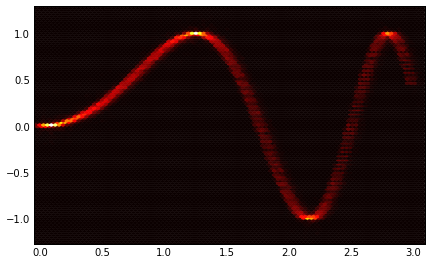
I'm using matplotlib from pylab to generate eye patterns for signal
simulations. My output pretty much looks like this:
http://www.flickr.com/photos/31208937@...3933.../6079131690/
Its pretty useful as it allows one to quickly see the size of the eye
opening, the maximum/minimum voltage, etc. I'd really like to be able
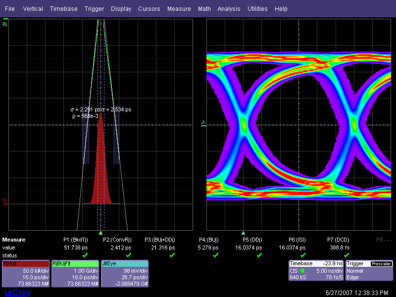
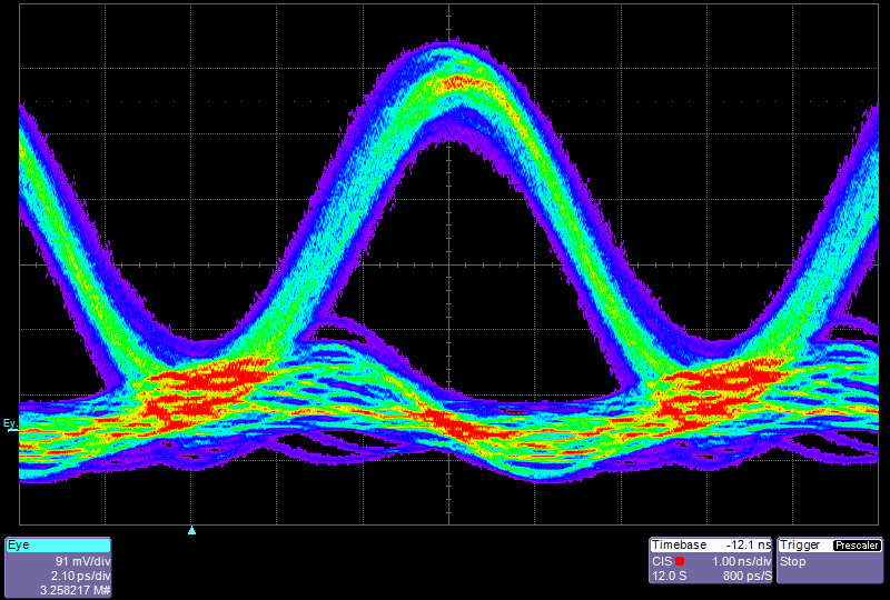
to create a heat diagram, like these:
http://www.lecroy.com/images/oscilloscope/series/waveexpert/opening-spread2_lg.jpg
http://www.lecroy.com/images/oscilloscope/series/waveexpert/opening-spread1_lg.jpg
http://www.iec.org/newsletter/august07_2/imgs/bb2_fig_1.gif
Intel® FPGAs and Programmable Devices-Intel® FPGA
Is there any way within matplotlib to do that right now?
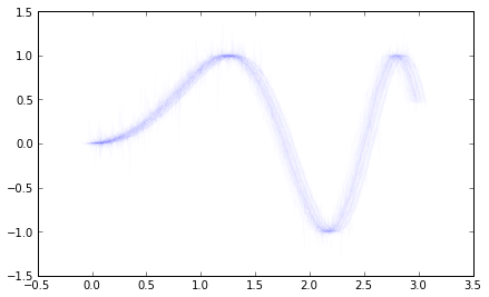
the quick and dirty way to get close to what you want is to add
an alpha value to the lines you're already plotting. Here's a
small example:
x = np.arange(0,3,.01)
y = np.sin(x**2)
all_x,all_y = ,
ax = plt.gca()
for i in range(100):
noisex = np.random.randn(1)*.04
noisey = (np.random.randn(x.shape[0])*.2)**3
ax.plot(x+noisex,y+noisey, color='b', alpha=.01)
all_x.append(x+noisex)
all_y.append(y+noisey)
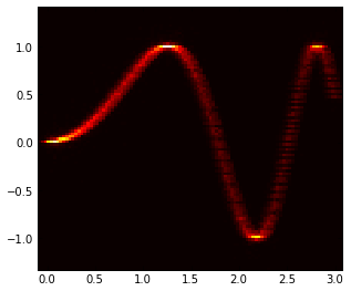
To get a heat diagram, as was suggested, you can use a 2d
histogram.
plt.figure()
all_x =np.array(all_x)
all_y = np.array(all_y)
all_x.shape = all_y.shape = -1
H, yedges, xedges = np.histogram2d(all_y, all_x, bins=100)
extent = [xedges[0], xedges[-1], yedges[-1], yedges[0]]
ax = plt.gca()
plt.hot()
ax.imshow(H, extent=extent, interpolation='nearest')
ax.invert_yaxis()
I'm attaching the two images for reference
best,
···
--
Paul Ivanov
314 address only used for lists, off-list direct email at:
http://pirsquared.org | GPG/PGP key id: 0x0F3E28F7