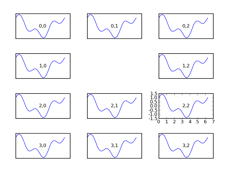
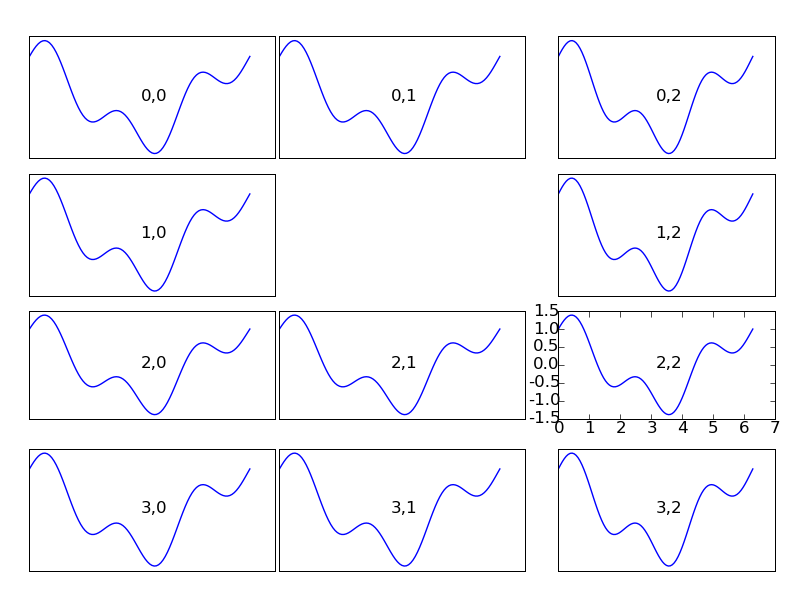
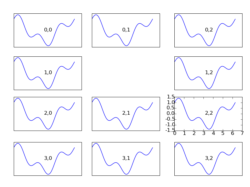
I have implemented (experimental) support for auto-shrinking of axes to prevent their tick labels, axis labels and titles from overlapping other axes. It's been tested on everything in backend_driver.py and seems to work fairly well, with a few minor glitches related to fixed aspect ratio axes and colorbars.
The important user-visible change is that the position of an axes (as set by axes([l, b, w, h])) is now inclusive of the axis labels, tick labels and axes title. The auto-layout algorithm prevents (well, reduces) any of the text from going outside of that bounds. I couldn't figure out a good to maintain the old convention, where the axes position is the position of only the "data" area, since it makes it unclear, particularly with multi-axes figures, when text should be considered "out of bounds". With respect to the examples, this only affected a few of them where the position of the axes was manually nudged to make room for text. Simply removing those lines results in better-looking plots. Maybe this API change doesn't matter, but if it does, we can brainstorm ways around it. I'd prefer not to keep both ways alive indefinitely, but perhaps there is a good argument for that anyway.
One of the considerations I made was to keep the axes aligned with one another. For example, if you have two axes stacked on top of one another, and one axes has large numbers on the y-axis, but the other does not, the left edge of both axes' data areas should remain aligned. The layout algorithm ensures that if an edge of an axes was aligned with other axes to begin with, it will always remain so. This applies whether the axes position was specified with "axes([l, b, w, h])" or "subplot(121)", or "axes().set_position([l, b, w, h])".
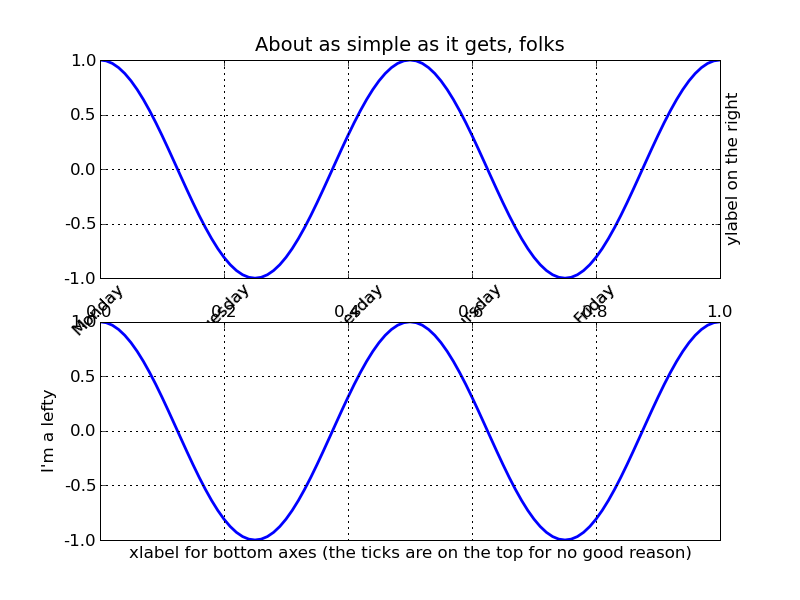
Attached is an example where tick labels have been put in weird places to demonstrate how all this works, with before and after pictures.
Cheers,
Mike
auto_layout.py (835 Bytes)
···
--
Michael Droettboom
Science Software Branch
Operations and Engineering Division
Space Telescope Science Institute
Operated by AURA for NASA