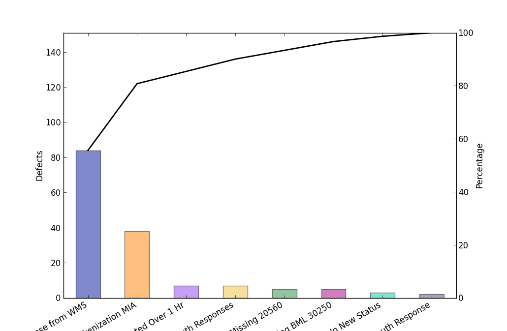
1. The scale is wrong. Imagine that you can stack all the bars on top of
each other. When stacked, all the bars should fill in the graph exactly. In
other words: ax1.set_ylim = sum(defects). See my original, or the wiki page.
2. The line starts in the middle of the bar. It needs to start on top, in
the middle.
I think pareto charts are supposed to be percentages, not totals.
data = [83, 38, 7, 5, 5, 4, 4, 2, 1]
labels = ["Vertical", "Horizontal", "Upper", "Lower", "Left", "Right",
"Behind", "Front", "Down"]
colors = ["#001499", "#ff7f00", "#9440ed", "#edc240", "#238c3f",
"#a60085", "#00cca3", "#464f8c", "#005947", "#00004d",
"#cc0052", "#591616", "#7d8060", "#299da6", "#9c8fbf",
"#4c132a", "#8c3f23", "#85cc33", "#607980", "#7c30bf", "#bf9360",
"#324d13", "#13394d", "#4c1659", "#b25f00", "#99cca7",
"#669ccc", "#594358"]
fig, ax1 = plt.subplots()
ax2 = ax1.twinx()
for i, d in enumerate(data):
ax1.bar(i + .25, d, .5, zorder=0, alpha=0.5, label = labels[i],
color=colors[i % len(colors)])
percent = [d*1.0/sum(data) * 100 for d in np.cumsum(data)]
ax2.plot(np.arange(len(data)) + 0.5, percent, linestyle='-',
color='k', linewidth=2, zorder=5)
ax1.set_xticks(np.arange(len(data)) + 0.5)
ax1.set_xticklabels(labels, rotation=30, ha='right')
#ax1.legend()
ax1.set_ylabel('Defects')
ax2.set_ylabel('Percentage')
ax2.set_ylim(0,110)
plt.show()
On Mon, Sep 24, 2012 at 11:43 PM, Paul Hobson <[email protected]...> wrote:
>> On Mon, Sep 24, 2012 at 12:21 AM, Paul Tremblay >> >> <[email protected]...> >> >> wrote:
>>>
>>> Here is my example of a Pareto chart.
>>>
>>> For an explanation of a Pareto chart:
>>>
>>> http://en.wikipedia.org/wiki/Pareto_chart
>>>
>>> Could I get this chart added to the matplolib gallery?
>>>
>>>
>>> Thanks
>>>
>>> Paul
>>>
>
>> On 9/24/12 4:40 PM, Benjamin Root wrote:
>> Your code looks overly complicated. You shouldn't have to be doing the
>> connection to the ylim_changed event, I don't think. I think your main
>> problem is that you are calling ax1.plot instead of ax2.plot.
>>
>> I am not against adding more examples to the gallery, but this would
>> have to
>> be cleaned up before it gets included.
>>
>> Ben Root
>
> On Mon, Sep 24, 2012 at 5:50 PM, Paul Tremblay <[email protected]...> >> > wrote:
>> I took my example from the matplotlib pages itself:
>>
>> http://matplotlib.org/examples/api/fahrenheit_celcius_scales.html
>>
>> If you know a better way, please show me.
>>
>> P.
>
> Paul,
>
> That example is an overly complicated template for making a pareto
> chart.
>
> Here's how I'd do it:
>
> # data
> defects = [0, 32, 22, 15, 5, 2]
> labels = ['', 'vertical', 'horizontal', 'behind', 'left area', 'other']
>
> # axes
> fig, ax1 = plt.subplots()
> ax2 = ax1.twinx()
>
> # plotting
> ax1.bar(np.arange(len(defects))-0.4, defects, zorder=0, alpha=0.5)
> ax2.plot(np.cumsum(defects), linestyle='-', color='k', linewidth=2,
> zorder=5)
>
> # formatting
> ax1.set_xticks(np.arange(len(defects)))
> ax1.set_xticklabels(labels)
> ax1.set_ylabel('Defects')
> ax2.set_ylabel('Percentage')
> plt.show()
>
>
> ------------------------------------------------------------------------------
> Live Security Virtual Conference
> Exclusive live event will cover all the ways today's security and
> threat landscape has changed and how IT managers can respond.
> Discussions
> will include endpoint security, mobile security and the latest in
> malware
> threats. http://www.accelacomm.com/jaw/sfrnl04242012/114/50122263/
> _______________________________________________
> Matplotlib-users mailing list
> [email protected]
> matplotlib-users List Signup and Options