Hello, would you help me in some design issues that I wish to put in my matplotlib graph?
I want my graph look like the one that I’m attaching on this email:
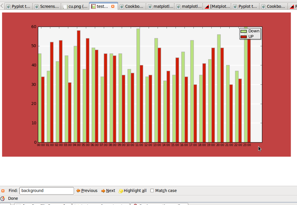
- Change the Background-color of the axis to gray;
- Display only horizontal lines on the axis, in white color;
- Display only the border-left and the border-bottom of the graph, and in 2px of width;
- Change the border-color of the bars of the graphics (to a more dark gray).
- Save in a transparent png.
Can anyone know how to change any of these features? thanks.
Below is some code to do 1, 2, and 4.
The 3rd issue is a bit more difficult. One approach is to use Jae-Joon’s AxesGrid toolkit; you may need to be using the latest development version of matplotlib to use the toolkit.
BTW, does anyone know why it’s ax.set_axis_bgcolor instead of ax.set_facecolor?
Best,
-Tony
% ==============================
import numpy as np
import matplotlib.pyplot as plt
fig = plt.figure(frameon=False)
ax = plt.gca()
light_gray = (.8, .8, .8)
dark_gray = (.2, .2, .2)
x = np.random.random_integers(1, 10, 50)
n, bins, patches = ax.hist(x, facecolor=‘#658A2F’)
for p in patches:
p.set_edgecolor(dark_gray)
ax.set_axis_bgcolor(light_gray)
ax.yaxis.grid(color=‘w’, linestyle=‘-’)
Assuming you want the gridlines below the bars
ax.set_axisbelow(True)
plt.show()
···
On Jul 27, 2009, at 11:22 AM, Gewton Jhames wrote:
thanks!!
only 4 left.
On Mon, Jul 27, 2009 at 11:31 AM, Gökhan SEVER <gokhansever@…287…> wrote:
For the 5th one 
figure(frameon=False)
On Mon, Jul 27, 2009 at 8:26 AM, Gewton Jhames <gjhames@…287…> wrote:
Hello, would you help me in some design issues that I wish to put in my matplotlib graph?
I want my graph look like the one that I’m attaching on this email:
- Change the Background-color of the axis to gray;
- Display only horizontal lines on the axis, in white color;
- Display only the border-left and the border-bottom of the graph, and in 2px of width;
- Change the border-color of the bars of the graphics (to a more dark gray).
- Save in a transparent png.
Can anyone know how to change any of these features? thanks.
Matplotlib-users mailing list
Matplotlib-users@…1544…ceforge.net
https://lists.sourceforge.net/lists/listinfo/matplotlib-users
–
Gökhan
Matplotlib-users mailing list
Matplotlib-users@lists.sourceforge.net
matplotlib-users List Signup and Options
I think it would be easier to use the recently added spine support,
because using the AxesGrid toolkit has some side-effects.
http://matplotlib.sourceforge.net/examples/pylab_examples/spine_placement_demo.html
Regards,
-JJ
···
On Mon, Jul 27, 2009 at 11:55 AM, Tony S Yu<tonyyu@...1166...> wrote:
The 3rd issue is a bit more difficult. One approach is to use
Jae-Joon's AxesGrid toolkit; you
may need to be using the latest development version of matplotlib to use the toolkit.
Thanks everyone. Everything works perfectly.
Only a few things left:
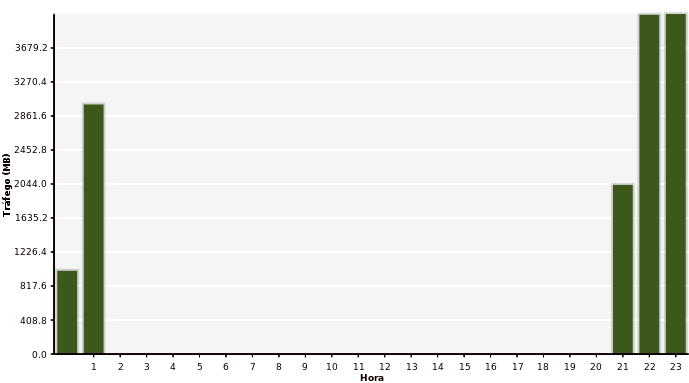
- How to “trim the canvas” of the image generated? It’s transparent, but still have a “padding”, if it would be cropped, I can safe almost 200px!. I have attached a file to this email to show it, the background of the graph was set to red only to you see the padding.
- In the file attached to this email, the graph have a space after the position 23:00, I wish to remove it.
···
On Mon, Jul 27, 2009 at 1:37 PM, Jae-Joon Lee <lee.j.joon@…985…> wrote:
On Mon, Jul 27, 2009 at 11:55 AM, Tony S Yu<tonyyu@…2705…66…> wrote:
The 3rd issue is a bit more difficult. One approach is to use
Jae-Joon’s AxesGrid toolkit; you
may need to be using the latest development version of matplotlib to use the toolkit.
I think it would be easier to use the recently added spine support,
because using the AxesGrid toolkit has some side-effects.
http://matplotlib.sourceforge.net/examples/pylab_examples/spine_placement_demo.html
Regards,
-JJ
For the 2nd one;
To re-position the figure content you might use axis(xmin= , xmax= )
···
On Mon, Jul 27, 2009 at 3:06 PM, Gewton Jhames <gjhames@…287…> wrote:
Thanks everyone. Everything works perfectly.
Only a few things left:
- How to “trim the canvas” of the image generated? It’s transparent, but still have a “padding”, if it would be cropped, I can safe almost 200px!. I have attached a file to this email to show it, the background of the graph was set to red only to you see the padding.
- In the file attached to this email, the graph have a space after the position 23:00, I wish to remove it.
On Mon, Jul 27, 2009 at 1:37 PM, Jae-Joon Lee <lee.j.joon@…287…> wrote:
On Mon, Jul 27, 2009 at 11:55 AM, Tony S Yu<tonyyu@…1166…> wrote:
The 3rd issue is a bit more difficult. One approach is to use
Jae-Joon’s AxesGrid toolkit; you
may need to be using the latest development version of matplotlib to use the toolkit.
I think it would be easier to use the recently added spine support,
because using the AxesGrid toolkit has some side-effects.
http://matplotlib.sourceforge.net/examples/pylab_examples/spine_placement_demo.html
Regards,
-JJ
Matplotlib-users mailing list
Matplotlib-users@lists.sourceforge.net
https://lists.sourceforge.net/lists/listinfo/matplotlib-users
–
Gökhan
That’s right Gökhan, I should have thought on it before ask. Thanks.
Only the first one remains… this one I could not find a way. I know there is one class called FigureCanvasAgg, but I didn’t find anything on it.
···
On Mon, Jul 27, 2009 at 5:16 PM, Gökhan SEVER <gokhansever@…287…> wrote:
For the 2nd one;
To re-position the figure content you might use axis(xmin= , xmax= )
On Mon, Jul 27, 2009 at 3:06 PM, Gewton Jhames <gjhames@…1896…> wrote:
Thanks everyone. Everything works perfectly.
Only a few things left:
- How to “trim the canvas” of the image generated? It’s transparent, but still have a “padding”, if it would be cropped, I can safe almost 200px!. I have attached a file to this email to show it, the background of the graph was set to red only to you see the padding.
- In the file attached to this email, the graph have a space after the position 23:00, I wish to remove it.
On Mon, Jul 27, 2009 at 1:37 PM, Jae-Joon Lee <lee.j.joon@…287…> wrote:
On Mon, Jul 27, 2009 at 11:55 AM, Tony S Yu<tonyyu@…1166…> wrote:
The 3rd issue is a bit more difficult. One approach is to use
Jae-Joon’s AxesGrid toolkit; you
may need to be using the latest development version of matplotlib to use the toolkit.
I think it would be easier to use the recently added spine support,
because using the AxesGrid toolkit has some side-effects.
http://matplotlib.sourceforge.net/examples/pylab_examples/spine_placement_demo.html
Regards,
-JJ
Matplotlib-users mailing list
Matplotlib-users@lists.sourceforge.net
https://lists.sourceforge.net/lists/listinfo/matplotlib-users
–
Gökhan
very old legacy where the axis background color "bgcolor" predated the
existance of an axes patch with the unified kwargs. If people want to
deprecate it in favor of
ax.patch.set_facecolor(color)
I don't object.
JDH
···
On Mon, Jul 27, 2009 at 10:55 AM, Tony S Yu<tonyyu@...1166...> wrote:
Below is some code to do 1, 2, and 4.
The 3rd issue is a bit more difficult. One approach is to use
Jae-Joon's AxesGrid toolkit; you
may need to be using the latest development version of matplotlib to use the toolkit.
BTW, does anyone know why it's ``ax.set_axis_bgcolor`` instead of
``ax.set_facecolor``?
Thanks everyone. Everything works perfectly.
Only a few things left:
How to "trim the canvas" of the image generated? It's transparent, but still
have a "padding", if it would be cropped, I can safe almost 200px!. I have
attached a file to this email to show it, the background of the graph was
set to red only to you see the padding.
use
fig.subplots_adjust(left=0.05, bottom=0.05, top=0.05, right=0.05)
etc to trim the excess space
In the file attached to this email, the graph have a space after the
position 23:00, I wish to remove it.
Several ways to do it: one is:
ax.autoscale_view(tight=True, scaley=False)
Use
···
On Mon, Jul 27, 2009 at 3:06 PM, Gewton Jhames<gjhames@...287...> wrote:
As John suggested, you can adjust the subplot params. This adjusts the
area occupied by the axes, while the figure size (canvas size) is
fixed.
The subplot params can be automatically adjusted.
http://matplotlib.sourceforge.net/faq/howto_faq.html?highlight=automatic%20adjust#automatically-make-room-for-tick-labels
On the other hand, there is some crude support for trimming, i.e.,
reducing the figure size while the axes area fixed.
savefig("file.png", bbox_inches="tight")
Note that the figure size of the saved output is only affected. This
does not change the figure displayed on the screen.
Regards,
-JJ
···
On Mon, Jul 27, 2009 at 4:06 PM, Gewton Jhames<gjhames@...287...> wrote:
How to "trim the canvas" of the image generated? It's transparent, but still
have a "padding", if it would be cropped, I can safe almost 200px!. I have
attached a file to this email to show it, the background of the graph was
set to red only to you see the padding.
John Hunter,
ax.autoscale_view(tight=True, scaley=False)
didn’t work. I put it before and after plot. Didn’t work in any case.
the first one, fig.subplots_adjust(left=0.05, bottom=0.05, top=0.05, right=0.05), didn’t work too. It let’s the graph crazy.
If you want, I can put the code here.
···
On Mon, Jul 27, 2009 at 6:32 PM, John Hunter <jdh2358@…287…> wrote:
On Mon, Jul 27, 2009 at 3:06 PM, Gewton Jhames<gjhames@…1003…7…> wrote:
Thanks everyone. Everything works perfectly.
Only a few things left:
How to “trim the canvas” of the image generated? It’s transparent, but still
have a “padding”, if it would be cropped, I can safe almost 200px!. I have
attached a file to this email to show it, the background of the graph was
set to red only to you see the padding.
use
fig.subplots_adjust(left=0.05, bottom=0.05, top=0.05, right=0.05)
etc to trim the excess space
In the file attached to this email, the graph have a space after the
position 23:00, I wish to remove it.
Several ways to do it: one is:
ax.autoscale_view(tight=True, scaley=False)
Use
Jae-Joon Lee, savefig(“file.png”, bbox_inches=“tight”) doesn’t work too.
···
On Mon, Jul 27, 2009 at 7:00 PM, Jae-Joon Lee <lee.j.joon@…2015…87…> wrote:
On Mon, Jul 27, 2009 at 4:06 PM, Gewton Jhames<gjhames@…1003…7…> wrote:
How to “trim the canvas” of the image generated? It’s transparent, but still
have a “padding”, if it would be cropped, I can safe almost 200px!. I have
attached a file to this email to show it, the background of the graph was
set to red only to you see the padding.
As John suggested, you can adjust the subplot params. This adjusts the
area occupied by the axes, while the figure size (canvas size) is
fixed.
The subplot params can be automatically adjusted.
http://matplotlib.sourceforge.net/faq/howto_faq.html?highlight=automatic%20adjust#automatically-make-room-for-tick-labels
On the other hand, there is some crude support for trimming, i.e.,
reducing the figure size while the axes area fixed.
savefig(“file.png”, bbox_inches=“tight”)
Note that the figure size of the saved output is only affected. This
does not change the figure displayed on the screen.
Regards,
-JJ
plt.subplots_adjust combined with ajustments in fig.set_size_inches is finally working.
···
On Fri, Jul 31, 2009 at 11:55 AM, Tony S Yu <tonyyu@…1166…> wrote:
On Jul 30, 2009, at 5:16 PM, Gewton Jhames wrote:
Anyone?
On Tue, Jul 28, 2009 at 3:23 PM, Gewton Jhames <gjhames@…287…> wrote:
Guys, there is the code.
On Tue, Jul 28, 2009 at 3:13 PM, Gewton Jhames <gjhames@…287…> wrote:
Jae-Joon Lee, savefig(“file.png”, bbox_inches=“tight”) doesn’t work too.
On Mon, Jul 27, 2009 at 7:00 PM, Jae-Joon Lee <lee.j.joon@…287…> wrote:
[Snip]
On Mon, Jul 27, 2009 at 4:06 PM, Gewton Jhames<gjhames@…287…> wrote:
On the other hand, there is some crude support for trimming, i.e.,
reducing the figure size while the axes area fixed.
savefig(“file.png”, bbox_inches=“tight”)
Note that the figure size of the saved output is only affected. This
does not change the figure displayed on the screen.
Regards,
-JJ
Jae-Joon’s suggestion worked for me (using your code). Since this feature is pretty new, it may depend on the version you’re using (I’m using the latest from svn).
I couldn’t get autoscale_view to work either. However, subplots_adjust should work with a little tweaking. Instead of the dimensions John gave, try plt.subplots_adjust(left=0.07, right=0.99). These dimensions may show up differently on your system, so try tweaking these values.
Best,
-T