val = mdates.drange(date1,date2,delta) # the bar lengths
pos = range(len(val)) # the bar centers on the y axis
height=0.5 # the bar height
left=mdates.drange(date1,date2,delta) # the bar starting position
Hello, I'm trying to create a bar chart that looks something like a gannt chart...
See the simple example here:
[http://www.promana.net/making-use-of-gantt-charts/](http://www.promana.net/making-use-of-gantt-charts/)
I'm trying to utilize barh() and fmt_xdata to accomplish this with the
following:
#~~~~~~~~~~~~~~~~~~~~~~~
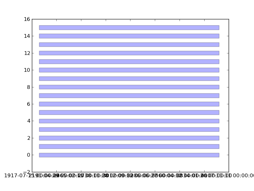
date1 = datetime.datetime( 2000, 3, 2)
date2 = datetime.datetime( 2000, 3, 6)
delta = datetime.timedelta(hours=6)
dates = mdates.drange(date1, date2, delta)
val = mdates.drange(date1,date2,delta) # the bar lengths
pos = range(len(val)) # the bar centers on the y axis
height=0.5 # the bar height
left=mdates.drange(date1,date2,delta) # the bar starting position
fig = plt.figure()
ax = fig.add_subplot(111)
ax.barh(pos,val,height=height,left=left,align='center',alpha=0.3)
ax.fmt_xdata = mdates.DateFormatter('%Y-%m-%d %H:%M:%S')
#~~~~~~~~~~~~~~~~~~~~~~~
Even with ax.fmt_xdata, I'm simply getting numbers on the x-axis instead of
dates. Can anyone offer some pointers?
Thanks,
James
val = mdates.drange(date1,date2,delta) # the bar lengths
pos = range(len(val)) # the bar centers on the y axis
height=0.5 # the bar height
left=mdates.drange(date1,date2,delta) # the bar starting position
Even with ax.fmt_xdata, I'm simply getting numbers on the x-axis instead
of
dates. Can anyone offer some pointers?
Thanks,
James
------------------------------------------------------------------------------
Benefiting from Server Virtualization: Beyond Initial Workload
Consolidation -- Increasing the use of server virtualization is a top
priority.Virtualization can reduce costs, simplify management, and improve
application availability and disaster protection. Learn more about
boosting
the value of server virtualization. http://p.sf.net/sfu/vmware-sfdev2dev
_______________________________________________
Matplotlib-users mailing list [email protected] matplotlib-users List Signup and Options
This actually did not work for me. Can you show me the full code that
you
used to successfully produce the time-format x-axis labels?
See attached files.
Goyo
------------------------------------------------------------------------------
Fulfilling the Lean Software Promise
Lean software platforms are now widely adopted and the benefits have been
demonstrated beyond question. Learn why your peers are replacing JEE
containers with lightweight application servers - and what you can gain
from the move. http://p.sf.net/sfu/vmware-sfemails
_______________________________________________
Matplotlib-users mailing list [email protected] matplotlib-users List Signup and Options