Hi,
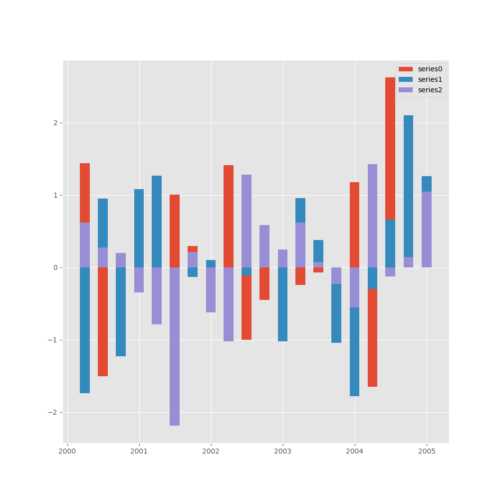
It seemed to be an easy solution, but took me about 2 hours to solve this intriguing problems. I could not see at first that you were trying to format a direct plot from Pandas, using Matplot´s instructions - I really do not know if we have a large range of formatting in Pandas in terms of plotting. Anyway I did an alternative (few minor adjustments in your code) :
import numpy as np
import matplotlib.pyplot as plt
import pandas as pd
plt.style.use(“ggplot”)
datelist = pd.date_range(“2000-01-01”, periods=20,freq=‘Q’)
bar_series = [‘series0’, ‘series1’, ‘series2’]
values = np.random.randn(20, 3)
df = pd.DataFrame(values,index=datelist,columns=bar_series)
fig = plt.figure(figsize=(10,10))
ax1 = fig.add_subplot(111)
import matplotlib.dates as mdates
ax1.xaxis.set_major_locator(mdates.YearLocator())
ax1.xaxis.set_major_formatter(mdates.DateFormatter(‘%Y’))
p1 = plt.bar(df.index, df[“series0”], width = 50 )
p2 = plt.bar(df.index, df[“series1”], width = 50 )
p3 = plt.bar(df.index, df[“series2”], width = 50 )
plt.legend((p1[0], p2[0], p3[0]), (‘series0’, ‘series1’, “series2”))
plt.show()
It gives you :