I am trying to format a date x-axis in a stacked bar chart.
I want to place date xticks every 2 years and show year only in order to make them look clean. However, the formatting codes below don’t work.
How can I achieve my goal?
datelist = pd.date_range(dt.datetime(2000,1,1), periods=20,freq='Q').tolist()
bar_series = ['series0', 'series1', 'series2']
values = np.random.randn(20, 3)

df = pd.DataFrame(values,index=datelist,columns=bar_series)

fig = plt.figure(figsize=(10,10))
ax1 = fig.add_subplot(111)

import matplotlib.dates as mdates

ax1.xaxis_date()
ax1.xaxis.set_major_formatter(mdates.DateFormatter('%Y'))
ax1.xaxis.set_major_locator(mdates.YearLocator(2))

df.plot.bar(ax=ax1,stacked=True)
plt.show()
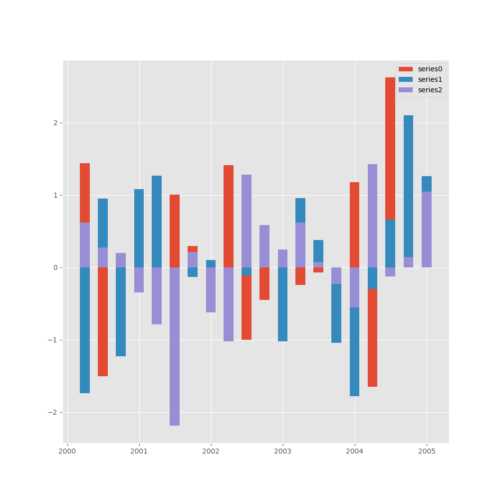
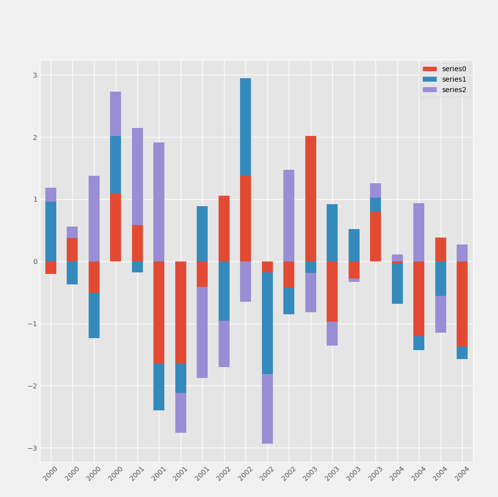
This code gives: