Hi, I am trying to put a sphere (rather than circles or disks) as markers for a
plot. I am a newbiew so I tried the poor man approach: I plotted several circles
one over the other for each point to mimic a sphere (looking it from very far).
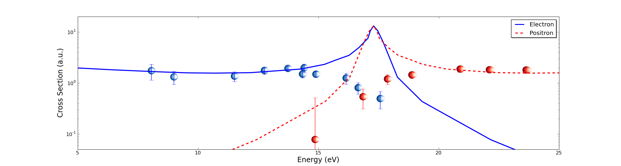
It kind of worked, except that all are not exactly the same and they distort
when I change the aspect ratio of the plot. I am attaching two figures
to show what I mean.
I looked around in the mailing list and searched all over the web but did not
find nothing mentioned. Any help is appreciated.
Regards,
Juan
Can you post a self-contained version of your code so that we can see exactly how you make the spheres? You can just use random/hardcoded numbers for the data in the plot.
Ryan
···
On Mon, Apr 27, 2009 at 7:50 AM, Juan Fiol <fiolj@…9…> wrote:
Hi, I am trying to put a sphere (rather than circles or disks) as markers for a
plot. I am a newbiew so I tried the poor man approach: I plotted several circles
one over the other for each point to mimic a sphere (looking it from very far).
It kind of worked, except that all are not exactly the same and they distort
when I change the aspect ratio of the plot. I am attaching two figures
to show what I mean.
I looked around in the mailing list and searched all over the web but did not
find nothing mentioned. Any help is appreciated.
–
Ryan May
Graduate Research Assistant
School of Meteorology
University of Oklahoma
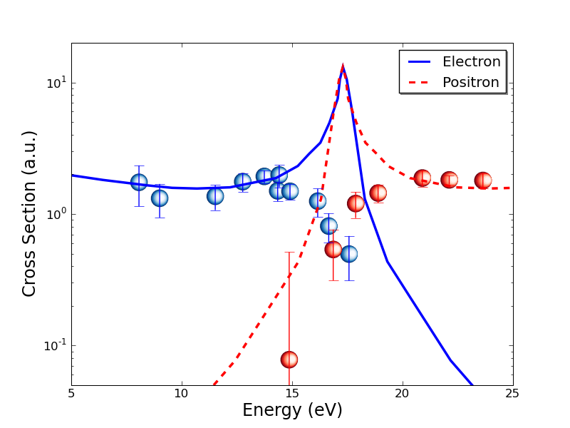
Hi, thanks Ryan for the interest. Here is a short script to produce the data. The method also breaks if I change too much the radius of the sphere or the size at which they are plotted.
I am using:
Python 2.5.4
Matplotlib 0.98.5.2
Regards,
Code follows:
···
###############################################################
#!/usr/bin/env python
from matplotlib import pyplot as plt
import matplotlib.mlab as mlab
import numpy as np
NN=9
xmin=0.1
xmax=3.5
x= np.arange(xmin,xmax,.10)
y=np.square(np.sin(x))
# Creamos la figura
fig = plt.figure()
ax = fig.add_subplot(111)
ax.set_yscale('log')
# Sphere radius (also radius and centers for all inner circles)
radio=.1
rads= radio*(1. - np.arange(0,NN)/(1.*NN))
dl= np.array([(radio-r) for r in rads])*radio
ylimits=(0.01,1.2)
for x1,y1 in zip(x,y):
ax.scatter(x1*(1+dl),y1+(y1*dl), cmap=plt.cm.Blues, c=rads,s=2500*rads, edgecolors='none')
ax.set_xlim(xmin,xmax)
ax.set_ylim(ylimits)
plt.show()
###############################################################
--- On Mon, 4/27/09, Ryan May <[email protected]...> wrote:
From: Ryan May <[email protected]...>
Subject: Re: [Matplotlib-users] custom symbols for scatter
To: [email protected]...
Cc: [email protected]
Date: Monday, April 27, 2009, 5:04 PM
On Mon, Apr 27, 2009 at 7:50 AM, Juan Fiol > <[email protected]...> wrote:> Hi, I am trying to put a sphere (rather than circles
or disks) as markers
> for a
> plot. I am a newbiew so I tried the poor man approach:
I plotted several
> circles
> one over the other for each point to mimic a sphere
(looking it from very
> far).
> It kind of worked, except that all are not exactly the
same and they
> distort
> when I change the aspect ratio of the plot. I am
attaching two figures
> to show what I mean.
> I looked around in the mailing list and searched all
over the web but did
> not
> find nothing mentioned. Any help is appreciated.
>Can you post a self-contained version of your code so that
we can see
exactly how you make the spheres? You can just use
random/hardcoded numbers
for the data in the plot.Ryan
--
Ryan May
Graduate Research Assistant
School of Meteorology
University of Oklahoma
Thanks Jouni, my first try was to make a PNG in gimp and use imread/imshow but it did not work with Log scale.
I think that the best approach would be to create an object (may be a patch) with the sphere and put it in the plots but I do not know how to do it and will not have the time to investigate it for a couple of weeks.
Thanks, for your reply