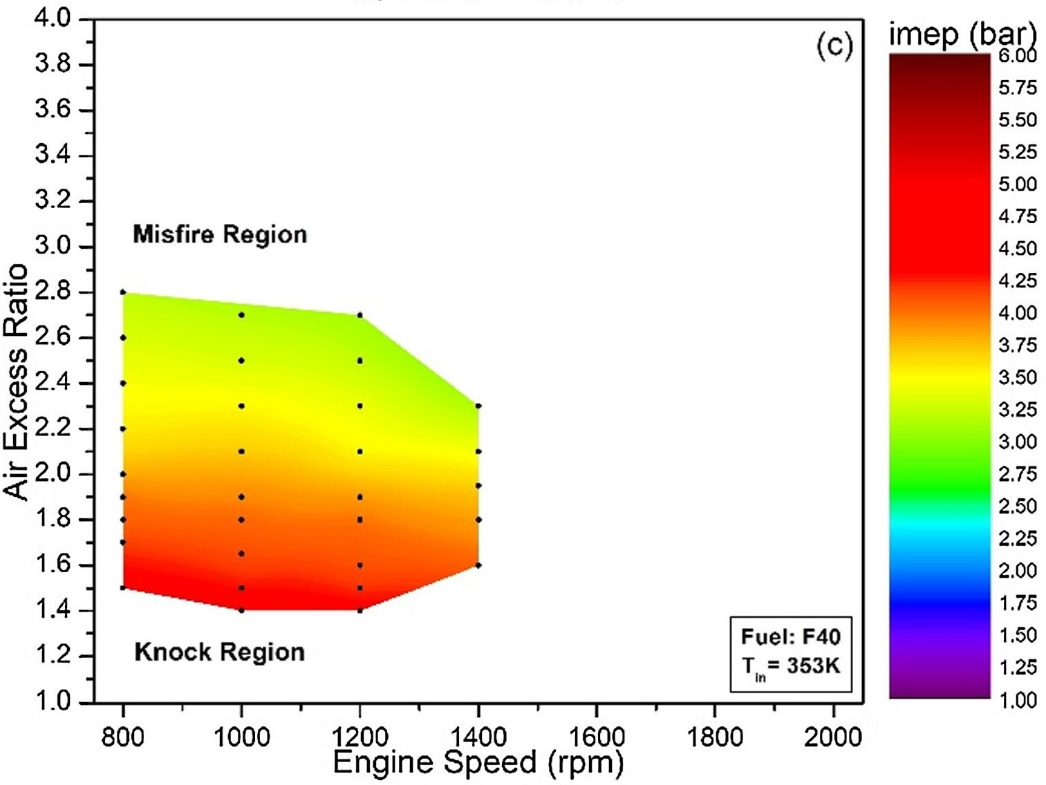
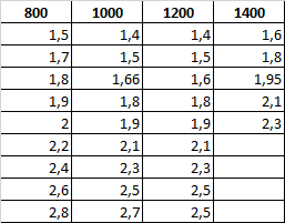
Is there an example of how I want to make a chart with the data like the chart below?
Can you please provide some detail of what you have tried? Making a chart like this is something like:
fig, ax = plt.subplots()
im = ax.imshow(data)
fig.colorbar(im, ax=ax)
but the answer varies depending on how you have data represented in Python.
Have a look at tricontourf (second example here:) https://matplotlib.org/3.1.1/gallery/images_contours_and_fields/irregulardatagrid.html#sphx-glr-gallery-images-contours-and-fields-irregulardatagrid-py