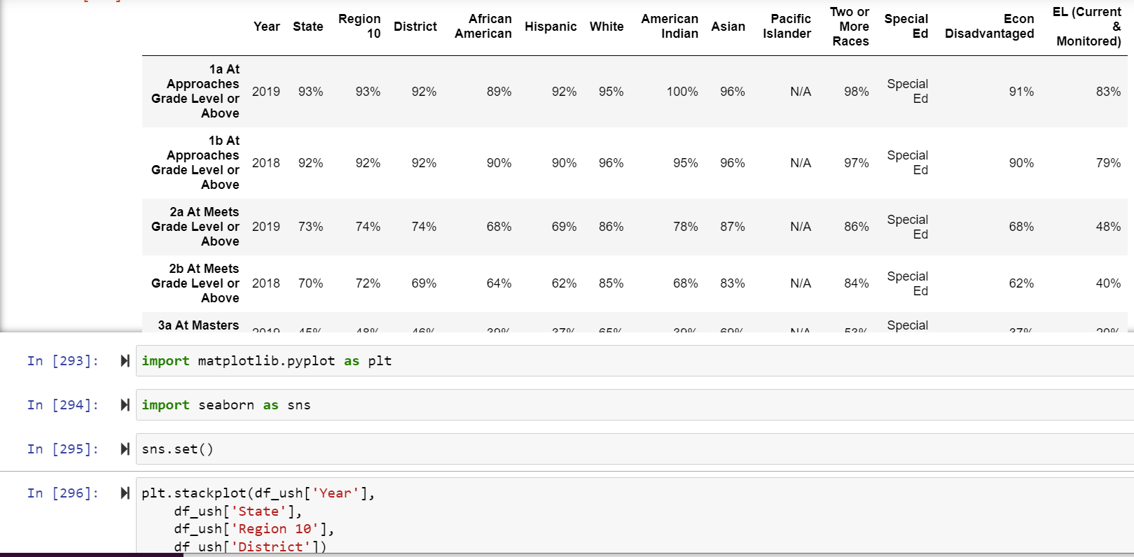
This is my data.
Any idea why my graph looks like this? Any suggestions would be nice, I’m trying to teach myself python
It would help to have your complete df_ush DataFrame pasted in here as text (not a screenshot) between code fences - it does not seem to be very large. Eg:
```
copy/paste the dataframe text here
```
See the docs for stackplot here: matplotlib.pyplot.stackplot — Matplotlib 3.6.2 documentation
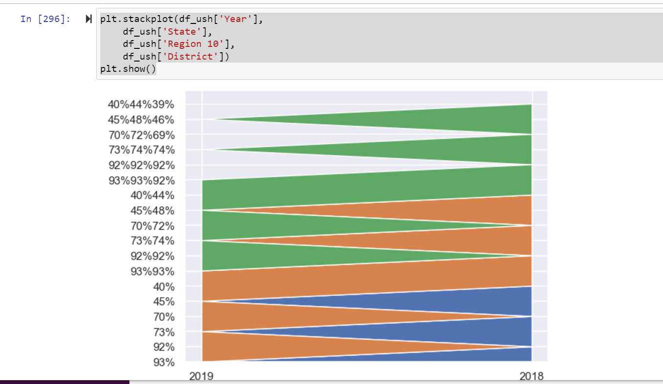
The first argument is the x-axis. Your first argument is df_ush['Year'], which to my eye seems to have alternative values of 2019, then 2018, then 2019, etc, back and forth. So there are only 2 x values: 2019 and 2018, and these are the left and right x-ordinates on your graph.
I expect that this is the underlying cause of the triangular look to the plot: a data point at 2019,something, then one at 2018,something, then one back at 2019,something_else. Thus the zig-zag from one side of the graph to the other as things get stacked.
The other arguments seem to be strings eg "93%", not numeric values eg 0.93. You may need to do some conversion of the original data to turn these percentage strings into numeric values.
If these data came from a CSV file via read-csv, maybe you need some conversion functions to use in that call. Or you can do some conversion of the columns after you’ve loaded the data.
I think because the values are strings stackplot is doing some combinatorial representation of the plots: first labels of 93% etc from the State column, then 93%93% etc representing “region 10 on top of state”, then 93%93%92% etc representing “District on top of region 10 on top of state”.
Cheers,
Cameron Simpson